As members of the print industry, we know how beautiful and luxurious print can be. We are aware of the possibilities of print-to-mobile tools and dimensional techniques that delight our sense of touch and pique our spirit of adventure. But with a little extra creativity, we can use print in ways most people probably haven’t thought about. Not because they use techniques that only a few clients can afford, but because someone came up with a really creative concept that tapped print’s capabilities in an unexpected way. Print Power, a European initiative designed to promote the use of print, has a large collection of case studies that showcase this creativity. As you click through the collection, you will invariably find yourself saying, “Wow! Why didn’t I think of that?”
Here are some examples that (hopefully) will inspire ideas for creative use of print by your clients, as well:
One Page, Two Ads
Both Volkswagen and L.L. Bean used light-sensitive inks to create two ads in one. To promote the Night Vision feature of the new VW Touareg, for example, Volkswagen created a knock-off of a Hans Christian Andersen fairytale. In one version of the story, a young deer wanders into the road, in the dark, in front of a moving car. The ending is not pretty. But read the ad in the dark and fluorescent inks reveal a second version of the story in which the Night Vision feature enables the driver to see the deer well in advance and stop just in time.
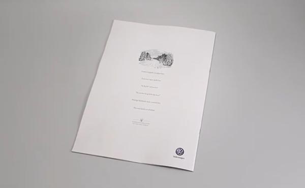
In the L.L. Bean ad, which is designed to get people up and moving outside, the page is blank except for the call to action: “Take this outside.” When the ad is taken outside, photochromic inks are activated, filling in the page with an “outdoor manifesto” in verse, extolling the beauty and virtue of outdoor fun. (See ads here.)
Sometimes Simplicity Speaks Loudest
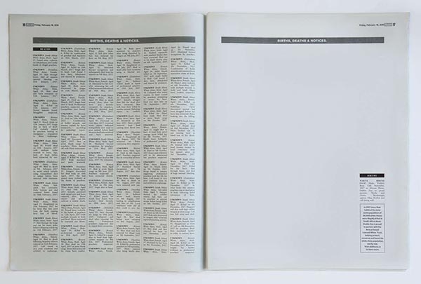
The Dublin Zoo wanted to draw attention to the plight of white rhinos and celebrate the birth of a single white rhino in its zoo. To do this, it ran a simple black-and-white “birth, death, and notices” ad in The Irish Sun. The spread has 70 death notices on one side, each one announcing the death of a white rhino and the gruesome manner in which it died. The other side is empty with the exception of a sole birth notice: a baby white rhino born at the Dublin Zoo and doing well. There is also a callout box letting readers know that in 2017 alone, more than 1,000 of the total world population of 20,000 white rhinos were illegally killed in South Africa alone. The ad spotlighted the importance of the birth of this one rhino and the critical nature of conservation efforts. (See ad here.)
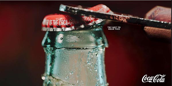
Try Not to Hear This!
As human beings, we have a variety of forms of memory. When we engage with certain aromas, for example, it triggers memories perhaps long forgotten. Coca-Cola tapped into this phenomenon with an ad featuring a crisp, powerful image taken with stop-motion photography, combined with the tiny words, “Try not to hear this.” The combination does something remarkable. It triggers auditory memory. We’ve all heard the opening of a bottle cap thousands or tens of thousands of times. The pop, followed by the releasing of those tiny yummy bubbles. With just the right image and the clever prompt, Coke triggers that auditory memory, causing the reader to “hear” the pop of the bottle cap and the rush of soda froth, and, hopefully, experience the craving for a Coke while they’re at it.
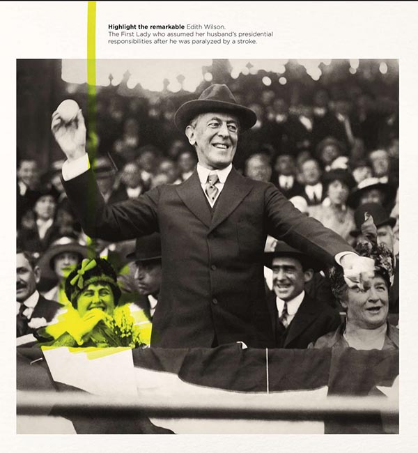
Highlight It
How do you make a highlight pen exciting? If you are German pen-maker Stabilio, you run ads featuring historic black-and-white photographs prominently featuring famous men, from politicians to celebrities, then use bright highlighter yellow to bring attention to historically relevant women we may not have noticed who are in the same photograph—thus promoting the value of highlighters to “highlight the remarkable,” while simultaneously associating the brand with promoting support for gender equality issues. Brilliant.
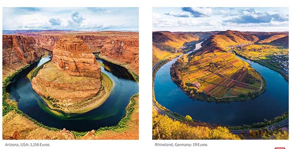
Instagram Envy
How do you encourage people to take staycations when they think their country is boring? That was the task of the German Rail. To combat the idea held by 72% of Germans that their country is boring, German Rail created a series of ads that provide Instagram-style images of beautiful international travel destinations set side by side with lookalike destinations in Germany and the cost of each. Get the same experience as an international trip...right here at home. Travel doppelgangers—who knew?
These are just some of the amazing ads in the collection, which contains everything from direct mail using holograms to magazine ads using pop-up airbags when the image of the car is punched. I’m also partial to the ad from the wireless company claiming “no more black[out] spots” that replaced every black dot from the page (from the dots in the ‘i’s to the tops of semicolons) with colored ones.
The creativity possible in print is endless, and when you click through these campaigns, you cannot help but come away with a new awe for the power of what print can do.