- The best color scheme will support the intent of the marketing piece and draw your audience in.
- Much like the psychology of color, the right font choice sets the tone and mood for a piece and can be instrumental in conveying a message and engaging with viewers.
- Your visuals should align with your brand's identity and personality while reinforcing your overall message.
By Karen Kimerer
Introduction
Direct mail marketing continues to be effective in today's digital age due to its ability to stand apart from a vast array of online marketing messages. Its tangible format provides an excellent opportunity for businesses to make a long-lasting impression on their desired audience. To guarantee success, attention should be paid to the visual appeal of the direct mail piece, including carefully selected colors, smart design elements, and a touch of personalization. If these aspects are neglected, even the most thoughtfully crafted direct mail piece might be overlooked or mistaken for a generic spam marketing effort. Not paying attention to the aesthetics of direct mail can result in missed opportunities for customer engagement, reduced response rates, and wasted marketing dollars.
The strategic use of color and other design elements can dramatically improve response rates for your direct mail. This article explores how visually appealing and impactful direct mail designs can increase engagement and maximize the effectiveness of your direct mail campaigns.
Getting Noticed with Direct Mail
Keypoint Intelligence’s latest Annual State of Transactional Communications study surveyed a total of 1,500 consumers in the United States. When asked how they decided which direct mail items to open and spend extra time reviewing, consumers most commonly reported that it came from a product or company that interested them. Other key factors included personalization and a visible offer on the outside.
Figure 1: Factors that Contribute to Reviewing
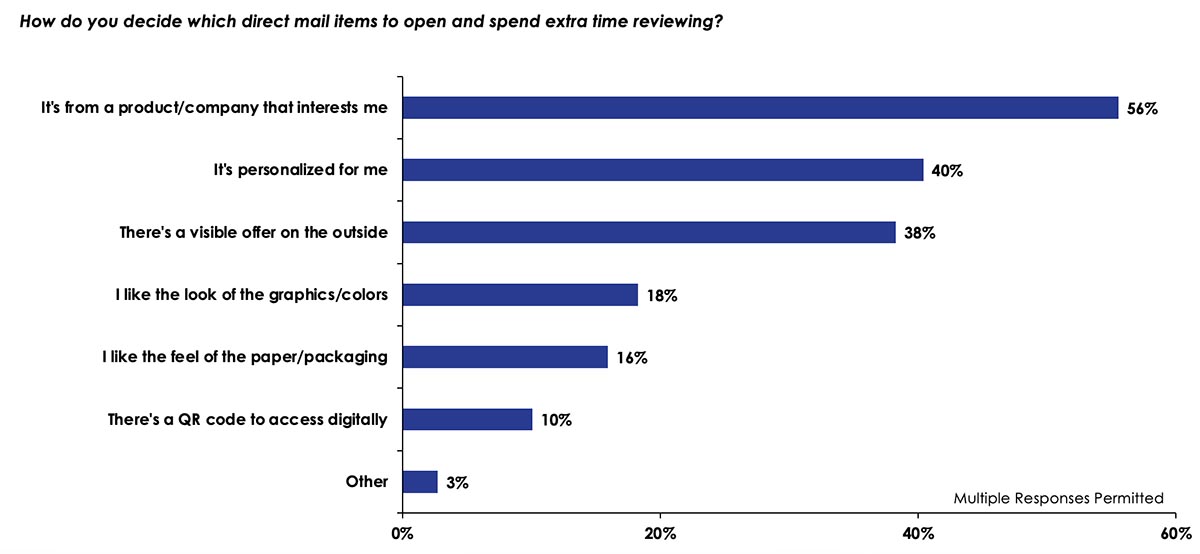
N = 1,500 Total Consumer Respondents
Source: Annual State of Transactional Communications Consumer Survey; Keypoint Intelligence 2022
As consumers become more discerning, presenting direct mail in the best possible way can significantly impact its success. Therefore, it is vital to prioritize high-quality design to capture attention.
The goal of most direct mail marketing is to communicate and engage with a specific audience. A marketing campaign aims to generate leads or increase brand awareness. It’s also an effective tool for driving sales and converting leads. In addition, direct mail offers an opportunity to nurture relationships with loyal customers. Unfortunately, a poorly presented marketing piece can quickly derail any of these objectives.
The Importance of Color, Font, and Visuals
In addition to establishing your visual identity, colors can evoke specific human emotions. The best color scheme will support the intent of the marketing piece and draw your audience in. For example, warm colors like red and orange create a sense of urgency, while cool colors like blue and green convey trust and dependability. It’s possible that you’ve already seen the Color Emotion Guide below, which depicts how color associations can link to a brand's image. Additionally, it demonstrates the link between color and the messages that various brands are trying to convey.
Figure 2: The Logo Company’s Color Emotion Guide
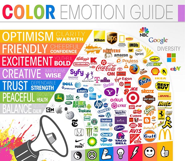
Source: The Psychology of Color in Logo Design; The Logo Company
Another best practice when it comes to color is using it to create a visual hierarchy that guides a recipient’s attention to essential elements. For example, contrasting colors can highlight key information, such as calls to action or discounts. At the same time, the use of complementary colors can create visual harmony and make the content more visually appealing.
Color selection alone is not enough. To get the most out of a direct mail campaign, it’s important to pair the deliberate use of specific colors with other best practices, such as personalized and relevant messaging. While variable data is not the focus of this piece, Keypoint Intelligence’s research has consistently shown that personalized print with recipient-specific information and customization fosters a sense of familiarity and relevance.
Choosing the font for a project or design might seem like an afterthought, but the truth is that fonts are quite important to a message’s overall appeal. The primary function of fonts is to ensure that the text is legible and easy to read. Selecting the right font helps prevent eye strain and enables readers to consume the information effortlessly. Much like the psychology of color, the right font choice sets the tone and mood for a piece and can be instrumental in conveying a message and engaging with viewers. For example, a formal document may use serif fonts to convey professionalism and authority, while a playful invitation might rely on a whimsical, decorative font to reflect a fun theme. Choosing the right font aligns the visual elements with the intended tone and message, effectively communicating with the audience without using any words at all.
The layout of this article provides an example of how fonts can distinguish and highlight specific information within a direct mail piece. Employing different font styles, sizes, or weights can help differentiate headings, subheadings, body text, and other key elements. This aids in organizing and structuring information, making it easier for readers to find the most relevant content. However, getting your font choices wrong can make all of your hard work look amateurish.
The brain needs to transform words and messaging into meaning when it comes to direct mail copy. Over the years, numerous studies have revealed that our brains process visual information far more efficiently than textual information. By combining text with visual elements, marketers can pack big ideas into small spaces. This is why effective direct mail marketing relies heavily on visual imagery.
Choosing the right visuals can capture your audience's interest and powerfully convey your message. When selecting imagery, it's important to consider your brand's personality and values. Incorporating visual elements into your mail piece can make it more appealing and easier to read, resulting in more impactful communications for your audience. Your visuals should align with your brand's identity and personality while reinforcing your overall message.
High-quality, original, and copyright-free images should be a top consideration because they will enhance the professional look and feel of your direct mail pieces. On the other hand, low-quality or overused visuals can detract from your brand's credibility. When direct mail pieces stand out in a meaningful way, they can establish connections and increase the chances of a positive response from recipients.
The Bottom Line
The aesthetics of a direct mail piece can profoundly influence its overall effectiveness. A recipient's interest in a brand or product plays a crucial role in determining their level of engagement and readership. This means that direct mail must create, capture, and maintain an audience’s interest. Marketers must deliver eye-catching direct mail that stands apart from the competition.
Designing a mail piece that grabs and keeps the recipient’s attention begins with careful consideration of every element involved. Every aspect of a direct mail campaign is vital to its success, from the choice of colors to the typography, layout, imagery, and overall design.
As part of the Business Development Strategies Consulting Service at Keypoint Intelligence, Karen Kimerer has experienced the many challenges of expanding current market opportunities and securing new business. She has developed a systematic approach to these opportunities, addressing the unique requirements of becoming a leader in our changing industry.


Discussion
Join the discussion Sign In or Become a Member, doing so is simple and free