- For marketers, the use of color can create powerful reactions among their intended audience members.
- Despite common associations, it’s important not to overgeneralize when it comes to color preferences.
- Businesses make subtle changes to modernize their logos all the time, but they will often stick to the basic color scheme that their customers have come to recognize.
By Eve Padula
Introduction
Few would argue that our world has changed a lot over the past few years. Marketing—even more traditional forms of marketing like direct mail—has certainly not been immune to these changes. Today’s consumers expect and in some cases demand to be treated like individuals. Regardless of their unique demographics or preferences, consumers expect the firms that they do business with to get to know them on a personal level. Effective marketing campaigns will reflect this knowledge and can make consumers feel like certain brands truly understand them and their needs.
There are many ways for brands to establish an emotional connection with their customers, and doing so can foster loyalty while also delivering a better overall experience. Sometimes we can get so wrapped up in focusing on the next big thing that we might forget the simpler (yet no less effective) connections. For example, did you know that something as simple as color can play a key role in catching your customer’s eye and triggering an emotional response? Let’s explore how color can create an emotional response and better connect consumers to brands.
The Effects of Color
Color has long been known to influence consumer behaviors. In today’s world, a color image is generally more desirable than a basic black-and-white one. For marketers, the use of color can create powerful reactions among their intended audience members. According to a study by Digital Information World, 93% of buyers primarily notice a product’s physical appearance when purchasing that item. Color is one component of physical appearance.
Brands of all sizes have been successfully using color to create demand and improve recognition and loyalty for quite some time. Marketers understand that specific colors have different effects on the human mind, and therefore trigger different responses. Warm tones like orange, red, and yellow are thought to promote feelings of familiarity and comfort. At the same time, however, it is important not to overuse these colors because they can also create feelings of anger and hostility. Meanwhile, cool colors like green and blue might provide a sense of calmness and security, but they can also trigger feelings of indifference or melancholy.
Figure 1. Colors and Their Common Associations
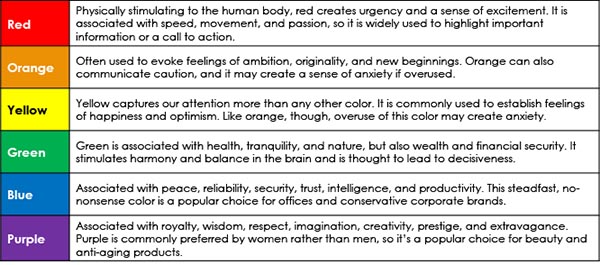
Think about all the images you’re exposed to every day. Whether you realize it or not, your built-in associations with certain colors—and even specific shades of those colors—can influence your perception of a brand. It’s no coincidence that major fast food brands like McDonald’s, Burger King, Wendy’s, and Pizza Hut frequently rely on various shades of red and yellow in their logos. Yellow creates a feeling of comfort and familiarity, while red is thought to make people feel hungry and more impulsive. Meanwhile, businesses like John Deere, Waste Management, and Seventh Generation rely on shades of green to communicate an affiliation with nature and eco-friendliness.
Of course, there are other colors too, and these also have their own associations:
- Pink can represent frivolity, whimsy, joy, kindness, and love.
- Brown is an earthy tone that makes people feel welcome, calm, and at home with their surroundings.
- Monochromatic tones like black and white are commonly associated with security, trust, reliability, and quality.
- Grey conveys feelings of practicality, timelessness, and solidarity. A word of caution, though—overuse of grey can be associated with feelings of nothingness and depression.
- Metallic tones like gold and silver can lend a touch of elegance. Because they are associated with prestige, they can elevate the perception of a brand’s status, wealth, and power.
Despite these associations, it’s important not to overgeneralize when it comes to color preferences. Personal experiences, cultural traditions, and even age and gender can affect the way people feel about certain colors. For example, green is typically more popular among younger consumers. Women are more likely to prefer purple than men. And while white is considered a sign of purity in the Western world, it’s the color of mourning in some Eastern areas.
Choosing the Right Color: It’s Complicated!
Marketers understand that they can use color to evoke certain emotions and support their brand’s image, but preferences are subjective and often change over time. Choosing the right color supports a brand’s character and can communicate a message about its company’s values. This is why brands are so sensitive about getting their corporate colors exactly right—a pale blue, for example, will send a different message than a bright royal blue, and consumers recognize specific brand colors more than they might realize. Going back to the fast-food example, McDonald’s uses very specific shades of red and yellow in its internationally recognizable logo. If these shades were suddenly changed, perhaps to a brick red and a pale yellow, just about everyone would notice.
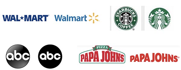
Businesses make subtle changes to modernize their logos all the time, but they will often stick to the basic color scheme that their customers have come to recognize. This is because they understand the associations that consumers have to different colors, and they want to maintain the connections they’ve worked so hard to establish.
Figure 2. Changes to Major Logos over Time
Linking the Digital with the Physical
Just a few years ago, many marketers were struggling to justify the cost of full-color direct mail. Direct mail is clearly a more traditional form of marketing, but it remains important. In the past, four-color click charges made many projects cost-prohibitive. On top of that, it was nearly impossible to add specialty features like gold, silver, neon colors, or textures at a price that brand owners were willing to pay. Today’s ongoing technological innovations are changing all of this.
Specialty printing capabilities (e.g., color embellishments, unique finishing, engaging digital enablers) and personalization are expected to be used even more as the digital and physical worlds continue to align. Modern brands can now deliver mail embedded with the technology to take their audience online at a reasonable cost.
The Bottom Line
It’s impossible to predict how every customer will feel about different colors. We all have our own unique preferences and experiences, and these will often shape our associations with color. The key takeaway is that color gets noticed and can trigger an emotional response, regardless of whether brand marketing takes place in digital or printed form. The process is certainly not foolproof, but marketers can make generalizations about color associations to predict how their customers and prospects might respond to a logo or corporate color scheme. Harness the power of color today to send your message, generate interest, and foster brand loyalty!
Eve Padula is a Senior Consulting Editor for Keypoint Intelligence’s Production Services with a focus on Business Development Strategies, Customer Communications, and Wide Format. She is responsible for creating many types of content, including forecasts, industry analyses, and research/multi-client studies. She also manages the writing, editing, and distribution cycles for many types of deliverables.