Premium Commentary & Analysis
Colorkarma’s Shoshana Burgett takes an in-depth look at how “grab-and-go” shopping in the age of InstaCart is forcing brands to rethink their approaches to packaging design.
Monday, February 07, 2022
Continue reading your article
with a WhatTheyThink membership.
Less than $4/week.
Get unlimited access to in-depth commentary and analysis covering the latest trends, emerging technologies, operational strategies, and key events across every segment of today's printing industry.
Stay informed. Stay competitive. Stay ahead.Colorkarma focuses on design for execution by bringing together unique perspectives on design and manufacturing to ensure a smooth execution on your creative vision the first time. Our mission is to be the leading resource for the creative community providing educational content, industry news, design tips and best practice advice from industry leaders.

10 Things PSPs Should Consider Before Adopting Robotics: What You Need to Know to Begin the Journey
Why Highly Targeted Communications Make Digital Print Essential to Modern Marketing
Wide Format in 2026: How Technology Is Reshaping Competitive Advantage

“Digitization” and “digitalization” sound similar, and it is common for people to confuse their meanings. Digitization focuses on the data required to objectively communicate product requirements, while digitalization is the process required to implement that workflow. ColorKarma’s Shoshana Burgett explains how the apparel industry needs both to successfully lower costs, speed product launches, and deliver sustainability targets. Read More

ColorKarma’s Shoshana Burgett describes her visit to the Imagine Van Gogh immersive exhibition and explores how the exhibit’s unique approach to providing a user experience can be applied to industry events and consumers’ relationships with brands. Read More
Supply chain issues have forced small businesses to shift their thinking and approach to the form and function of their packaging design. ColorKarma’s Shoshana Burgett looks at some of the top impacts. Read More
ColorKarma’s Shoshana Burgett reports from Texprocess Americas, the theme of which was “Sell Then Make,” and identifies the five trends shifting the apparel industry, Read More
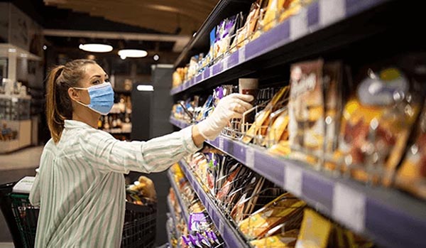
In the post-pandemic age of online grocery services like InstaCart, the shopper selecting consumer product goods off store shelves is not the final consumer. Colorkarma’s Shoshana Burgett explains what this means for brandowners and how approaches to packaging need to change. Read More