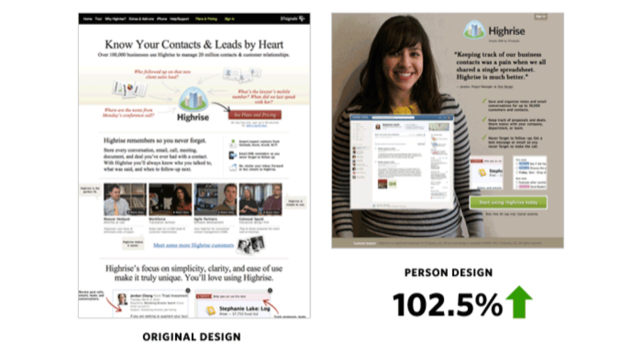
I recently ran across a blog post that caught my attention. The blog is called Jeremy Said (from the conversion expert Jeremy Smith), and the title of the post is “The Jaw Dropping Effect that Images Can Have on Your Conversion Rates.” I must admit, after reading these examples, my jaw did drop. These data from real-life campaigns show just how much power images can have.
Why cover the topic here? Doesn’t everyone know that images increase the chances that people will pay attention to your communication and respond? You’d think so, but over the past few weeks, I’ve run across a number of direct mail pieces that were text only. Seriously—no images at all. Hence this post.
Everyone is trying to save money, but this is one of those “penny-wise, pound foolish” scenarios. If your customers bring you files with no images, limited numbers of images, or images that are too small to have much punch, these data may come in handy. I also spent time looking for data from other sources, and while Jeremy’s post does give you particular bang for your reading buck, all of the posts reflect similar results—that images boost conversion rates significantly. Moreover, they show that bigger images boost conversion rates more than small ones and that images of real people, places, and things outperform graphics or stock images.
In fact, a variety of studies have confirmed that just by using the headshots of (real) customer service people, marketers can increase conversion rates by 20%. But don’t use stock photos, cautions Said. Use real people. As just one example, Jason Thompson, a Canadian actor, did an A/B test. He created two pages with different calls to action. The first used an icon of a phone to request people give him a call. The conversion rate was 3.7%. Then he used his own face. The conversion rate jumped to 5.5%.
Said also cited examples and data from Kissmetrics on the importance of using facial images. As one of those examples, Kissmetrics cited the website of Medalia Art, which tested two graphics leading to artists’ profiles—one using artists’ work and the other using headshots of the artists themselves. When Medalia Art used the headshots, click-through shot up 95%.
“It doesn’t really matter whether the faces are ugly or beautiful,” Smith writes. “The point is, they’re faces. And faces are human. And humans connect with humans.”
Also writing on this topic is Instapage, which cites a study from Visual Website Optimizer that found that replacing a stock image with an image of the company’s founder increased signups by 35%.
Another writer, Peep Laja of ConversionXL, cited data from 37Signals that, when it started using images of its customers on its landing page, it saw conversion rates go up 105%.

Image Source: Basecamp.com
But it’s not just having images in your communications pieces that makes a difference. It’s also how big those images are and what percentage of real estate they take up. To this end, Smith gives an example from Skinner Auctions, which wanted to increase the number of people bidding on items on its site. By increasing its image by 28%, Skinner got 63% more visitors to start the bidding process and 329% more to complete the bid forms.
Said’s next example came from Dell, which wanted to increase response to its expert consultation page. The image on the first page took up approximately 30% of the visible space on the page. The second was significantly larger, taking up about half the space. It also had less text, a larger font, and a large “let’s get started” box. The results? Bounce rates decreased by 27% and conversions increased by 36%.
Images are also important in backgrounds. Said discussed a case study from Second Wave Recycling, which recycles old cellphones. On its website, Second Wave wanted people to fill out a form to donate their old phones. First it used plain gray forms with no images. Then it added backgrounds to the forms to make them look like shipping labels. Donations increased 53%.
So think the importance of the size, placement, and presence of images is something everyone knows? Think again—and be prepared to help your clients think about it, too.


