Every brand is looking for ways to connect personally with customers, but let’s face it. It’s expensive (at least in terms of upfront costs). It’s no wonder that brands are increasingly using tricks to make their mailings seem personal, even if they aren’t. I received such a piece from Xfinity the other day.
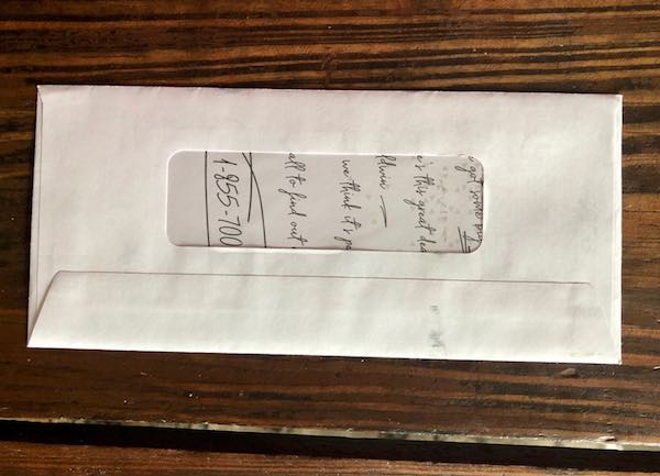
This envelope was interesting because it was addressed to “Our Neighbor at [our address]” so no one would confuse this with a personalized letter from the front. On the back was a peekaboo window through which I could see an insert printed in a handwriting font, including the phone number to call, that made it feel oddly more personal, even though I knew it wasn’t.
The insert talked about the “great deals” in our town (mentioned by name), and included a marketing letter that mentioned our town by name, as well. So while the mailing was not personalized, it was segmented, although I couldn’t tell that from the outside since, whether due to design oversight or lack of prioritization, the town wasn’t identifiable through the window.
This approach wasn’t something I’d seen before, so I stopped and took notice. While most handwriting fonts look like fonts, because this was behind cellophane and on the back where I wouldn’t expect to see it, it wasn’t asobvious and did make me look twice. It also made me wonder why Xfinity would go to the effort of printing a letter in a handwriting font (or in real handwriting, which is what I’m sure it’s hoping at least some of its target audience will think) in what appeared to be an undifferentiated mass mailing. But the point is, I stopped and thought about it. I’m sure others did, too.
It makes one wonder how much more effective the mailing would have been if Xfinity had personalized the mailing at least using the recipients’ names. (Although I assume they’d already crunched the numbers and figured that the cost savings outweighed the potential benefit—at least, one would hope they had done that.)
Since we are former Xfinity customers, it also makes me wonder how much more effective the mailing would have been if they had suppressed the addresses for former customers like us, then sent our group a customized “win back” mailing rather than the same mass market messaging.
Regardless, this was an interesting mailing that raises interesting questions that could lead to some really terrific targeted mailings. Have any of you used this approach before? How did it work?






Discussion
By Greg Patt on Mar 04, 2020
Was it enough to entice you to open and read it?
By Heidi Tolliver-Walker on Mar 04, 2020
Unfortunately, I think most of us don't look at these things as consumers. At least, not usually. I opened it because I wanted to see what they were up to. It's like a watchmaker opening up someone else's watch to see how it works. I wish I knew someone else who received one and who would be looking at it through different eyes.
Discussion
Only verified members can comment.