It’s customary to speak of the “imprints” that great figures leave behind them, but no one ever left them more literally or abundantly than Hermann Zapf. As typophiles the world over know, the 200 type designs he created are essentially inescapable—they’re to be encountered wherever people rely on letterforms for the information they need to carry out the ordinary chores of everyday life.
Those chores include selecting packages based on what the lettering says and suggests about the products inside them. Packaging typography neither began nor ended with Zapf, but his passing is an appropriate occasion to reflect on the central role that letters play in the graphic communications experience that every package represents.
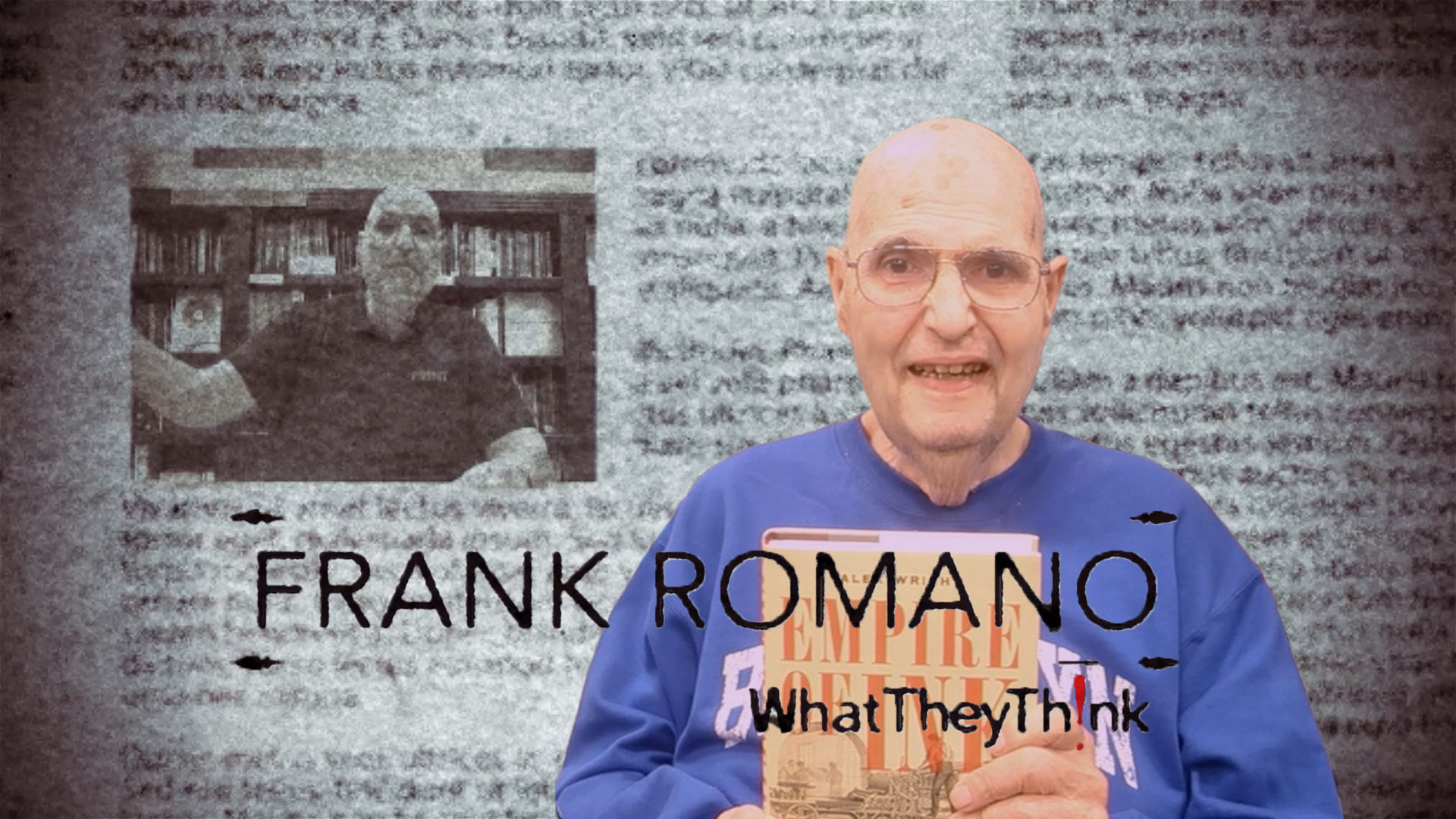
Zapf understood that no printed medium was more closely bound up with typography than packaging. Frank Romano, professor emeritus at Rochester Institute of Technology, shares an anecdote that reveals Zapf’s perception of typography’s place in the visually crowded world of consumer-goods retailing:
“I once visited a Wegmans supermarket with Hermann Zapf when he was in Rochester for an event. I had been named to the RIT Cary Professorship, the chair that he held in the 1970s and 1980s. As we walked the aisles, he would point out packages with his typefaces and those of other designers he knew.
“He knew them all. He noted that color and illustration were drowning out the type, but that the type would always dominate because one word was worth a thousand pictures. He bemoaned the amount of sans serif use and lit up when he found Optima.”
Zapf would have been the first to agree that for a word to be worth a thousand pictures, the type it consists of must supply what illustration and color don’t fully convey during the handful of seconds in which shopping decisions usually take place. If colors and images are the emotional heart and soul of a package’s outreach, typography is the cool intellect—the feature that states the facts and makes the purchasing proposition in an unambiguous way.
Today, because the scope of consumer product marketing is so vast, incorporating typography into packaging means pushing letterforms into new modes of clarity and expressiveness. That may mean departing from some of the norms laid down by Zapf and other masters of the discipline.
Harvey Levenson, professor emeritus of graphic communications at Cal Poly State University, notes that typographic design trends in packaging and labels may not even be particularly relevant when there is so much creative ground to cover.
“A trend suggests similarities,” Levenson explains. “However, labels and packaging rely on differentiation so a particular design or typestyle becomes identified with a particular product. This is why in packaging many logos are created using custom designed typestyles that do not closely resemble any of the thousands of commercially available typefaces. The goal is to be ‘different.’"
Nevertheless, the classical elements of typography continue to guide designers who want to give their packages the kind of visual differentiation that endures. As this essay on typography for beauty brands points out, individuality isn’t necessarily the best way to achieve it. Typefaces need to be “ownable by the brand,” but they must not appear “gimmicky” or “unsophisticated” because time-tested rules of letterspacing, leading, and other type characteristics have not been applied.
Rules are useful, but the best typography for packaging is neither hidebound by them nor resistant to ideas from elsewhere in the spectrum of visual communications. Mark Chapman, a packaging specialist in the U.K., writes that with the rise of social media, some brands are transferring their online identities to offline marketing through changes to their packaging. These could include the use “whimsical, hand-drawn or hand-written typography” to let consumers know there is a human face behind the brand.
“Packaging trends generally borrow from other medias’ influence to target a particular consumer,” concurs Jeff Zack, principal of the Zack Group, a provider of packaging design and visual identity services to leading brands. “Recent design trends towards natural (hand-lettering) and simplicity (clean and somewhat softer styles) have been very popular. There has also been some trending to a retro use of typography (a yearning for quality and nostalgia in America).”
That “yearning” for something to believe in also may point to an entirely new challenge for packaging typography: that of overcoming consumer skepticism toward brands and branded products. Andrew Gibbs, founder of The Dieline, a portal for best practices in package design, recently blogged that consumers—especially those in the Gen-Z age group—“are not responding to traditional established corporate brands” and are searching for the “human connection” that they feel mainstream brands don’t offer them.
To give consumers “the visual authenticity” they crave, writes Gibbs, brands may turn to “handwritten, raw, freeform, or sketchy typography” that includes “vintage inspired references” to type styles of days gone by. In contrast, a minimalist trend he calls “Ultra-Pure” will favor simple, sans-serif fonts for brand logos and packaging typography.
Whatever approach is taken, the letters must always convey the uniqueness of what is in the package. “Typography for packaging is highly dependent on driving a particular brand’s personality: fun, premium, natural, tech innovation, etc.,” says Zack.
This is an exercise in coding the brand message in the typography and leaving the interpretation to the consumer, according to this discussion of typography’s role in food packaging. Often, it’s a balancing act between the wish for visual flair and the need for precise brand expression. As another designer counsels, “Never use a typeface which is so full of style or ‘character’ that it is difficult to read.”
The relationship between printing technologies and typographic design objectives also has to be considered. Levenson says that the various processes have evolved to a point where they all produce quality printing. But, creatives still have to be aware of what can happen to their type designs when they commit their packaging layouts to production.
“The selection of substrate and ink or toner often influences typography,” Levenson says. “For example, non-porous substrates such as cellophane, foils, plastics, and so on may not lend themselves to type having thin strokes and fine serifs as would good-quality gloss or dull coated paper. This is due to the tendency of ink-spread on non-porous substrates. Highly rough and absorbent substrates are typically not the best for fine typography in small point sizes.”
Designing packages with type also involves keeping an eye on rules that have nothing to do with aesthetics or technology but everything to do with regulatory compliance. “The legibility of required legal information such as nutritional information, ingredients and pharmaceutical warnings have remained little changed over the years,” says Zack. For these applications, “simple, crisp sans contrasting bold and regular styles still rule!”
In all of the ways that it has changed and remained the same, packaging typography continues to draw upon the legacy of Hermann Zapf. That legacy was nearly strangled at birth 50 years ago when Zapf, frustrated by plagiarizers taking advantage of loopholes that existed in font copyright law at that time, took a ten-year hiatus from font design. His return to the practice in 1976, reported in the pages of the now-classic typographic publication U&lc, may have been the greatest stroke of good fortune that modern graphic arts has ever known. Every well-designed package since then, with Zapf fonts or without them, is a fitting celebration of it.