WhatTheyThink

Premium Commentary & Analysis

When Typographers Were Kings, Raiders of the Lost Art

As I sit at a table peering out the large windows that make up the front lunchroom at Hunan&

Friday, September 06, 2002

As I sit at a table peering out the large windows that make up the front lunchroom at Hunan’s, I cannot help but notice the excessive number of "For Lease" signs attached to the exterior of what appears to be every building lining San Francisco’s historic Sansome Street. The Dot.coms that once dominated this old and rustic neighborhood have long vanished. Even the once mighty advertising agencies that took up complete floors of office space have been reduced dramatically in size.

This neighborhood, like most major metropolitan cites, has seen its share of change. Long before our world was infected with political correctness, (When drinking a cup of hot coffee meant you might burn you tongue, but you never thought lawsuit and when baseball players actually played for the love of the game, not the money) this neighborhood was the home to some of San Francisco’s finest typography houses. Companies like Rapid, Mercury, Omnicomp, Mastertype and Andresen called this neighborhood home. The Typography houses that populated metropolitan cities were an indispensable resource to America’s creative professionals.

Today’s printed pieces do not have the aura of communication they once represented. It’s not hard to see the differences and the gradual lowering of typographical standards that stem from the demise of the typography industry. Many of today’s printed pieces suffer from some typographical deterioration.

Advertising agencies and design firms once considered typography an important part of the communication process. Today, most no longer share the passion for the artful letter and word spacing that once was such an important element in the creative process. From the 1950’s to the late 1980’s typography mattered and had purpose. Whether you were part of this process during the days of hot metal or phototypesetting it did not matter. Typography was an art and typographers were kings.

All across America there were typography houses run by dedicated craftsman who gave their life’s blood on the floor of their shops. All this just to make sure some illegible sand scroll an Art Director had drawn up on a cocktail napkin over a four Martini lunch, was transcribed perfectly into the work of art it was intended to be. These Creative Directors and Art Directors were great, and many carried huge egos the size of Boeing 747’s, but most had the talent to match the ego. An idea born inside the mind of these creative genius’s would never make its way to a printing press until the final round of typography had been approved by everyone involved in the process.

If typographers were kings, then the king of kings was Drew Andresen of Andresen Typographics. Mr. Andresen thought outside the box long before the term was coined. In doing so, Mr. Andresen brought his company and an entire industry to national prominence. Mr. Andresen’s combination of savvy business and marketing skills, long left out of the typography industry, carried the industry to new levels which others emulated.

Mr. Andresen created the largest typography organization in the country with five locations in California and two in Arizona. At the height of the industry, Andresen was responsible for the typography on most every record album Warner Brothers and Motown Records produced. Most of the major entertainment companies, advertising agencies and design firms in California and Arizona worked with Andresen Typographics.

During the 1980’s, television network ABC launched a show called Bosom Buddies starring an actor with no reputation at the time, Tom Hanks. The art director for the show called Mr. Andresen to ask if he could use their famous typography catalogues for their set to replicate the environment of an advertising agency. When Honda Motor Company hired Ketchum Advertising to introduce the very first Acura campaign, Ketchum's creative team spent several months working with Mr. Andresen pouring through his company's library of over 10,000 typefaces looking for the right one. Finally it was decided that all the work would be produced on a Berthold typesetting system, and a series of specially designed fonts were created just for the Acura campaign giving Honda a very distinct look.

For most art directors and designers today, terms like track two, minus leading, 10/10 mean absolutely nothing. Nor would they be able to identify the names of typography legends Vern Simpson or Les Usherwood.

When Mr. Warnock and company founded Adobe, it forever changed the graphics and publishing industry. One of the indirect consequences of Postscript was the death of the typography industry. It is unfortunate that the art of typography did not take root in the Postscript world. While many of the legends from the typography industry have passed on, some like Mr. Andresen continued on in the prepress and printing industry. Their place in history is important and their story should be told.


Continue reading your article
with a WhatTheyThink membership.

WhatTheyThink Annual Membership

Less than $4/week.

Get unlimited access to in-depth commentary and analysis covering the latest trends, emerging technologies, operational strategies, and key events across every segment of today's printing industry.

Stay informed. Stay competitive. Stay ahead.
WhatTheyThink Day Pass

$5 for 24 hours

Unlimited access to all of WhatTheyThink. Get your Day Pass

Already a member?
Sign In

About WhatTheyThink

WhatTheyThink is the global printing industry's go-to information source with both print and digital offerings, including WhatTheyThink.com, WhatTheyThink Email Newsletters, and the WhatTheyThink magazine. Our mission is to inform, educate, and inspire the industry. We provide cogent news and analysis about trends, technologies, operations, and events in all the markets that comprise today's printing and sign industries including commercial, in-plant, mailing, finishing, sign, display, textile, industrial, finishing, labels, packaging, marketing technology, software and workflow.

Recent Articles from WhatTheyThink

Print ERP Built Natively Inside Microsoft Dynamics 365

Print ERP Built Natively Inside Microsoft Dynamics 365

No third-party integrations. No disconnected systems. DynamicsPrint® extends Microsoft Dynamics 365 F&SCM with print-specific ERP designed to scale globally with your business. Read More
Around the Web: Of Moons and Mother Roads

Around the Web: Of Moons and Mother Roads

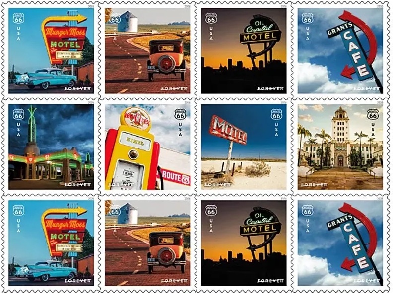
The 1835 “Moon Hoax” made ridiculous news stories credible. The USPS is issuing the 2026 Route 66 Centennial Stamp Collection. Highlights from the recent Sustainable Brands Conference. Researchers have created what might be the most accurate mathematical representation of color perception ever. When in North Dakota, visit the Theodore Roosevelt Presidential Library, which opens tomorrow, July 4. An Etsy gardening scam features AI-generated plant images and fake seeds.  Good grief: corneal tattooing is a thing. Graphene radar-absorbing coatings for defense use. If you missed Monday’s Strawberry Moon, more moons are coming. Answering the burning question: “do bug zappers still exist?” Turn any water bottle into a water vessel for dogs. Is there any advantage to “alkaline water”? Welcome to WhatTheyThink’s weekly miscellany. Read More
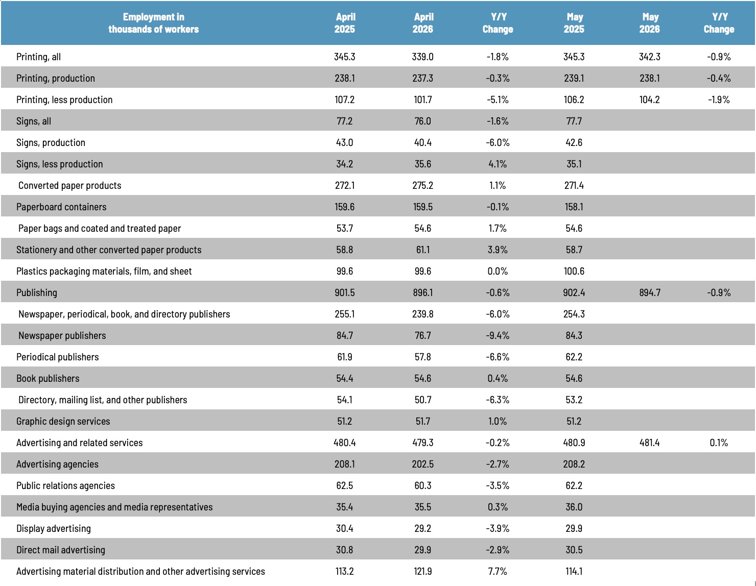
Graphic Arts Employment in May Up Overall—Substantially Among Non-Production

Graphic Arts Employment in May Up Overall—Substantially Among Non-Production

After a sluggish four months, the employment situation picked up in May, with overall printing industry employment up 1.0% from April, production employment up 0.3%, and non-production employment up 2.5%. Read More
Explore Mohawk's new paper options for all your digital printing needs

Explore Mohawk's new paper options for all your digital printing needs

Digital printing is the answer to the agility of modern work?ow. Mohawk Digital offers a diverse collection of fine and production papers for Inkjet, Dry Toner and HP Indigo presses. Read More

Around the Web: Of Botticelli and Beef

Around the Web: Of Botticelli and Beef

Newspaper Club has partnered with type foundry abcD8 to create a custom typeface inspired by the visual history of newspapers. MAD magazine has published its 600th issue. “Wordhord: Old English Word of the Day.” New evidence for the cause of death of the model for Botticelli’s “Birth of Venus.” Attending a Zoom meeting while on a roller coaster. Graphene-enabled PFAS-free firefighting foam. A jacket that can harvest moisture from the atmosphere. The iPhone’s Vehicle Motion Cues are surprisingly effective at reducing car sickness. An e-bike designed specifically to carry children. “Do fitness trackers still work if you have tattoos?” Rouser Lab’s “Earth’s black box” attempts to track humanity’s spiral into environmental destruction. “Beef tea” was a thing in the 19th century. Welcome to WhatTheyThink’s weekly miscellany. Read More