From very unfortunate translations to packaging filled with the wrong contents, there are some pretty hilarious packaging fails out there. (Someone needs to fire the copywriter who came up with “Frown is a four-letter word.”) Some of these fails could (and should) have been caught in the dielines. Others have failure points that might not have been obvious until assembly into full prototypes.
Despite the risk of packaging failures, not all customers are sold on the idea of prototyping, however. After all, it’s an additional expense (and “it’s never going to happen to me”). Why pay to create a full 3D prototype when you can just look carefully at the dieline, blank, or flat?
Here are eight examples why!
1. Who put that die-cut there?
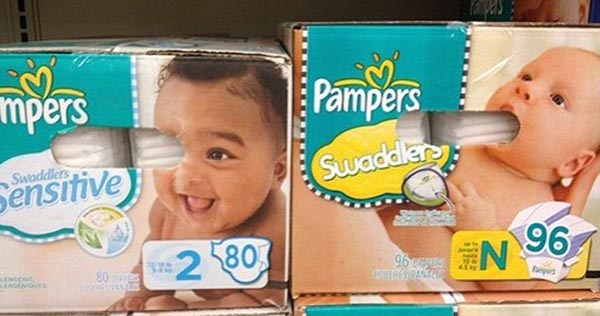
One fully assembled prototype could have made all the difference here. But, eh. That baby probably didn’t need that other eye anyway.
2. It didn’t look like that in Word!

Copy flows differently when it’s in layout, people.
3. Fanta failure.
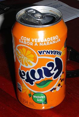
This is why we assemble the package exactly as designed. If that’s where the designer put it, that’s where it goes!
4. Closure calamity.
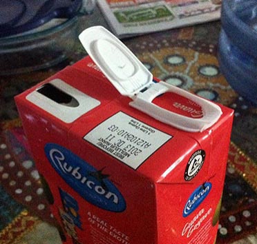
Just like printing presses, assembly lines place the packaging elements where you tell them to. Who was managing quality control on this one?
5. Sometimes you have to fill it to see it…
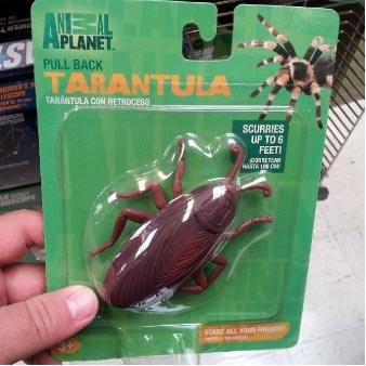
Do you think the bug was in the package when this one got approved? If so, someone needs to retake high school biology.
6. Product placement matters.
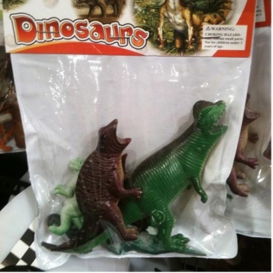
Sometimes it’s not the packaging that’s the problem. It’s the placement of the product inside. How those toys, cosmetics, or widgets fall within the package matter. Especially toys.
7. Font handling matters.

Kerning is too tight! Too tight!
8. Misplaced cut-outs
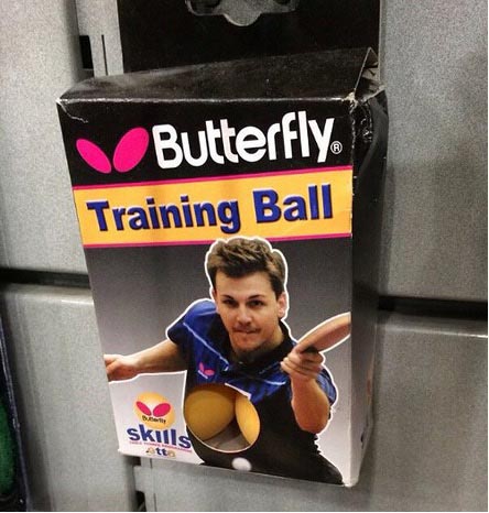
Another example of why, when producing a prototype, it’s important to evaluate it with the product inside!
In the printing industry, we understand the importance of prototypes. But especially for digital natives on the customer side, the importance of making the investment in time and expense to create physical prototypes may not be as obvious. So it’s good to have examples of packaging fails hanging around in case they are needed.


Discussion
By Joe Treacy on Jan 24, 2024
Great examples, Heidi. Truly amazing that these got through the normal client-side checkpoints.
Needless to say, the Butterfly Training Ball diecut reveal is especially unfortunate. Hilarious in this context, of course, but what an on-shelf disaster.
How could everyone along the design and approval process not anticipated that reveal appearance? I definitely would not have wanted to be the packaging designer or product developer involved.
It also highlights that if you’re a purchasing manager or in production/prepress at the printer and you see some kind of epic fail hit your desk or screen (and not necessarily as outrageous as the article’s examples), and your design client seems unaware, say something.
I try to foster really cooperative relationships with my graphic arts vendors. And just like one calling or emailing to say “you know, that UPC can’t go on the glue tab”, I’d certainly want to be told about design decisions like these.
Sometimes, working relationships are more important than just “putting it through” and “getting it done”.
I would like to know whether the “1 night stand” graphic had any effect on sales….
Joe Treacy
President and Director of Typography
Treacyfaces.com
By Patrick Henry on Jan 24, 2024
I'm cringing, even though I had nothing to do with any of these screw-ups. What a brilliant compilation. It ought to be part of the curriculum in every packaging design course now being taught!
By Heidi Tolliver-Walker on Jan 25, 2024
Thanks! What's really scary is that these are the ones I could actually show . . .
By jd Jones on Jan 29, 2024
The die cut of the buterfly ball is so funny.