We’ve all seen the data on customer experience (CX). CX these days is everything. Good CX = higher profits, stronger customer loyalty, and healthier bottom lines. Poor CX? Well, have you seen a Kmart around lately?
From that perspective, I’ve had two recent experiences (before the current shutdown) that were “eh” at best, where opportunity was clearly missed, and where QR codes could have prevented the bleeding (of customers, subscribers, engagements).
Do I hear a collective groan? “QR codes are dead! Why won’t she just let it go?” Because they aren’t dead. In fact, with the scanning capability now built into the cellphone browsers and with many situations remaining in which AR and NFC are just not (and probably never will be) practical, I’m seeing increased use of QR codes as businesses and organizations, especially nonprofits, begin to embrace the possibilities. I’m not saying QR codes should be used for everything, but there are plenty of opportunities when it would be foolish not to.
The first example comes from Goodwill Chesapeake’s launch of its new loyalty program. As the parents of teenagers, we are quite fond of the Goodwills around here, where lots of wealthy people like to discard their high-end brand clothing with the tags still on them. Goodwill Chesapeake launched the program earlier this month, and the literature promoting it was stacked at each register. As soon as I picked up the flyer, I groaned—something, as a marketer, you never want your audience to do. I had to register for the program online, and the URL looked like this: https://goodwillchesapeake.datacandyinfo.com/login.
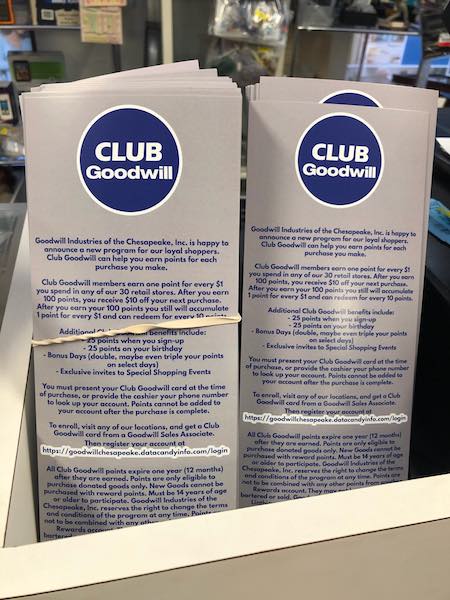
We know that when asking someone to register for a loyalty program, your best opportunity is right then. As soon as someone walks away (i.e., taking the flyer home to type the URL in at home), the chances that they will actually sign up drop precipitously. That’s why you want them to do it right there at the register. But who’s going to take the time to type all that in using their cellphones while standing in line at the Goodwill checkout?
Once customers leave the store, the risk of missing the opportunity entirely is high. That’s what happened with me initially. I didn’t want to hold up the line in the store, so I took the flyer to register at home. When I got home, I set the flyer on the counter, where it got buried under school calendars, catalogs, and who knows what else. I completely forgot about it until the next time I was in the store.
If Goodwill Chesapeake is wondering why response to its new loyalty program is so low, it might be how difficult the organization is making it to sign up for it.
I wonder what would have happened if they’d added a QR code with the caption: “Hold your phone’s camera over this code to be taken to the signup page”? Then trained the employees at the registers to guide people if they weren’t familiar with the process? All they had to do is what my husband and I did at the exit to the Beachmont Corn Maze last fall when we wanted people to take customer experience survey—just point to the code and tell them what to do. Nearly everyone we engaged scanned the code and took the survey (and was surprised how easy it was), and the maze had 23,000 visitors last year. We couldn’t engage with every one of them and direct them to the survey, but we captured a lot of them.
Granted, Goodwill had two other options it could have used other than a QR code: a .bitly link instead of the full URL and the hope that people would Google “sign up for Goodwill Chesapeake loyalty program” and get to it that way. But let’s be honest. With every extra step you ask people to take, you increase the chances that you will lose that engagement altogether.
The next was the fish caper. Individual fish fillets I had bought were vacuum-sealed, and the manufacturer had put on a tempting invitation to watch a video on the preparation of cilantro bacon lime mayo to go with the fish. Once again, all customers were provided was with a long string of letters that nobody wants to type in. By forcing people to type in this entire URL, with no other options, the manufacturer is setting up an artificial barrier to people responding, even if customers think cilantro bacon lime mayo sounds like a great idea.
Adding a QR code would have solved that problem. “Hold your phone’s camera over this code for 2–3 seconds to be automatically taken to the video.” This situation is a little less ideal than the Goodwill example since there wouldn’t be someone standing right there to help, but text on the package would have been more effective than nothing.
Are QR codes ugly? Maybe. Are they a waste of time? Maybe. But so is a marketing campaign that is too difficult and cumbersome to respond to.
That’s why it’s so important to ask the right questions. After all, you know there are members of two marketing teams out there right now scratching their heads, wondering why signups to the new loyalty program are so low or why no one is watching the cooking video.
- Is the messaging not compelling enough?
- Do people not like the details?
- Is it the wrong program?
- Are shoppers not interested in receiving recipes on their fish packaging?
- Do too few people like cilantro bacon lime mayo?
- Was the program a failure?
These are likely the wrong questions. Lack of response could be the result of something as simple as making responding too much of a pain in the butt.
Customer experience is everything. It’s critical to make things as easy as possible for people, and there is no reason to make it unnecessarily difficult. Maybe you hate QR codes and think they are a waste of time, but in these cases, not having one (or any other option) resulted in a very poor CX and missed opportunities for engagement or worse.










Discussion
Only verified members can comment.