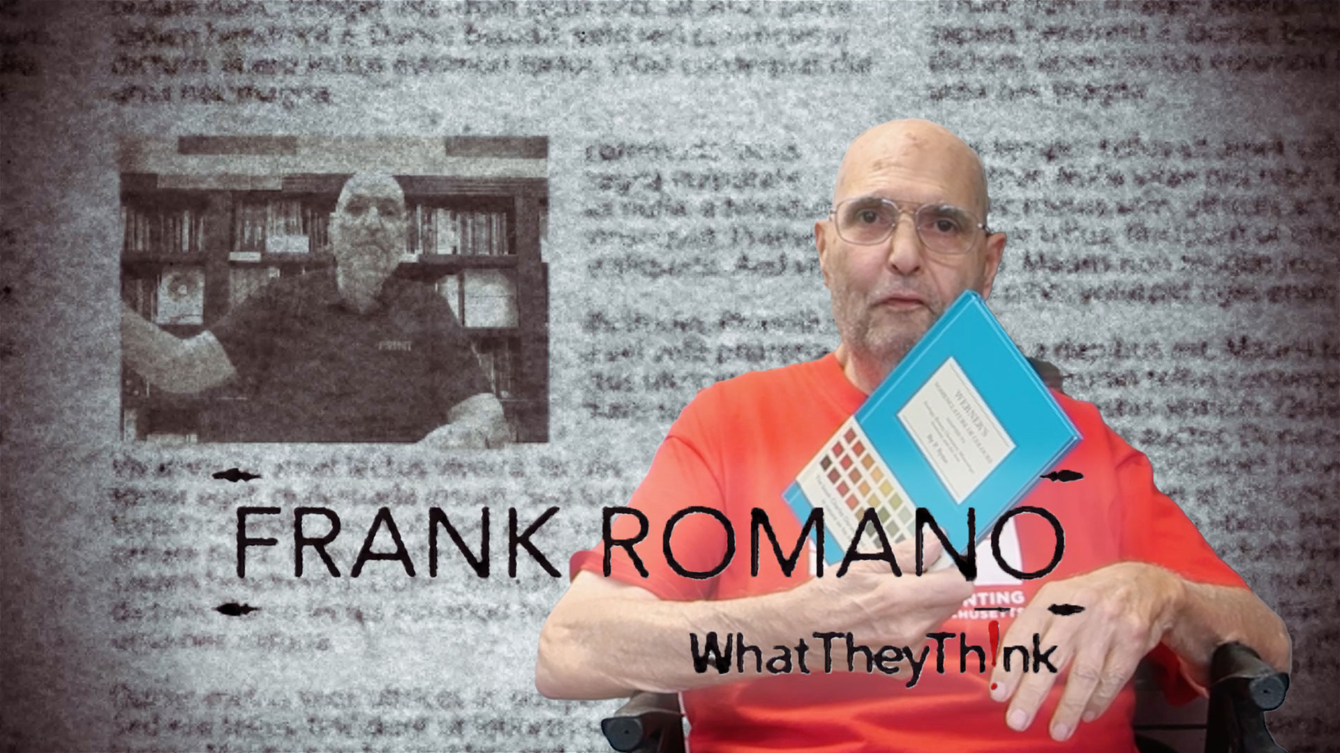
Hi, this is Frank Romano from WhatTheyThink.com. A little nostalgia today, if you will, for the way the world used to be.
To the days when I had hair…
I’ve been putting together a book on the history of the linotype company and collecting as much material as I could find about the company, so for instance, this is a book from 1913, I think this one is. And it deals with all the things that they did with the linotype, all the things that they invented. 1913, I’m correct. By the way, beautifully done. This was the transitional period, by the way. The linotype was introduced in 1886 –
I was a mop top lad then…
But it really didn’t go anywhere because most of the type was designed for newspapers and they didn’t really care that much about it. And as a result, typographically, the machine was not very astute. So commercial printers, book printers, didn’t use it. As time went on, the company realized there was money to be made in type and one of the most important people in the history of the company, Chauncey Griffith, who was one of their salesmen down south, wrote to the company and said that they were really doing a terrible job. So they brought him up north and said, okay, you’re in charge.
And so after 1913, a lot of what they did started to change. They promoted more; here is the promotion piece for Cloister. I mean, they produced the most beautiful material to show their new typefaces for the commercial marketplaces. Here’s another one. And by the way, this one shows you the use of borders that they had available as well. Here’s Granjon. Beautiful job. Monticello. This font was developed for Princeton for the production of the Jefferson papers. Scotch. Scotch is one of the oldest typefaces they had. Scotch goes back to the very beginning. And because it was around so long, they essentially – every character that you could think of was available in Scotch. So later on, as they developed Serif typefaces, what they did was they didn’t recreate every symbol in every font. So what they did was they substituted them out of Scotch. So if an order came in and you wanted a certain kind of dingbat, we would have to go to these big books in the Order Department and find out what font. And it was always Scotch’s that it was coming out of.
They did this wonderful book, they called it, Linotype Leadership, and they put in it a lot of the new products, the net attachments to the machines that they were developing. By the way, in the area of fonts, I should have mentioned to you they also did these wonderful little books. This is the Caledonia. Now this was Dwiggins redo of Scotch. Caledonia is the Latin word for Scotland, and Dwiggins designed a beautiful Serif typeface.
Electra, which was another Serif typeface, but beautifully done. And again, they tried to do a booklet to show you how it would look. They did – this is another 1913 publication. By the way, I love this – 28,000 machines in use around the world. By the time they stopped making the Linotype in 1972…
You guessed it, hippee hair…
There were 90,000 Linotypes that had been shipped. And the company sold you everything from oil cans to grease.
If you wanted to understand how fonts worked, they had a little booklet called useful metrics information. This was the first one they did. This was also 1913. Again, that was the turning point in the history of the company. They did lots of stuff that was utility, for instance, Researches in Readability, they did a lot of work to make sure their typefaces were very readable. They did testing on them and published all these little books that you could use.
These books got more expansive – this is an extension of that called, The Readability of Type, almost the same illustrations, by the way because in those days, you typed out manuscript copy and then had to mark it up. They taught you how to do copy fitting.
Stamps. One of the original merchantilers stamps. Here’s a cancelled version of it. And then the last one I think they did, 1996, there’s a – by the way it was 32 cents for a stamp in those days. Thirty-two cents.
I remember paying five cents…
By the way, I’ve collected just about anything you can imagine. I’ve collected the original Linofilm promotion that was their first photographic typesetting machine. The first booklet they did, The Big Scheme of Simple Operation, it explained how the Linotype worked because that was part of their mystique. And by the way, if you’ve ever seen one operate, it’s fascinating. We had a previous video, if you go back in the archives, there’s a video where we actually show one running.
This is the nameplate from one of the machines. This was a model 1442M, so this was a 7 inch wide machine. Most of them were 30m and they were five inches. And it says, “Originators and Improvers of the Linotype.”
Their competitors of course, Monotype did the Monotype Recorder. American Typefounders did a book here; this is one on typographic borders. But Linotype did probably the best job in promoting everything they did. After – when the Depression came, 1930, it all slowed down –
Parting hair off center was all the rage…
After World War II it picked up a little bit, but then the world was changing to photographic typesetting and there were more companies, so no one company could afford to do all this kind of stuff. So as time went on, this part of the world, it’s promotional base, went away. It’s kind of sad, but I’m trying to collect it all and keep it as a time capsule of the way things used to be.
Take care.
Next time…
Well, here we are, we’re at the print shop for the Mount Washington Hotel…

 Official camera partner of WhatTheyThink and the drupa daily.


Discussion
By James Sours on Dec 08, 2010
I actually have one of the 32 cent stamps framed on my bookshelf.
By Jim Hamilton on Dec 08, 2010
I have a pin that Linotype made of that same 32 cent stamp. I keep it in my office on display in a Hamilton type case along with other print industry knickknacks.
By Paul Cavanaugh on Dec 13, 2010
In 1978 at Canoga Park High School in CA we had a Linotype machine in our printing class. When you had hand set enough type to prove you were proficient in the use of a California Job case you were "promoted" to be able to use the Linotype machine.
I set the school newspaper each week with that machine. (Prior to that I was setting it by hand.) I think even today it is one of the most amazing pieces of printing equipment ever developed.