I read a lot of packaging trend reports and commentary. One thing is clear: many different packaging trends are happening at the moment; it all depends on the market and industry. What may work for health and beauty does not necessarily work for wine or clothing. The reason is simple: shopping experiences are complex, and retailers have begun to update their in-store experiences to better engage consumers.
Here are a few packaging trends being seen in various markets, and why each is unique.
Health & Beauty
Over the past year, Target has been updating and rebranding its beauty department to compete with higher-end retailers like Sephora. Only a few years ago Target was like any other box retailer, carrying Maybelline, L’Oréal, Revlon and other common brands. Experience a Target today, and it is a vastly different experience.
The beauty section of Target is now more extensive, there’s LED lighting on each shelf, and select products are displayed on tables rather than crammed into historically vertical spaces. This new approach has enabled Target to attract brands like Bliss, which also has new branding and updated packaging. I was in a Target recently when they were even sampling Bliss products (as well as others) and giving away samples.
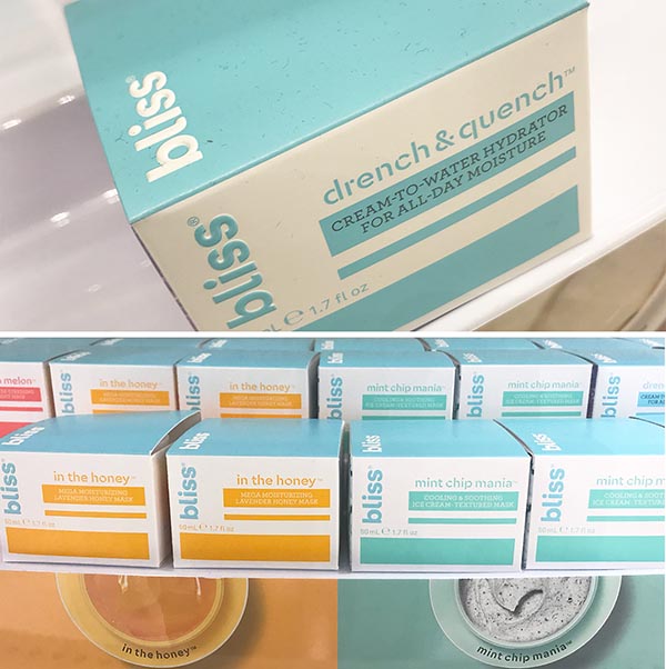
Today’s health and beauty market has shifted to new, more straightforward packaging, and Bliss’s rebranding is no exception. The Bliss blue is still apparent, as is the sans serif font, but now Bliss relies on color to draw the consumer’s attention. The bliss packaging is solid blue on the top, clearly identifying the Bliss brand. However, the front is color-coded to distinguish the various products. The Honey is a rich honeybee yellow, Mint Chip Mania is the color of tropical waters, and What A Melon is a watermelon red.
Brands pay a premium for end shelf space, and Bliss’s packaging and point displays quickly grab the consumer’s eye with its soothing and calming color palette – an adjective I would not normally use when shopping in Target on a Saturday afternoon. It stands out from afar; its contemporary design makes it distinct and easily recognizable; and any loyal Bliss enthusiast will know which merchandise to select based on the color.
People are busy, and whether it is in a retailer, specialty store or a restaurant, brands only have a few seconds to catch the eye of the consumer.
Beer, Wine, and Liquor
Craft beer, wine, and liquor are considered premium packaging, using specialty inks, embossing, UV coatings and, more recently, metallics. Brand names and labels have been vital in attracting and retaining customers. Popular wine names such as Layer Cake or Skinny Bitch have stood out in consumers’ minds for their name. However, looking for them solely on the label can be like looking for a needle in a haystack.
To stand out in a forest of brands with similar shapes and sizes, wine labels are now making use of metallics—a trend used by liquor companies for decades. Whether you’re at a bar, restaurant, or your dining room table, metallics catch your eye, even from a distance. The label sparkles and shines. Metallics make a consumer pause to query the brand. I recently observed a gentleman ask a bartender “What is that over there, the one with the metallic label?” It’s a great way to compete both on the shelf of a store and in restaurants.
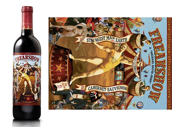
A label trend, seen explicitly in wine, is the visual shifting from a vertical label to a horizontal view. A restaurant or store would put wines in racks, with just the cork end facing out. Now high-end wine stores and restaurants line the wines up horizontally across a wall, showing the bottle and label. The change in orientation has turned the orientation of the labels, inviting designers to create a landscape label, or in the case of Freakshow wine, design for both directions.
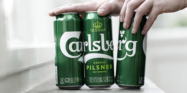
Carlsberg recently revamped its branding and packaging. The Danish beer company is adopting a Snap Pack, a technique where the bottles are stuck together. This replaces the ring packs that we know are ending up in the ocean and polluting the environment. Designed by UK-based Taxi Studio in collaboration with Tom Lane, their innovative approach reduces plastic packaging and allows Carlsberg to leverage the cans as a billboard. Like a puzzle, the three cans create a billboard effect on the shelf, highlighting the updated and recognizable logo. I foresee this approach expanding across the beverage aisle, to beauty and food products.
H2O
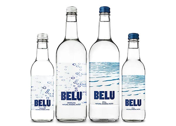
When it comes to the beverage industry, we typically think of plastic bottles or cans. Over the past couple of years, brands have begun using flexo printing to shrink-wrap labels over the entire can. But when the product is water, some brands are taking a different approach. Belu water created a business that makes money and considers its impact to our planet, something every company should have in their mission statement. Belu is a UK-based not-for-profit bottled water company. Their bottles use 40% recycled glass with a clear label. Depending on the design, the interior of the bottle label looks like ocean waves or bubbles. Coupled with its crystal-clear typography, Belu’s packaging has set itself apart with an engaging product. The foreground and background are playful, and the brand has made a name for itself marketing through hotel chains. By moving away from plastic packaging, Belu communicates both quality and moral value.
Apparel
When it comes to bricks-and-mortar retail, shelf space is costly, no matter what is being sold. This is especially true for clothing items displayed on tables. Consider intimate apparel; if you are shopping at Macy’s, Kohl’s, or Victoria’s Secret, there are often large tables of nicely folded panties for anyone to pick up and rummage through. These tables take up a lot of space, and store employees are continually rearranging and organizing items back to their uniform pattern, only to be messed up by the next customer.
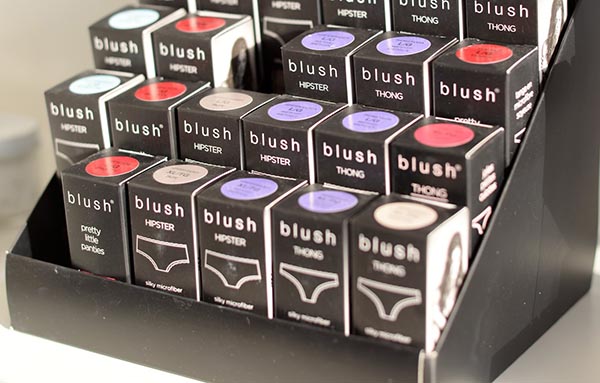
Blush lingerie has taken a distinct approach to display their underwear. Blush packages their panties into neat boxes that are color-coded. The items are placed on a tiered display that saves space and makes it straightforward for customers to identify the size, color, and cut. The packaging is considerably smaller than positioning the items on a table. This approach to apparel packaging allows Blush to extend its numerous cuts and colors to customers and maintain an orderly display. Store employees now have extra time to spend assisting the customer.
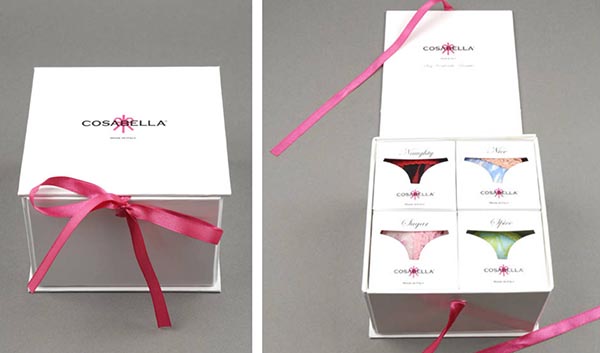
Cosabella creates packaged sets for customers. The heavyweight packaging contains smaller boxes that act like a matryoshcas, the Russian nesting dolls. I received them as a gift one holiday and it was engaging opening each one. The weight of the package gives the perception it is special and luxurious.
The packaging world is evolving across shape, form, and function. Agencies and designers have novel canvases to work with. Designers should not constrain themselves to matching older ideas or limit themselves to an industry standard way of thinking. Brands have story and mission; it is up to the creatives to visually communicate it. We are all consumers, including designers. It is time to look through the lens of the consumer and leverage those originative approaches for their next package or label.
This article was provided by Colorkarma. Colorkarma focuses on design for execution by bringing together unique perspectives on design and manufacturing to ensure a smooth execution on your creative vision the first time. Our mission is to be the leading resource for the creative community providing educational content, industry news, design tips, and best practice advice from industry leaders. More info at Colorkarma.com.

