(This article previously appeared on Inkjet Insight.)
Print quality is a big topic. So many things can affect final visual appearance: RIPs, print heads, pre-coating, inks, papers, speeds, dryer settings, and post-coatings, to name a few.
Comparing print quality between papers or even inkjet devices is often simply a visual process: laying out prints on a big table and organizing them from “best” to “worst” based on a subjective point of view. Varying vision deficiencies, room lighting and even wall color can affect your perception of the quality, clarity and color accuracy of the print. This may be OK as an initial step in your decision process, but it should never be the only one.
Judging quality based on perception alone can leave a lot of questions unanswered.
Two prints produced on the same device may look completely different based on the resolution and speed used. Some devices require a slower speed for proper drying on certain papers. Other devices reduce their process resolution when they speed up the device but running that device at a slower speed will provide a resolution increase. Same device, different result and different economics. The speed and resolution factors will effect color chroma and density, graininess, small text clarity, and line raggedness. Your visual acuity can’t tell you what settings were used to create the sample so you need to make sure that data on production settings is incorporated in the evaluation process for an “apples to apples” comparison.
Understanding a machine’s speed and resolution is imperative to understanding how the paper is reacting to the ink.
Some papers provide a more ink chemistry-compatible surface than others. Depending on the paper formation, fiber content, base paper chemistry, surface treatment, and calendering there will be differences in how an inkjet drop will stick, spread, wick, bridge, and dry resulting in a difference in print quality. It will also affect how much ink is needed to achieve the same results as compared to a different paper. Ink is like liquid gold—ink consumption should be one of the data points in your evaluation.
Inkjet beauty is not skin deep.
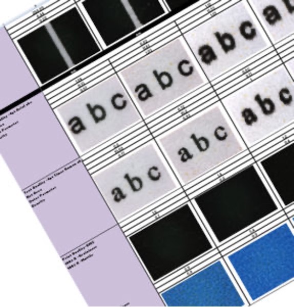
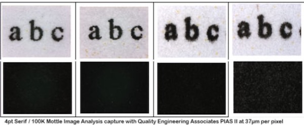
Inkjet beauty may be seen on the surface, but it’s not just skin deep. Stray drops, dot formation, wicking and other defects caused by print heads, ink volume, coatings, paper, or motion control can all cause a printed dot to look sharper or grainier. Taking a deeper dive into inkjet dots gives a clearer picture of achievable print quality.

How do you truly compare one print to another? By conducting an objective Print Quality Analysis.
Objective print quality analysis provides clear comparative data and removes all personal bias and visual subjective deficiencies when reviewing prints off competing inkjet devices. Objective data allows a clear determination of which device produces the best output for specific market needs. The initial comparative data gathered previous to purchasing can then be used as a benchmark for machine installation acceptance and long term data/performance tracking to highlight trends and identify failure points in your high speed inkjet process
It’s very difficult to resolve problems with a vendor if you don’t have specific data points. Conveying issues with “it’s not working like it used to” or “it’s not the same” creates longer technical assessment timelines and frustration for both you and your support team. It can also result in unnecessary down time and loss of revenue. Communicating objective data to your OEM will help identify the root cause of a problem faster.
When purchasing something that costs as much as a house, shouldn’t data always be the driver?
You can find multiple resources on Inkjet Insight where I provide more details on individual areas of print quality, why they are important, and how the measurements are captured. My goal is to give a step-by-step guide to developing objective measures of print quality. Search Inkjet Insight for topics such as optical density, chroma, color gamut, color space targets, dE to ISO, strike thru, mottle, graininess, line jaggedness, and small text clarity.


