Frank's Comic
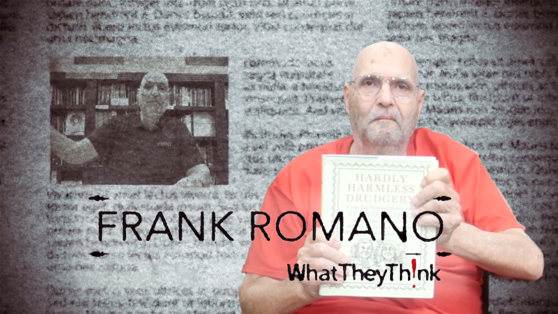
Frank talks about typeface jokes. Before there was Comic Sans, there was Souvenir, a typeface that Frank ridiculed for years. All of his Souvenir jokes are in “Types Best Remembered/Types Best Forgotten” (1993) by British typographer Robert Norton. Norton was the typographic advisor to Microsoft.
 Official camera partner of WhatTheyThink and the drupa daily. Video from drupa 2024
Video Center
- Questions to ask about inkjet for corrugated packaging
- Can Chinese OEMs challenge Western manufacturers?
- The #1 Question When Selling Inkjet
- Integrator perspective on Konica Minolta printheads
- Surfing the Waves of Inkjet
- Kyocera Nixka talks inkjet integration trends
- B2B Customer Tours
- Keeping Inkjet Tickled Pink
© 2024 WhatTheyThink. All Rights Reserved.


Discussion
By Joe Treacy on Dec 15, 2023
Frank, I used to look forward to every issue of TypeWorld. It was always jam-packed with interesting articles and lots of ads cataloging the modern advancement of the typesetting industry.
And it was always a treat to see how you’d skewer ITC Souvenir every issue with some zinger.
Except for probably some microscopic differences, the beautifully executed Ed Benguiat ITC redesign was nearly identical to the ATF original.
Looking back, it always seemed to me that it was the kind of squishy design of Souvenir’s lowercase g was what made it worthy of lampooning. The type family always deserved a stronger lowercase g.
The core problem was in how the g tail shaping was derived a little too much from Art Nouveau’s flowering plant tendrils, as one sees in Alphonse Mucha poster art.
Souvenir was always an interesting dichotomy for me, because in 1970s advertising, I had worked on food and ice cream accounts, and we’d found that ITC’s rerelease of ATF’s Souvenir was both extremely well drawn and a very timely release that helped describe “deliciousness” very well. It helped me sell a lot of ice cream in the first ice cream company account I designed for.
I think somewhat worse than ATF Souvenir and ITC Souvenir was Phil Martin’s Souvenir Gothic. That was basically a worthy and mostly successful design experiment in seeing what happens to Souvenir when you simply lop off its round, bracketed serifs.
Overall, like most of Phil Martin’s other progressive type design work, it seemed very useful. He actually did break with the ATF lowercase g and added a more “Helvetica-style” lowercase g, which proved that approach could work to help improve the original Souvenir concept.
But as with the problematic ATF Souvenir lowercase g, the Souvenir Gothic lowercase e was where the experiment fell short. It was a little too overstated in its righthand sharpness, and that prevented me from specifying it in my pre-Treacyfaces.com advertising design work.
(Lowercase e is often the most-used letter in composition, so it’s important that lowercase e design is superb.)
Equally fascinating was having the one-in—lifetime opportunity to attend the very sad to see ATF bankruptcy liquidation, and got to view ATF’s actual letterpress proof sheets for the final ATF Souvenir release.
In proof after proof, every weight presented it as one of those Morris Fuller Benton designs that has a kind of composed visual brilliance in all sizes that just seemed to leap off the page.
Joe Treacy
President & Director of Typography
Treacyfaces.com
By Dov Isaacs on Dec 16, 2023
Frank, exactly what was it (or is it) that you don't like about ITC Souvenir?
I used it in a number of projects back in the 1980s very successfully, especially when I was printing with 300dpi laser printers. I never got any negative feedback from recipients of my documents about use of that font family. To the contrary, I was often complimented about its readability in contrast to Helvetica, Times, and other ubiquitous font families of that time period.
- Dov
By Frank Cost on Jan 05, 2024
Dov, I think you may have just touched the third rail. I would run away fast, if I were you.
By Dov Isaacs on Jan 05, 2024
Frank Cost, Great to hear from you. I understand that you are now retired!!!!
WRT/ touching a “third rail” you must remember that my undergraduate degree is in electrical engineering. ?? I know how to handle power. I assume that you are implying that the “type” of passionate barbs back and forth pro-and-con with regards to various font families is really a “three ring circuits?”
- Dov
By Frank Cost on Jan 05, 2024
Hi Dov! Yes, joyfully retired! You remain one of the delightful memories of my professional years, along with the Souvenir mocker himself! In my years at RIT I learned not to mess with typefaces like Papyrus and Comic Sans for fear of persecution by angry mobs of graphic designers. (Souvenir had already been banished from polite society by Professor Romano before my time.) I’m happy to see you retain that lovely New York talent for comical wordplay!
Discussion
Only verified members can comment.