Graphic Designer Takes Viewers Back in Time in New Disney Movie
Press release from the issuing company
Irvine, Calif. – Spanning more than 50 years and two continents, Disney’s new motion picture, “Saving Mr. Banks,” paints a picture of the sharp contrast between 1960s Hollywood and rural, turn-of-the-century Australia.
The story of how the movie “Mary Poppins” was made stars Emma Thompson and Tom Hanks as author P.L. Travers and movie mogul Walt Disney, respectively, in a head-to-head duel over just how to deliver all the magic of “Mary Poppins” to movie viewers everywhere.
To set the stage for these two distinct eras, production designer Michael Corenblith called on Martin T. Charles of Santa Monica-based SagaBoy Productions. An award-winning graphic designer and member of the Academy of Motion Picture Arts and Sciences, Charles has been Hollywood’s go-to designer for many of the last decade’s most successful period pieces, including “42,” “Public Enemies,” “Miami Vice,” “Leatherheads,” “Seabiscuit” and “Charlie Wilson’s War.”
Additionally, he counts among his many credits high-profile projects ranging from HBO’s hit television series, “The Newsroom,” to blockbuster movies such as “The Avengers,” “AI: Artificial Intelligence,” “Minority Report,” “Be Cool,” “50 First Dates,” “Catch Me If You Can,” “Murder by Numbers,” “Stuart Little” and “That Thing You Do.”
“When a movie is set in the past, I always get a history lesson,” Charles said. “As a designer, it's a challenge to recreate the look and feel of the times through research. This time, we were talking about 1907 flashbacks from a 1960s storyline. What a diverse period!”
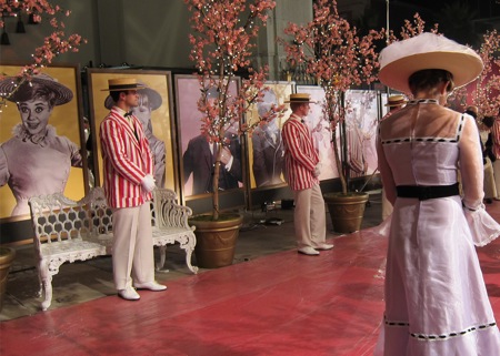
For the movie, Charles was asked to focus on two primary settings: Los Angeles International Airport in the 1960s and the Allora Fair, held in early 20th century Australia. He began the project approximately six weeks before production was scheduled and worked for a total of 14 weeks.
To recreate the movie’s larger-than-life venues, Charles worked primarily from old photographs to design more than 185 advertisements, signs and décor elements styled for the period. Starting with hand-drawn illustrations, he then digitized them and embellished the designs with Photoshop. Final prints were produced primarily on artist canvas using a pair of Roland large-format printers.
“For the fair scenes, we created dozens of enormous banners, some as long as 30 feet,” he said. “The airport graphics were equally imposing.” In total, more than 2,000 square feet of printed graphics were produced and installed to create the film’s vintage backdrops.
“Working on this scale can be tricky because you need to be mindful of registration issues as well as color consistency across the largest of prints,” Charles said. “However, the greatest challenge here was keeping in line with the established Disney Studios guidelines which can be quite detailed.”
Another challenge, he said, was recreating the hand-painted production methods of the times. “Interestingly, replicating someone’s hand renderings can be difficult in a digital workflow because the pigments and materials used in sign making decades ago were much more rugged,” he said. “To achieve an authentic look, we literally stomped on the prints to age them.”
Among the most complex graphics were the metallic accents used to decorate the bank and city hall sets. “It is interesting that so much fine gold was used architecturally years ago,” he said. Charles recreated the look using metallic ink which is featured in his Roland VersaCAMM VS series printer. According to Charles, advanced capabilities like this can make all the difference to the final product.
“Working with my Roland printers is like enjoying a perfect bottle of red wine,” he said. “You never want it to end! And when the producers and director compliment you on a job well done, you know you have done something right.”
- Questions to ask about inkjet for corrugated packaging
- Can Chinese OEMs challenge Western manufacturers?
- The #1 Question When Selling Inkjet
- Integrator perspective on Konica Minolta printheads
- Surfing the Waves of Inkjet
- Kyocera Nixka talks inkjet integration trends
- B2B Customer Tours
- Keeping Inkjet Tickled Pink
© 2024 WhatTheyThink. All Rights Reserved.

