PPC Announces Winners of the 2022 North American Paperboard Packaging Competition
Press release from the issuing company
SPRINGFIELD, Mass. — The Paperboard Packaging Council (PPC) has announced the top winners of its 79th annual North American Paperboard Packaging Competition. These folding cartons and rigid boxes represent some of the best paperboard packaging manufactured by North American converters over the past year.
Paperboard Package of the Year
Mentos
Submitted by Graphic Packaging International
The next time you snap open a new paperboard container of Mentos mints, congratulate Graphic Packaging International (GPI) and fellow consumers, food producers, and brand owners for driving this sustainable trend in packaging. GPI’s new Boardio canister design is the first product in the gum category from a major global confectioner to be delivered in a paperboard bottle. Converted using a customized paperboard laminate, the package consists of more than 90% renewable fibers from sustainably managed forests, replacing the previous 100% rigid plastic container.
Folding Carton of the Year
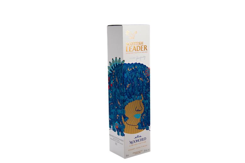
Scottish Leader Moonchild Whiskey Limited Edition
Submitted by the WestRock
For this one-of-a-kind offering, WestRock put South African musician Seneziwe Sanelly’s profile, her distinctive blue hair, and her natural sultry demeanor front and center on the package, while remaining true to Scottish Leader’s bold, premium image and distinctive assets, such as the eagle, gold tab, and font. Rather than requiring four separate hot foil passes, the design uses WestRock’s FoilKote, an inline alternative to foil stamping, which not only was a sustainable solution but saved time and costs. The pops of gold throughout the design, which emphasize the premium nature of the whisky, are printed on WestRock’s PrintKote 405gsm, a high-quality, coated, solid-bleached paperboard (SBS) that delivers exceptional printability and a market-leading stiffness-to-weight ratio.
Rigid Box of the Year
Red Bull Winter Edition
Submitted by the Taylor Box Company
For its 2021 winter edition package, Red Bull asked Taylor Box Company to design an eye-catching and functional design that would amp up marketing buzz. Swept away in bright pink frosty hues, the outer package encourages recipients to open the box and discover its surprise gift. As the cover is lifted on the inner box, four flaps drop down, revealing two cans of pomegranate-flavored Red Bull and two branded glasses nestled within the package while jagged mountain peaks form a wall. To provide durability, brightness, sustainability, and reliability, the Taylor team chose #95 C1S Text paper stock that was digitally printed with a gloss aqueous coating.
Sustainability Award of the Year
Paperboard Yogurt Container
Submitted by Huhtamaki
When Chobani and Cocojune selected Huhtamaki to produce renewably sourced paperboard yogurt containers rather than single-use plastic cups, they heard a resounding “Thank You” from consumers. Huhtamaki chose SBS coated paperboard because it was certified for product and hygiene management; it could keep the yogurt fresh; and it offered high strength at a lower basis weight, improving material efficiency and allowing for precision-formed small container shapes. Huhtamaki was even able to reduce a step in the converting process as well as collect and recycle waste from die cutting. The new yogurt container reduced plastic by 80% and featured high-quality graphics without the need for secondary labels or wraps.
Innovation Award of the Year
Take Smart Fridge Beer Pack
Submitted by Graphic Packaging International
When start-up firm Take and Go Comercio de Bebidas developed a mobile app to interact with special vending machine-style fridges that dispense six-packs of their beer, they needed new, innovative packaging. That’s where Graphic Packaging International (GPI) came to the table. The Take Smart Fridge Beer Pack is a six-bottle clip in which the bottle tops extend through the top of the package, allowing the smart fridge technology to read the bottle caps and charge the customer the correct amount. Glued sleeves slide down over the neck of each bottle with small tabs encircling the top holes. This prevents the bottles from sliding out of the clip, providing a safe and secure package that the customer can carry with confidence. The designers also included perforations on either side so that consumers can more easily remove one bottle at a time while retaining the structural integrity of the multipack.
Digital Application of the Year
Cinnamon Toast Crunch
Submitted by Tap Packaging + Design
It’s no wonder that this special limited-edition project, converted by Tap Packaging + Design for Cinnamon Toast Crunch, received the “gold medal.” The cereal brand chose five stand-out celebrities from all walks of life, including Olympic snowboarding gold medalist Chloe Kim, who became a “Cinnamoji” animated character. With a short run of only 10,000 boxes highlighting each celebrity, Tap used its HP digital press for speed and its capability to create accurate spot color reproduction with an extended gamut of CMYK + orange and violet. The result of a unique set of embossing or combo stamping/embossing dies, Kim’s box mimics the reflective nature of her snowboard goggle lenses, which was achieved utilizing a clear, neon holographic specialty foil that allows the printed graphics underneath to be visible.
Richard DePaul Award for Creative Design & Converting
Love Cube
Submitted by Graphic Packaging International
Every Valentine’s Day since 1991, White Castle has transformed its restaurants into fine dining establishments with host seating, tableside service, and festive decor. But when the pandemic closed dining rooms, White Castle wore its heart on its sleeve by partnering with Graphic Packaging International (GPI) to create the Love Cube and continue the tradition in a take-out-only environment. For over a year, the structural design team at GPI worked on a combination of three separate cartons: a base that holds eight sliders and two smaller cartons, attached to the sidewalls, that hold side dishes like fries or mozzarella sticks. They chose a 20pt Solid Bleached Sulfate (SBS) for brightness, smoothness, and high-quality print surface as well as an interior .5 mil poly coating to provide grease resistance.
Judges’ Award
Honey Wildflower
Submitted by TPC Printing and Packaging
When Honey Wildflower made its debut, Bath & Body Works knew they needed an outstanding box to set it apart from the competition. Who better than TPC Printing and Packaging to draw a consumer to a dazzling display of brightly colored wildflowers, ferns, and clover glowing in the bright summer sunshine? The field of honey wildflowers and leaves, printed on Clearwater .018 SBS for surface quality and brightness, is enhanced against the textured emboss pattern using a Scodix polymer application. Perfectly registered cold foil of the copper tones and leaf dropouts create a natural and appealing feel.
Judges’ Award
Greenleaf Home Fragrance Folding Cartons
Submitted by RRD Packaging Solutions
When RRD Packaging Solutions was chosen by the Grace Management Group to produce cartons for its popular Greenleaf candle and diffuser product lines, RRD delivered a richness and crisp color match by utilizing its HP digital press production line. Grace required print quantities up to 5,000 per SKU with approximately 10 to 12 SKUs per product line. After producing a variety of samples, RRD’s designers chose 20pt C1S Spectro board white for the best print and protection of the product. The glass and reed diffusers required special strong housing, along with a reinforced tuck flap on the bottom to protect the product. RRD’s folding and gluing equipment finished the print job in one pass.
Visit PPC’s website to see all of the winning entries and learn more about the North American Paperboard Packaging Competition.
© 2025 WhatTheyThink. All Rights Reserved.

