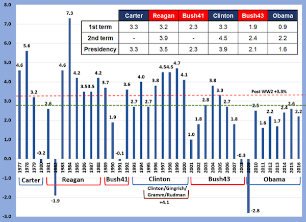
A new administration is in Washington, so we created a chart that looks back at general economic conditions of the prior six administrations.
It can offer some historical context and perspective about the task before the new one. Fourth quarter 2016 GDP is not available yet, so we used the latest Atlanta Fed's GDPNow to complete the calculation of the Obama years.
The red dotted line is the post-WW2 average real GDP (+3.3%), and the green dotted line is the average for the six administrations (+2.8%). One of the interesting periods in this chart is the first term of the Clinton administration. Its first half growth was not particularly notable, but after the power shift of the 1994 Congressional elections, a policy of pragmatism began with Speaker Gingrich and Senators Gramm and Rudman that included fiscal restraint, freer trade, capital gains tax rate cuts, and an overhaul of social transfer payments. That second half of the first term plus full second term had an average growth of +4.1%.
Not noted in the chart is the challenges faced by the Reagan administration, coping with high inflation from the Carter years, and the high interest rates of the aggressive inflation fighting by Fed Chair Volcker (probably the best of the Fed leaders in its history). The Trump administration will likely be judged for its economic policies based on its consistent ability to achieve growth levels unseen since the Reagan and Clinton years.