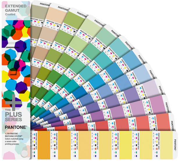
I was quite excited to learn about Pantone’s new Extended Color Gamut (ECG) guide. The PANTONE EXTENDED GAMUT Coated Guide, part of the PLUS Series, contain formulas for printing with a seven-color printing process. ECG, sometimes referred to as Fixed Color Palette Printing, has been gaining in popularity, especially in the packaging industry. The seven colors typically used are CMYK + Orange, Green and Violet or Blue. Pantone has chosen to formulate colors using CMYK+OVG. Combined with the PANTONE PLUS Formula Guides, this new guide is a tool that makes it easy for designers, printers and packaging converters to take advantage of the efficiencies offered by ECG printing of 1,729 PANTONE MATCHING SYSTEM colors.
Pantone GM/SVP Ron Potesky says, “Even though we have been known as a spot color system, we recognize that Extended Color Gamut printing is gaining increased acceptance due to the many aspects of this process that deliver time and cost savings. We know that brands and designers want to specify their brand colors using the Pantone language, and this is a great way for them to determine how best their brand colors can be produced. In terms of color integrity, we still feel that spot color is best, but ECG is a close second, with CMYK often delivering quite good results. For printers and packaging converters, these new formulations use the same 14 base ink colors that almost every printer always has on hand and that are aligned with standards coming out of industry associations, making it easy to adopt ECG with easily accessible ink products.”
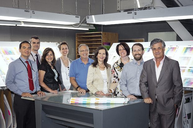
Andrew Partridge, DISC Graphics; Nik Blake, DISC Graphics; Lori Maisano, DISC Graphics; Michele Nicholson, PANTONE; Carmine Matarazzo, PANTONE; Margaret Krumholz, DISC Graphics; Molly Walsh, PANTONE; Jeff Hall, X-Rite; Don Sinkin, DISC Graphics
The Guide was beautifully printed by Disc Graphics of Long Island in partnership with Pantone and X-Rite. Disc President Margaret Krumholz explains, “Our business was founded in 1969 and the name comes from the term used to describe the label on a vinyl record, the original product we produced. Over the years we have evolved into a folding carton company, but still do a significant amount of business in the entertainment industry. We have had a great relationship with Pantone for more than two decades and were extremely honored to be approached by them to produce this important project. We couldn’t say yes fast enough!” Disc Graphics has about 200 employees, operates out of 160,000 square feet of manufacturing space in Hauppauge, NY, and generates $50 million in annual revenues. A Komori 40” 8-color press with two coaters was used in the production process. The Guides are aqueous coated.
Why Extended Color Gamut?
Krumholz states, “The EXTENDED GAMUT Guide is a very powerful tool. One of the reasons Pantone approached us is that we have been doing ECG print runs for several years. We are familiar with it and we do it to keep costs in line. One of the key advantages is that by using only seven ink colors, you can more easily combine multiple jobs, which is extremely important as quantities and turn times continue their downward trend. In that way, makeready costs can be shared across multiple clients and jobs, reducing the total cost for each. You never have to change out the inks on press!”
Prior to the availability of the new guide, Disc was using CMYK plus orange, green and reflex blue. “We found it relatively easy to replace blue with violet,” she says, “but for companies that are just getting started with the process, the guide will make it easy to transition from spot color printing to ECG. They now have access to color separations that can be built to a satisfactory delta E as compared to spot colors.”
Nik Blake, Disc’s Vice President of Operations, adds “ECG really increases efficiency, minimizing wash-ups and reducing the amount of ink inventory as well as eliminating the time associated with doing ink drawdowns and formulations. Basically, you are moving what was formerly done in the ink room into prepress. You use the same set of inks and anilox rollers all day long without having to swap anything out. In fact, there are so many benefits that we are better off financially, and so are our customers. Also important to note is that this is the first attempt to standardize how you would build each of these spot colors in the extended gamut world. We developed our own system, but another supplier may be doing something different. This is a way to standardize across the industry. Everyone can look at the same book to get a PMS 174 build, for example. There’s been nothing like this out there before. I think it is a game-changer for the industry.”
Blake adds one other important concept, saying, “When we think we can convert a specific brand color from spot to build, we have been running test patches on scrap areas of a sheet and submitting them for approval. Now the book does that for you so you don’t have to waste those resources.”
Preparing for the Project
Blake explains that the process of getting ready for production was thorough. “The X-Rite &Pantone team, including Carmine Matarazzo and Jeff Hall, visited us three times to prepare for production. Each time, we fingerprinted the press and printed test sheets. Jeff made adjustments to the color builds based on those test sheets to make matches as close to the PMS book as possible. Based on this work, we went to press for a 3-day production run. The job looks more complicated than it is, especially with the preparation we had. The finishing is actually more difficult, but luckily Pantone has a lot of experience with that.”
Krumholz adds, “When we were preparing for the three separate tests, we didn’t know what to expect. We are high-quality printers, but we had X-Rite &Pantone coming to our house! It was a bit intimidating. We were bracing ourselves for the worst. But it went spectacularly well. Everyone worked well together with mutual respect. The day we went live, we were still holding our breath. It’s kind of like having Frank Sinatra come to listen to your concert. But we didn’t have a single issue on press. It was a phenomenal experience.”
Behind the Scenes
In preparation for the launch of the new guide, X-Rite Solutions Architect Jeff Hall worked closely with Pantone behind the scenes to ensure all the elements were in place. He says, “Many of the printers I have worked with over the last several years have difficulty articulating what ECG is all about; everyone wants spot colors. Now they have the tools that will help them present the concept effectively. Everyone can understand the outcome early in the process instead of running a series of trials. It’s another form of communication that will be helpful in the sales process.”
In addition to testing formulations through the pre-production process with Disc Graphics, Hall has been busy ensuring that all of the ECG formulations are available in PantoneLIVE for use with PantoneLIVE Color Book and Viewer as well as ensuring that the libraries are included in Pantone Color Manager to enable designers to quickly and easily pull ECG color specifications into their designs and keep their Pantone libraries up to date. With the PantoneLIVE Color Book and Viewer, designers can have a direct connection between Illustrator and PantoneLIVE that allows the designer to not only pull in the colors from PantoneLIVE but use the Viewer to accurately portray them on screen. “Illustrator is fantastic for previewing CMYK images because it uses 4-color ICC profiles to render the intent on the screen,” Hall explains. “But it is less effective at previewing spot colors. The Viewer tool renders the intent of that spot color more closely to how it will be printed.”
Hall also points out that ECG in no way puts handcuffs on designers, saying, “They can design with as many spot colors as they want and specify those colors using ECG. Solutions like Esko’s Equinox can then be used at the premedia house to do separations to a digital standard and prepare the file to deliver the proper design intent.” Hall emphasizes that the EXTENDED GAMUT Guide is just that, a guide, not a standard. He says, “In the end, the digital color standard, such as those contained in the PantoneLIVE libraries, is always the central place for common communication. It is the DNA of the color. The book is the tactile reference that we use to talk about and be inspired by color, but it is always best to go back to the truth every time, which is the digital standard.”
The Future of ECG
“Some customers are very protective about their brand colors,” Krumholz comments. “Some larger companies engage a third party to ensure brand color integrity. But not everyone can afford that, and the new guide gives them a tool to understand how to get there. For anyone with a 7- or 8-color press, it’s a great solution. If it is a very long run on a special substrate, or if the job requires metallics or fluorescents, you may still need spot color. We are already building a number of our brand colors using the new guide,x and client response has been very positive.”
For Krumholz and her team, the key challenge is educating the design and brand owner community about the benefits. “If we can get designers to understand the concept and design to ECG from the inception, it will save brands significant money over the life of the brand. I think most printers understand the concept. The challenge still lies in educating the brands and designers. I can’t emphasize enough how honored we are to have been a part of this project and how excited we are for the industry and the benefits that will be reaped over time.”
Hall concludes, “The beauty of this whole thing is that every printer can use this as a guide to implementing ECG printing, regardless of the printing technology being used. With more 7-color digital presses coming to market, in addition to offset, flexo and gravure, printers now have the tools to pretty easily take advantage of the efficiencies of ECG printing as well as to explain the benefits to their customers. And the timing is great. Over the last several years, press, plate and anilox technologies have all come together to a point where we can do this well and do it consistently. It’s another step in Pantone’s strategy of providing communication tools that enable a printer to sell their printing processes better.”