- Generally speaking, warm colors are associated with energy, brightness, and action, while cool colors are seen as peaceful and calm.
- In addition to having some natural connotations, brown is often associated with ruggedness, stability, and seriousness.
- Explaining why this year’s color was chosen, Executive Director of the Pantone Color Institute Leatrice Eiseman stated, “Mocha Mousse expresses a level of thoughtful indulgence. It’s sophisticated and lush, yet at the same time an unpretentious classic.”
By Mark DiMattei
Introduction
At the end of every year, we’re flooded with all these different lists and wrap-ups: Spotify Wrapped, the Williams-Sonoma catalog, or (one my favorites) Drew Magary’s Hater’s Guide to The Williams-Sonoma Catalog. Not to be outdone, Pantone also releases its Color of the Year on an annual basis—and 2025 has been proclaimed the year of Mocha Mousse.
Pantone’s 2025 Color of the Year
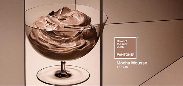
Source: Pantone
While this is fun and gives us something to talk about at parties, it’s also interesting to consider what Pantone’s choice can mean concerning our collective mindset and cultural outlook. While “Mocha Mousse” is a tasty dessert or a pretty name for a concealer/lipstick shade, Pantone is ultimately stating that the color for 2025 is…brown. It’s certainly an elegant and warm shade of brown, but it’s brown all the same. What does this say about us and the new year that’s just begun?
About Color Theory
A quick primer on color theory: We have our primary colors (red, yellow, blue), secondary colors that are created by combining primary colors (orange, green, purple), and then tertiary colors that are created by combining primary and secondary colors (e.g., red-orange, yellow-green, blue-violet). These can then be separated into warm colors (generally shades of red, orange, and yellow) and cool colors (blues, greens, and purples).
These colors are also sometimes referred to as “hues.” Beyond colors/hues, there are other words that often get used when talking about color theory. “Tint” implies that white is added to a hue, creating pastels or even hues that we’ve come to see as separate colors (like pink). “Shades” are made by adding black to a hue, which darkens the color. Using red as an example, adding black would create a hue we could call “burgundy” or “maroon.” “Tone” adds gray to a color, essentially reducing its saturation and intensity (changing a toned red into something we could name “brick”).
All of this can affect our perception of the color and create cultural touchstones that transform “color theory” into “color psychology.” Generally speaking, warm colors are associated with energy, brightness, and action, while cool colors are seen as peaceful and calm. Pale colors have a child-like, youthful quality to them. Darker tones might be dangerous, sinister, or serious. These associations may also change across cultural boundaries. While black is often associated with funerals and somberness in the West, mourners in many Eastern cultures wear white.
A Look Back
When the past three Colors of the Year were “Peach Fuzz,” “Viva Magenta,” and “Very Peri” (i.e., periwinkle blue-violet), what does it say about us when we learn that 2025 will be the year of brown? We first need to remember that each of these colors are announced during the prior year—giving our mindset for what we expect the coming year to hold.
Colors of the Year: 2019–2025

Source: Pantone
In addition to having some natural connotations, brown is often associated with ruggedness, stability, and seriousness. Considering our current sociopolitical atmosphere and concerns about climate change, it makes sense that Pantone would pick a more serious, conservative hue with subtle ties to the Earth for what it expects 2025 to be like. Even so, it’s important to note that Mocha Mousse is a warm tint of brown, which offers a sense of energy and hopefulness that 2025 might not be too bad.
Explaining why this year’s color was chosen, Executive Director of the Pantone Color Institute Leatrice Eiseman stated, “Mocha Mousse expresses a level of thoughtful indulgence. It’s sophisticated and lush, yet at the same time an unpretentious classic. Mocha Mousse extends our perceptions of the browns from being humble and grounded to embrace aspirational and luxe.” Perhaps this sense of luxury could scratch an itch for finery when many economists across the political spectrum are concerned about our economy with the looming threats of tariffs and general upheaval.
As alluded to before, Mocha Mousse is a striking difference compared to the Colors of the Year that precede it. 2024 was the year of Peach Fuzz, a pale yet fun hue of orange with a lot of warmth (suggesting happiness, enthusiasm, and a sense of optimism). Before that was a ruddy pink called Viva Magenta (suggesting sophistication, romance, and creativity) as well as Very Peri (associated with elegance, aspiration, and spirituality).
These colors seem to be bookended by the years close to the COVID-19 pandemic. 2021 was a schizoid year of Illuminating (a vibrant yellow that symbolizes cheer as much as caution). It provided a sharp contrast to 2000’s Ultimate Gray and 2019’s Classic Blue—colors that can symbolize practicality, sophistication, authority, and dependability.
The Bottom Line
Of course, we all know that color psychology is hardly an exact science. While there is validity to color therapy for some matters (mostly mental health and psychiatry), the jury is still out on how various hues can affect our physical selves. That said, Pantone’s Color of the Year can have a real effect on our lives. Exploring the launch page for Mocha Mousse, there is a list of artists and companies that are promoting the color in their work. You can purchase a Mocha Mousse Motorola Razr phone, furniture and fabrics, cashmere clothing, and even Post-It notes. These items will be sought out for their sense of luxury among the masses in the same way that design and print nerds might buy the limited-edition Mocha Mousse mug to add to their growing Color of the Year collection. It feels very much like Meryl Streep’s character in The Devil Wears Prada when a particular shade of blue trickles down from high fashion houses to the general public.
It'll be interesting to see how the color psychology and symbolism that Pantone has chosen for 2025 will reflect the year ahead. While there’s little doubt that we’ll see a return to conservatism and ruggedness, there’s hope that we’ll also have a year of stability, reliability, friendship, a return to nature, and a little of Eiseman’s thoughtful indulgence.
Mark DiMattei is the Manager for Keypoint Intelligence’s Publishing, Editing, and News group. He is responsible for editing all of the company’s deliverables for grammar and content, ensuring that all documents adhere to the company’s standards. He also assists in authoring reports and blogs on topics spanning the production printing and office document technology markets.

