By Dan Gillespie, Director of Technical Services, Alder Color Solutions
You’ve probably already heard that Adobe and Pantone have agreed to disagree. There’s a question of why (which I believe is probably money-related), but the bigger question is, What are you going to do when the Pantone libraries aren’t included in Adobe Creative Cloud apps anymore?
Many people and companies are freaking out about it, but it could be a blessing in disguise. Pantone has long been the de facto standard spot color matching system…but is it the best system? As a color consultant, I’m suggesting (stating) that there may be other/better ways for spot color matching, and now is the time for everyone to re-consider how they define, handle, and manage spot colors.
Issues with the Adobe and Pantone Separation
Most folks don’t realize that the Pantone libraries that have been included in the Adobe Creative Cloud apps for more than eight years now are much older versions than what is available today. For example, the Coated and Uncoated libraries were last revised by Pantone in September, 2019 (v4)—but these updated libraries were never included or updated within Adobe Creative Cloud apps.
Leading up to this parting, the two companies have been haggling over new licensing agreements for quite some time now. The bottom line is the Pantone libraries that Adobe customers have had access to for almost a decade are old and outdated and with this separation, your hand is being forced to decide what you’ll do moving forward.
Pantone’s Preferred Solution
Pantone is hoping that, with this parting, customers will choose to utilize the Pantone Connect platform. This platform allows users to “connect” to the Pantone Live cloud database where all Pantone color libraries can be accessed and is available as a plugin for Adobe Creative Cloud apps, a web application for web browser, and as an app for smartphones and devices.
Though the Pantone Connect platform may be one solution, an important question to consider is… Will you pay for this new platform, forever? The overall reviews of Pantone Connect are not positive, with many people frustrated and angry about having to now pay a subscription fee to Pantone—on top of their Adobe subscription—for something that used to be included. If you can get past the additional fee in order to access Pantone libraries, this might seem like an okay solution, but there’s still more to consider that I’d like to point out.
Matching (or Not Matching) Spot Colors with Digital Print
Pantone has many libraries available, but their Coated and Uncoated libraries are the most popular, so I’m going to focus on talking about these. The colors in the Coated and Uncoated libraries were originally created from inks for traditional printing presses, where you would mix up a can of ink to produce a specific spot color and pour it into the machine.
These days, more and more people are designing and producing products using digital printing machines. These machines come with fixed ink sets (CMYK, CMYKOR, CMYKOGV, etc.), which means you can’t just pour whatever color ink you want in them—or accurately reproduce any given color, at that. By using a digital printing machine, you are limited to printing only colors within the gamut that your specific printer can produce.
So, know this…unless you are printing on a traditional printing press and paying extra for every single spot color, you cannot match a large percentage of colors available in these Pantone libraries. This matching issue is the root cause of many expectation problems.
When designers/brands have access to these libraries, often products are designed utilizing those colors that may not be able to be produced. Many don’t realize that the particular printer, ink, and paper (substrate) combination being used to produce the final product is what actually dictates what colors can be matched. Shouldn’t you know this information upstream, so that you can choose only the colors you know can be achieved?
So, What’s the Solution? Defining Your Own Device-Dependent Libraries
The time is now to consider defining your own “device-dependent” libraries. There are several software tools available that enable companies to easily create and print their own fan guides–fan guides that are printed with the exact printer, ink, and substrate combination that your project will use. These fan guides provide you a visual reference where all the available colors are “in-gamut” and are achievable of being reproduced very closely.
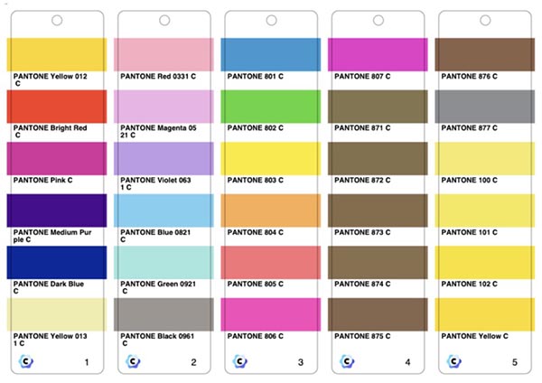
These device-dependent libraries can also be created digitally. The old and outdated Pantone (v3) libraries that are currently included with Adobe products are in the ACB (Adobe Color Book) format. Now, Adobe additionally supports ASE (Adobe Swatch Exchange) format for digital libraries, which broadens designing capabilities.
There are many software programs that allow you to export digital color libraries (also called “tables”) in the ASE format to use for accurate design. One popular software sold by Alder Color Solutions—Coraye—is a favorite for creating custom libraries. In one method, the software lets you create a chart of all your colors, which you then print (or have printed by your provider) and measure the values with a supported spectrophotometer (color measurement device). These measured colors are then used to build your custom library. Another software favorite, ChromaChecker, can predict the Lab values from any ICC output profile to build custom libraries, as well. Either of these methods work well and enable you or your print provider to create libraries of colors that are all “in-gamut” for that particular printer, ink, and paper combination.
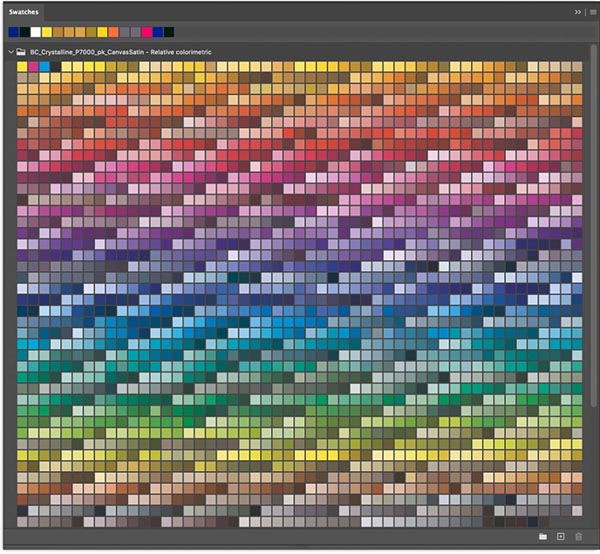
Because ASE is a proprietary file format, it’s only suitable for Adobe applications. There is an international standard (ISO) format for spot colors called CxF (Color Exchange Format). This is the format that is most widely supported. So, you may need to export ASE libraries for creatives to use in their design software, but you may also need CxF files to import into your RIP (Raster Image Processor) or DFE (Digital Front End). QTX is another popular format for spot color definitions, but it’s proprietary to Datacolor products.
If the process of creating your own custom color libraries seems too complicated, Alder Color Solutions also offers this service for a reasonable price. When you purchase a Custom Spot Color Table with myself or through our website, we’ll take your uploaded media profiles and convert spot colors into gamut in in both .CxF and .ASE formats.
In Summary
With all this said, there is a better way to define, manage, and QC spot colors. Hopefully you will take this opportunity to re-evaluate how well your current/legacy way of handling spot colors really works for you. Should you need any help, we’ve got a wealth of knowledge and the best products on the planet to offer you.
Learn more about the software you can purchase to do this yourself here:
Coraye - https://aldertech.com/product/coraye/
ChromaChecker - https://aldertech.com/services/alder-color-control-platform/
For us to do the work for you, visit: https://aldertech.com/product/spot-color-tables








Discussion
By Eddy Hagen on Feb 24, 2022
I 100% agree that it's a blessing in disguise. There are too many issues with Pantone guides, also rather high deviations between individual copies of the printed color guides (more on that: https://www.insights4print.ceo/2018/11/your-color-guide-and-you-first-results/).
A 'standard' or a 'reference' should be rock solid; color definitions - especially brand color definitions - shouldn't fluctuate, change over time.
If designers, brand owners don't want to create the full libraries you suggest, there is this easy option: just measure the color(s) you like and create color patches in one of the Adobe Creative Cloud applications, based on the measured Lab values, export those patches as ASE files and share these with everyone involved in design and print production. To avoid possible confusion, you might want to name the MyBrandColor 1, MyBrandColor 2, ... And being Lab values, the RIP will make a perfect color conversion.
(more on that: https://www.insights4print.ceo/2022/01/the-adobe-pantone-breakup-how-brand-owners-designers-should-deal-with-it/)
By Michael Jahn on Feb 24, 2022
Hi Dan, Great article ! So, here is what happens often - lets say we have a 'corporate' color - like Pantone 151 ( https://www.pantone.com/connect/151-C ) - ( oh, I shared that link because, if you notice - suddenly - the Color Data - sRGB, L*a*b*, CMYK, Hex and even the Pantone guide book page is now BLURRED - so, you can't snag that and enter that for free anymore - but I DIGRESS )
But, assume I am a university in-plant printer, with offset, digital and wide format printers. While i "know" I can "match" that color within a few ( acceptable ) deltaEs in offset ( as I am cheating, and mixing the ink and printing that as a spot ) - what is the strategy for building the color in Adobe InDesign for the several different digital press device they might have ( think HP Indigo, Konika- Minolta, Canon, Xeikon, etc..) ?
Do we begin creating the custom Spot color swatch library L*a*b* as the color mode within the .ASE file, and let each DFE or RIP do its best to simulate that Pantone 150 ? Or do we simply send some CMYK values - so, all devices simulate the Pantone 150 color "so they look the same ?
By Marcus Brune on Feb 25, 2022
Nice read!
This topic is getting more and more hot for all printing companies and design agencies.
We at CGS ORIS deliver software solutions, that will help all involved printers and designers to create and communicate spot colors. From the printing side this would be the creation of CxF-files and for designers the ASE-format for the layout software as Adobe products.
For us it´s important to have a consistent workflow and communication of colors/ spotcolors from creation to print.
By Dan Gillespie on Feb 25, 2022
Glad you agree, Eddy. And thanks for sharing your article links, as well.
Michael, thank you for the compliment , my (real) friend. To answer your question, it could be done several ways. Designers could use L*a*b* values and build files using spot colors - the RIP/DFE would the convert them to device dependent CMYK values based on the output profile automatically. They could also generate the ASE library with CMYK values - in this case they would build files as process color, not spot. Eventually, we can/will be defining spot colors with a full characterization spectral curve - that would have all tonality and transparency information - but this would require the RIP/DFE have a spectral blending engine that could interpret these definitions properly.
Marcus, thank you for commenting. CGS makes a great piece of software called CxF Toolbox which lets you define CxF (even full characterization with 11 measurements over what and 11 over black). It also let's you swap Lab solid spot colors with the spectral definitions and export in a PDF - which Adobe apps don't support.
One other thing I wanted to add/clarify, Coraye software can also can predict the Lab values from any ICC output profile to build custom libraries
Discussion
Only verified members can comment.