Stork Boosts Baking Heritage with Design Refresh by Sun Branding.
Press release from the issuing company
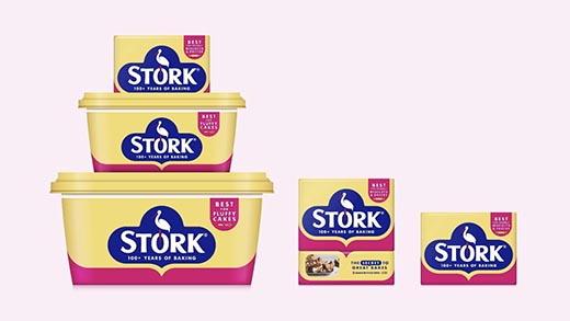
Stork, a cherished home baking brand since 1920, turned to creative brand packaging agency Sun Branding to enhance and refresh its heritage appeal. The design challenge was to honour Stork's visual legacy, connect with a new generation of home-bakers and be reassuringly recognisable to loyal consumers.
In a competitive baking category where private label is prominent, authentic heritage brands like Stork must convey confidence and a compelling reason to believe at the point of purchase.
“We brought much-needed love to the brand by refining the iconic Stork logo, promoting it to centre stage and by giving it the space it deserves. During our exploration of heritage messages, the phrase "100+ years of baking" emerged as the most compelling to consumers. While polka dots can bring to mind a sense of nostalgia and playfulness, they also run the risk of seeming outdated or childish in today's modern design codes. As brand-blocking has become prevalent in the spreads aisle, with private label imitating the yellow and pink palette, we strategically developed a distinct and clean design, utilising Stork's rich heritage colours to achieve maximum impact and standout " shared Si Inman, Creative Director at Sun Branding.
"Stork has long been recognised as a people's brand, and we committed to evolve the brand while honouring its deep-rooted history, notably The Stork Cookery Service of the 1940s. This community initiative provided advice to households on how to provide meals despite rationing restrictions," revealed Ross Gray, Senior Designer at Sun Branding.
Sun Branding's creative team developed a simple and confident visual language, such as the pink-line-device, which evolved from the idea of "baking memories", the shape inspired by a timeline of memorable moments created through generations of baking with Stork. We combined heritage, with the Stork bakers of today, featuring real bakes made by star 'Stork-ers' on the side of packs, helping to connect with Stork's growing insta community #bakewithstork.
'The new refreshed design is instantly recognisable as Stork because it elevates the unique assets that make Stork so distinctive. I love how the tub and block play together, the range is more connected and considered, even down to the SRP tray, which the Sun team pro-actively added to the brief, ensuring greater appeal in store. It's new and modern in the right way, and we think long-term Stork-ers will agree.
We kept the brief relatively open, to allow the designers creative freedom to solve our challenge. The Sun creative team responded with initial concepts which challenged us in the right way, and enabled the Stork team to focus on what we wanted to achieve, Sun listened, and developed the designs further to absolutely nail it. They were collaborative and a pleasure to work with. Their way of working made our lives so much easier and the refreshed Stork packaging speaks boldly for itself.' Julie Dang, Junior Brand Manager, Stork
You can see Stork's new look brand and packaging in stores from this week.


![]()
- Kyocera Nixka talks inkjet integration trends
- B2B Customer Tours
- Keeping Inkjet Tickled Pink
- Don’t let the samples fool you
- Global Graphics Integration Story
- Unintended Consequences: AI and the Impact on Sustainability
- Inkjet Integration with Kodak Continuous Inkjet Printheads
- What You Don’t Know About Print Volumes and Inkjet
© 2024 WhatTheyThink. All Rights Reserved.
Discussion
Join the discussion Sign In or Become a Member, doing so is simple and free