By APTEC, HK
In the print production process, discrepancies between “design color” and “print color” often trouble the industry. It is common to encounter situations where the colors in a design do not match the printed output or fail to meet the expectations of designers. Additionally, colors in printed materials may not appear the same as those displayed on the designer's monitor. A primary reason for this discrepancy is miscommunication between the designer and the printing company; both parties lack a common “color language.” The introduction of CTV (Color Tone Value) offers a promising solution for accurate color transmission.
To address the critical issue of “miscommunication regarding color language,” it is essential to comprehend color communication throughout the prepress, design, and printing stages.
- Color tone is defined using a linear method within the design file: The software establishes a linear dot percentage (e.g., 50% cyan dot) and simultaneously uses an ICC profile to calculate LAB values. Therefore, a designer’s understanding dictates that 50% of the color correlates to 50% of the color tone, and all color tones in prepress are generated using this “linear” approach.
- Printed color tone is based on “physical phenomena”: In the printing press, ink is transferred from the printing plate to the blanket and then from the blanket to the paper. During this process, the dot gets squashed, increasing the physical diameter of the printed dot. Factors such as ink, fountain solution, blanket, pressure, and the speed at which the press operates contribute to dot gain. Consequently, the original 50% dot in the file will result in a print dot that exceeds 50%. Another term for dot gain is TVI (tone value increase), which can vary across colors; different CMYK colors may experience slightly different dot gains. However, connecting dot gain or TVI to the designer’s linear dot concept can be challenging.
The terms “design with color values” vs. “printing with dots” represent entirely different languages and concepts, leading to unavoidable discrepancies. CTV provides a linear approach and a calibration method based on colorimetric data calculations. Unlike traditional method that calculate TVI solely based on dot area or density, CTV directly measures Lab/XYZ chromatic values from print sheets and calculates the corresponding color tone values. This methodology ensures that a “50% tone” in the design file matches the appearance of “50% tone” in the final print. Consequently, CTV establishes consistency and a “common language” for color communication.
Enabling CTV for Seamless Color Communication
Achieving consistency between design colors and print colors requires effective communication and application spanning from design to printing.
Design serves as the foundation for printing. Thus, it is crucial to implement correct color settings and separation settings within design software. Creating a file compliant with CTV can help avoid color inconsistencies. The objective of the color settings in the software is to maintain consistency across various applications (such as Illustrator, Photoshop, InDesign) and devices (e.g., the designer's computer, proofing machine), thereby preventing color deviations that arise from differences in device color gamuts.
To enhance color accuracy, correct color setting and ICC profiles must be incorporated into the design file. These profiles capture the color characteristics of devices, enabling precise color conversion that ensure accurate previews and predictions of final print colors. Color settings should encompass the configuration of appropriate ICC profiles for RGB, CMYK, grayscale, and spot colors.
Understand Four Working Spaces (Color Gamut) in Color Settings:
- RGB:
- Generally, use Adobe RGB 1998 or eciRGB; avoid using the monitor's color gamut.
- CMYK:
- Use industry-standard ICC profiles based on CTV, such as those generated by Advanced Printing Technology Centre (APTEC) for CCNB, coated paper, coated white board, etc., instead of the software's default “Generic CMYK.”
- Grayscale:
- Use ICC profiles based on CTV, such as those generated by APTEC for CCNB, coated paper, coated white board, etc.
- Spot:
- Utilize either linear settings or ICC profiles based on CTV.
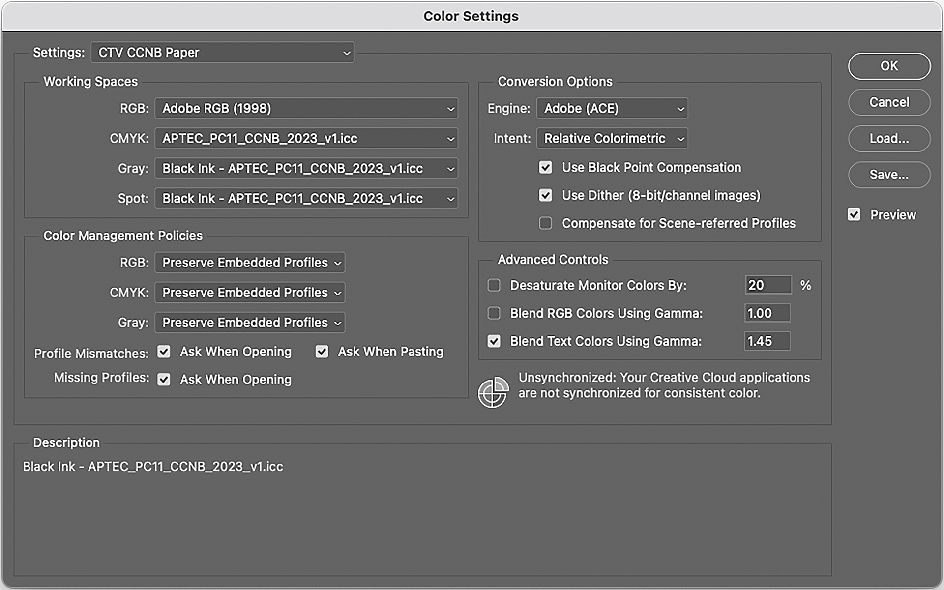
Color Settings in Photoshop
Understand Separation Settings
To facilitate printing, designers must convert design files to CMYK within the software. Currently, color separation is primarily executed through software employing ICC profiles.
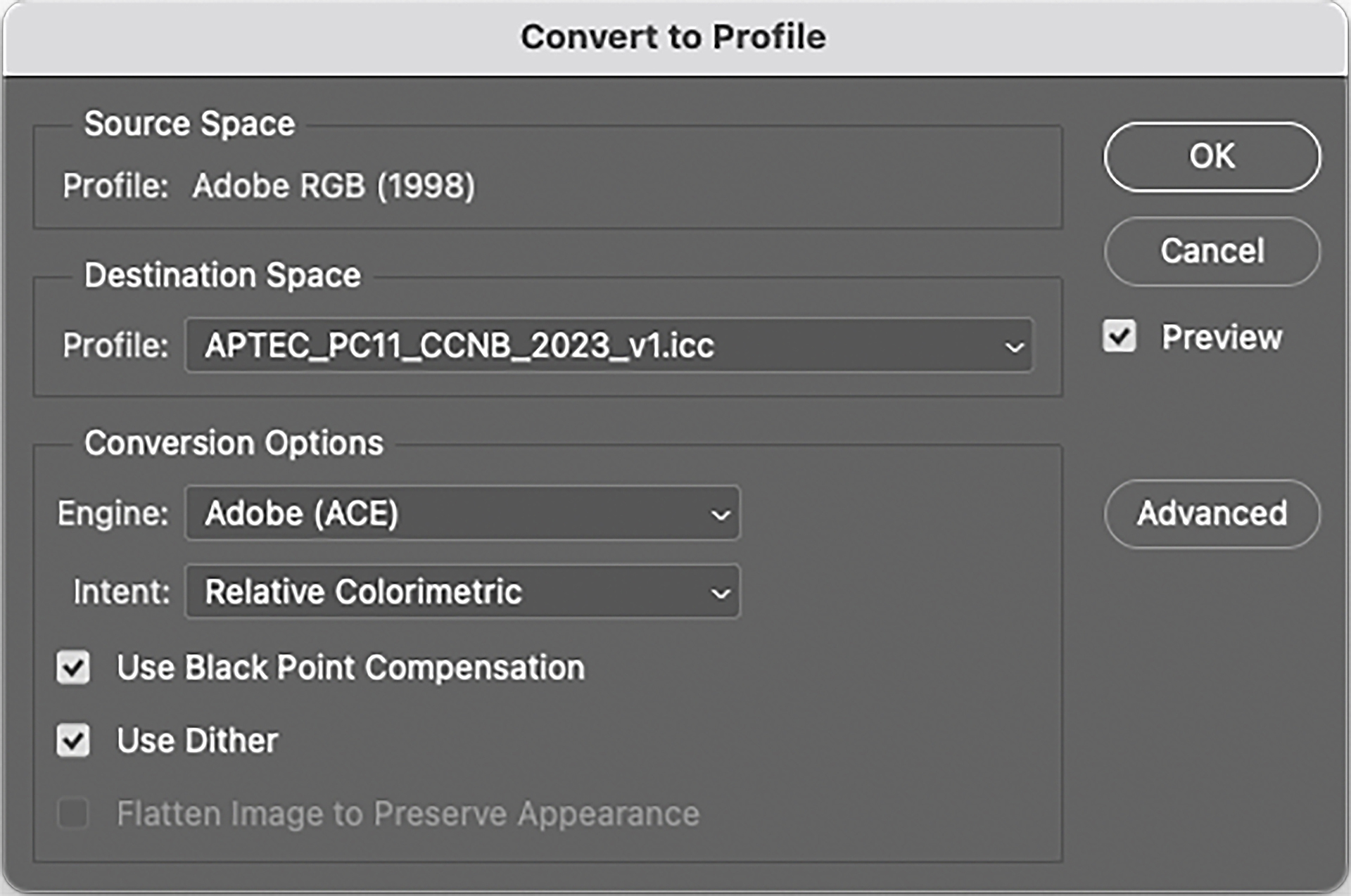
Separation Settings in Photoshop
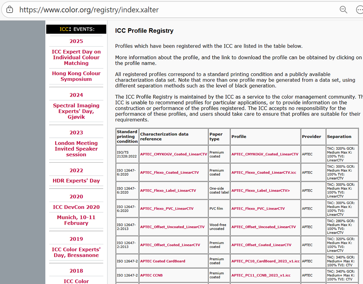
APTEC has developed eight sets of ICC profiles for offset and flexographic printing across different substrates using CTV, which have been made available on the ICC website. For details, please refer to: https://www.color.org/registry/index.xalter.
- Offset: coated paper, uncoated paper, CCNB, coated white board, multi-color (7C)
- Flexography: coated paper, adhesive sticker, PVC
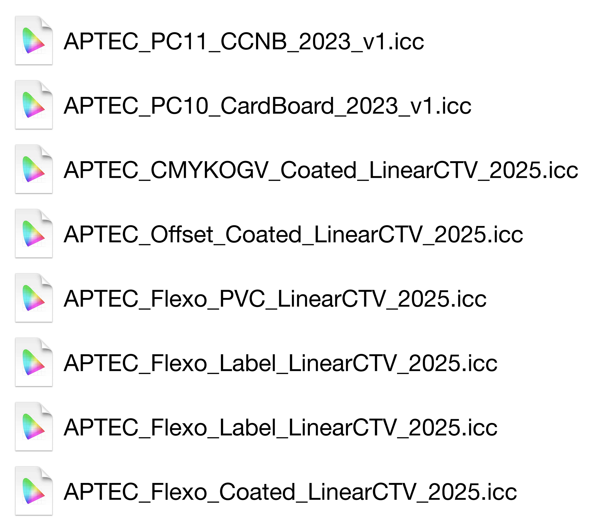
APTEC’s ICC profiles by using CTV
Implementing CTV Calibration in Print Production
To guarantee seamless communication and color consistency between design and printing, it is vital to fully integrate the CTV calibration method into the printing process.
Prior to production, verify that the correct ICC profile is employed during the design stage. To facilitate effective color communication, it is imperative to utilise CTV's ICC profile and CTV calibration during printing, covering both 4C and spot colors. If alternative calibration methods are used, color deviations and inconsistencies will likely occur.
During print production, a spectrodensitometer should be employed in CTV mode to measure the print dot with the relevant tone value, ensuring that the tonal range meets client requirements and falls within tolerance.
Conclusion
Achieving accurate color reproduction in printing goes beyond merely “design focusing on design” or “printing focusing on calibration.” It constitutes a comprehensive process involving “design—communication—printing.”
The key lies in establishing a “common language.” CTV fundamentally standardizes color language, promoting clear and precise communication between prepress and printing (e.g., linear 50=50). This ensures that the colors in the final printed product align with design expectations.
To know more about the application of CTV, please contact APTEC at [email protected] or visit www.ctv-aptec.org.