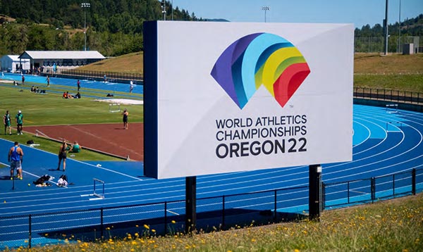
The winner of this year’s FASTSIGNS/Wide Format & Signage Project of the Year is FASTSIGNS Eugene (Ore.), whose work for the World Track and Field Championships went the distance in the eyes of the judges.
This was the first time that the World Track and Field Championships were held in the U.S.—at Hayward Field in Eugene, Ore., July 15–24, 2022—and, as a result, the Oregon 22 organization was seeking to make a major statement with the graphics for the event.
There was also a time crunch—all materials needed to be installed within a seven-day window and removed within a five-day window.
Adding to FASTSIGNS Eugene’s challenges were the high sustainability requirements for all the materials used for the graphics: they had to be either re-sellable, re-usable or recyclable.
FASTSIGNS Eugene owner Peter Knight-Sheen is a U.S. Army veteran and, like many FASTSIGNS franchise owners, comes from outside the sign and graphics industry.
In 2016, he was running a staffing business in San Antonio, Tex., which he sold and then bought FASTSIGNS Eugene in November 2016. The center had been doing well—and then COVID hit, which actually had an inadvertent benefit.
The event was supposed to be held in 2021, but the pandemic delayed it. The Championships, postponed to 2022, bought Knight-Sheen and his team some extra time to expand the FASTSIGNS facility.
“Whether luck or divine intervention, the way this whole thing came together was unbelievable,” he said. “There’s no way we could have pulled it off in 2021.”
Staff turned over during COVID, and in 2021 the center moved to a new 8,500 square foot facility, an upgrade from the previous location’s 1,800 square feet. They acquired a flatbed printer, a Colex cutting table and a bucket truck.
“Had we not done that, we would not have been able to do most of this stuff,” said Knight-Sheen.
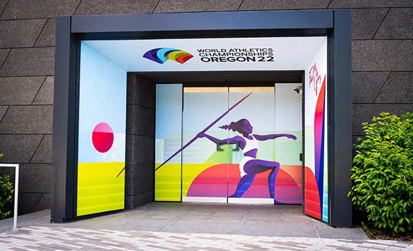
Door/window graphics and fabric wrap for Hayward Field vestibule.
Helping the process was AHM Brands, a design company that Oregon 22 hired to do all the design work. As it happened, FASTSIGNS Eugene had been working with AHM on other projects, so they had a working relationship that helped pull the project off.
Knight-Sheen estimates that they produced thousands of different signs for the event—banners (including more than 500 pole banners), window graphics, vehicle graphics, a 30-ft. scoreboard wrap and plywood wayfinding signage. There were also graphics for local hotels and the airport, the latter of which comprised an 8- by 10-foot Falconboard “selfie” backdrop.
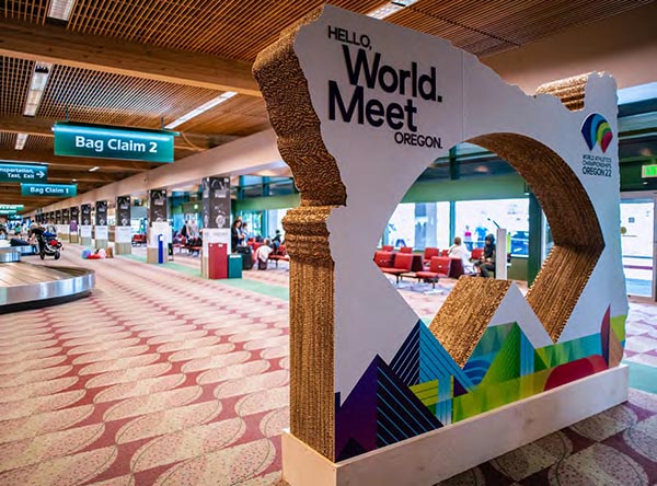
Falconboard “selfie” backdrop at the Eugene Airport.
Another unique component was a 60-foot long by 12-foot high “pallet wall” for the athletes' village, which FASTSIGNS had to design and construct by themselves—a curve to the wall added to the structural challenges.
How do you keep it from falling over? Ultimately, they had to use sandbags to keep it stable. The pallet wall was completely disassembled and used again.
“Pallet wall” installed at the athlete’s village.
The event organizers had a commitment that materials used would comprise at least 30% renewables, and the event met that goal. FASTSIGNS helped with this goal as well. FASTSIGNS Eugene worked with a Eugene-based organization called BRING, the executive director of which was the sustainability coordinator for Oregon 22.
Knight-Sheen and his team are hoping to do more events like this, especially as the high visibility and success of the project was a great boost for FASTSIGNS Eugene’s reputation and has led to an influx of business.
“We’re now the go-to and have a reputation for figuring stuff out and making stuff happen,” said Knight-Sheen.
First Runner Up
The first runner-up in this year’s FASTSIGNS Project-of-the-Year is FASTSIGNS of Syracuse (N.Y.) that won for work done for Gilbane Development/The Laurel, a student housing community in Syracuse.
The space was a historic building that had been renovated, and they wanted new graphics to liven up the space, as well as to appeal to Syracuse University students looking for housing.
This project mainly focused on the client’s leasing office in a different location with the goal of filling tenant spaces in a large multi-story building being constructed in the city.
FASTSIGNS of Syracuse designed and installed full-cover wall graphics that transformed the space into a branded location for The Laurel, including a greenery wall and neon-style signage.
To give some of the wall applications texture, the team used PVC with backer pieces to make graphics appear as if they were floating on the wall.
The project greatly enhanced the space, and increased traffic to their location.
Second Runner Up
Coming in third was FASTSIGNS of Lakewood (Colo.) for their rebranding project for Terumo Blood and Cell Technologies, a “global leader in blood component, therapeutic apheresis and cellular technologies.”
Rick Abercrombie, owner of FASTSIGNS Lakewood, has had a long, on-going relationship with Terumo.
“They've been one of our clients since I started back in the early 2000s at a smaller scale,” he said.
When Terumo moved to the Lakewood area, “it was a natural fit when time came for them to entertain this rebrand in updating their campus.”
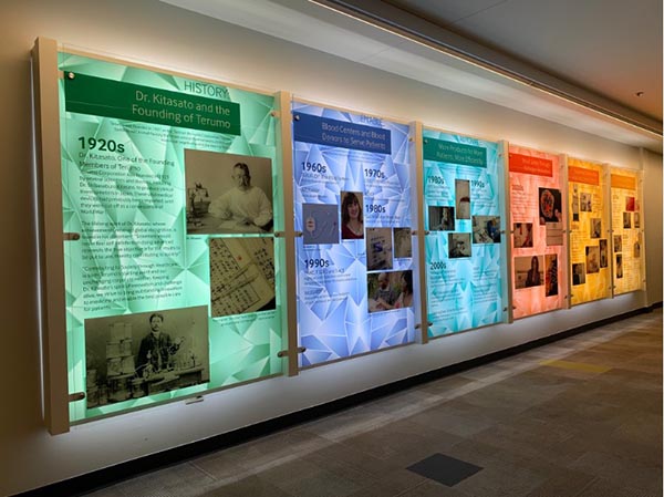
Backlit LED timeline for Terumo Blood and Cell Technologies rebranded campus.
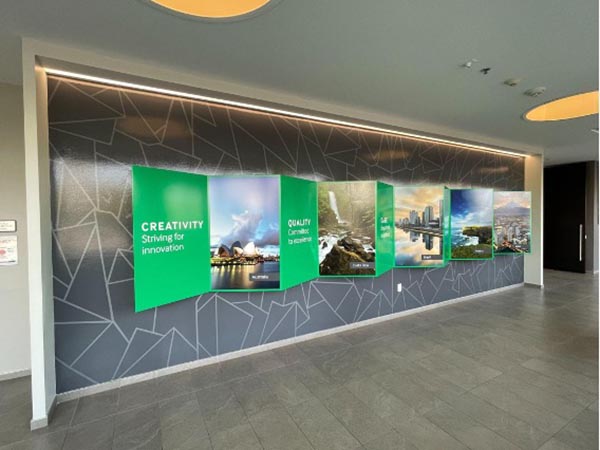
The graphics installed throughout the campus included custom fabricated pieces, dimensional graphics and LED lighting. Several parts of the campus were updated using traditional wall vinyl along with raised dimensional acrylic panels, custom-painted PVC shapes, and reverse pan faces (a type of vacuum-formed dimensional signage). Other areas included custom fabricated aluminum wall art and a backlit LED timeline.
Abercrombie and his team worked with Terumo’s marketing team and spent time walking the campus and discussing options.
“They threw out some ideas that they had and then leaned on us pretty heavily to turn concept into reality,” said Abercrombie. “It was pretty intensive.”
One highlight of the project was a seemingly dimensional map that shows all of Terumo’s locations around the world.
“It was a combination of just simple wall vinyl and raised acrylic for the key,” said Abercrombie. “It’s flat, but the artwork was created with shadow effects to give you more of a dimensional look.”
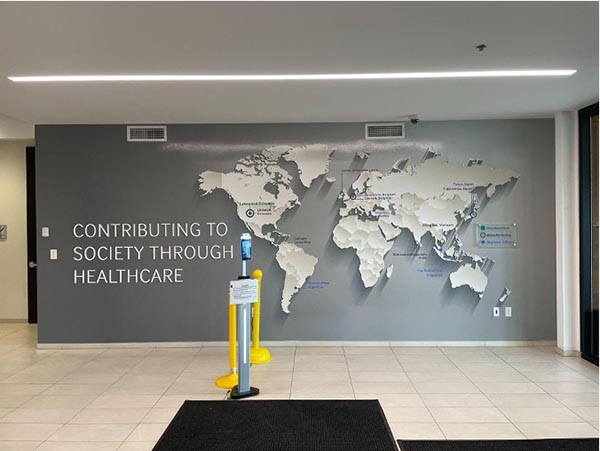
Although this looks 3D, the dimensional appearance was accomplished with shadow effects.
Another element that wasn’t necessarily a challenge but required a lot of attention to detail was an “accordion wall.”
“The idea was to be able to look down the hallway and see one view and then the other way see another view,” said Abercrombie.
The trick was “to fabricate something that was going to be structurally sound, because it’s in a primary walkway.”
They also needed to make sure it didn’t protrude too far off the wall, that someone was likely to walk into it.
Terumo’s “Accordion wall” needed to be visually compelling and structurally sound.
Abercrombie admits that he doesn’t get an overwhelming number of these kinds of major rebrands at this scale.
“If you get one or two a year, you’re lucky,” he said, “but they’re the type of thing that makes your job a little more exciting and challenges your team. Just the reward when you’re all said and done.
“There’s some pride in that part of it too. Everything went smoothly and it’s a project that we’ll remember.”
WhatTheyThink congratulates all the winners of this year’s FASTSIGNS Project of the Year.
FASTSIGNS’ Leah Edwards contributed to this article.