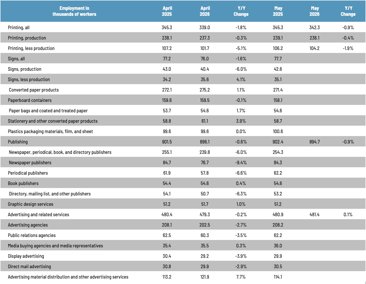
Industry Data
US Commercial Printing Shipments on a Per Capita Basis
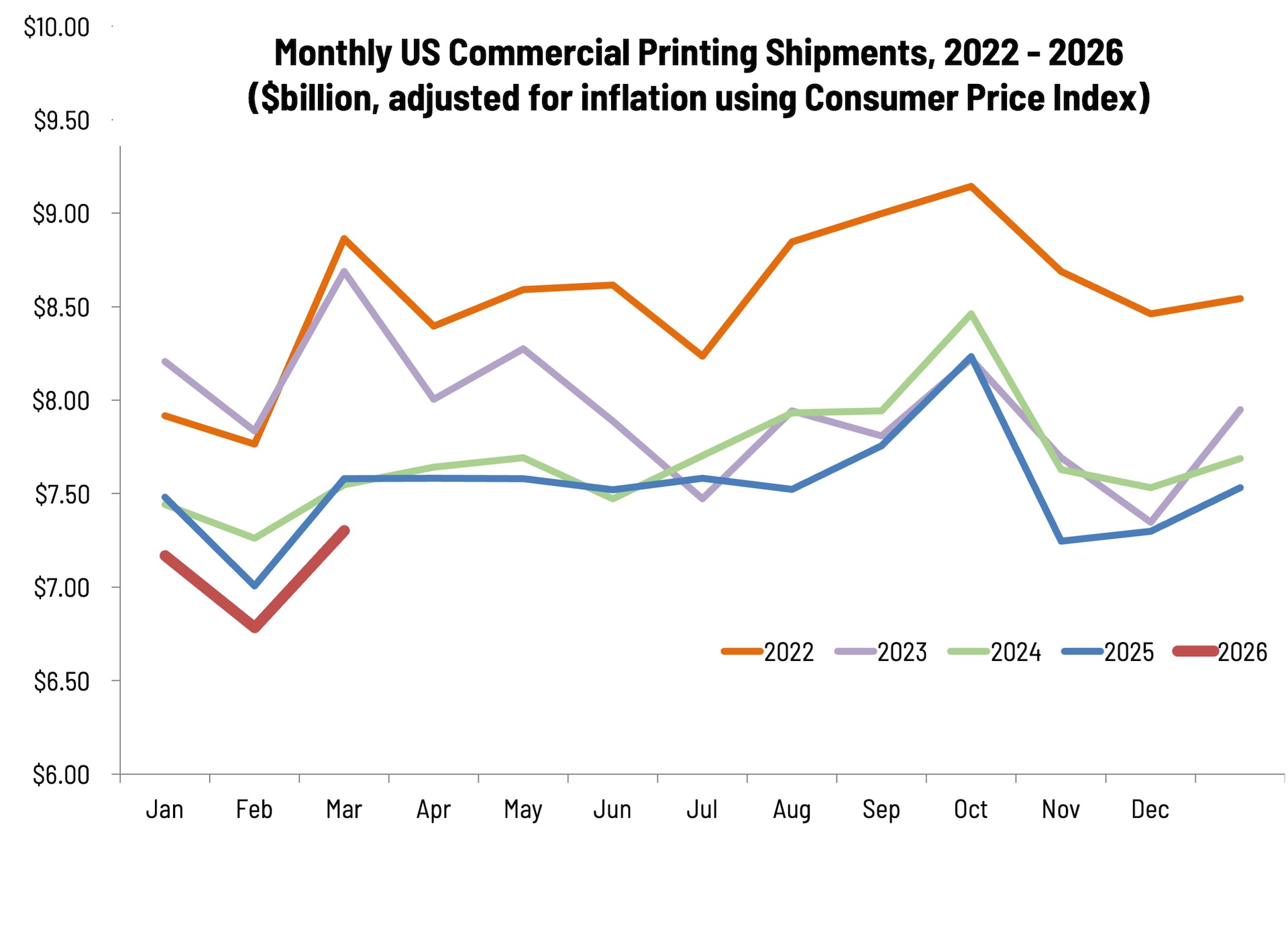
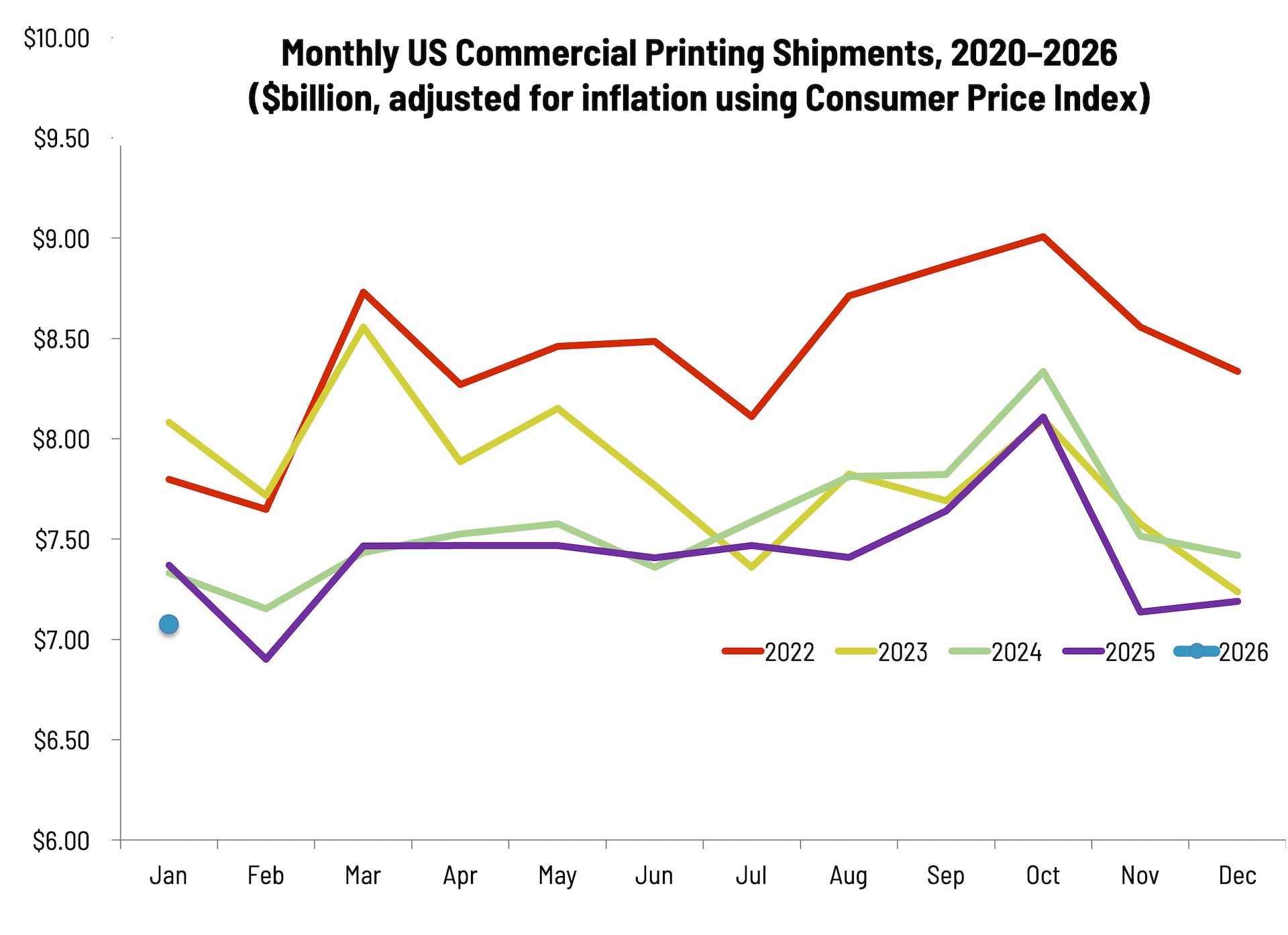
Yes, that sounds boring, but the data have been made interesting by including details about the last forty years or so of industry history and technological change. We added some statistical forecasts from our models that take the data out to 2025. When we started this chart almost ten years ago, those outlying years were near zero. They’re not any more (whew!). The data are inflation adjusted and based on the population data and forecasts of the US Census Bureau. It’s interesting how there are periods of relative stability, a change, followed by another period of stability. Technological change has been a much bigger factor affecting consumption than general economic conditions.
Thursday, March 30, 2017
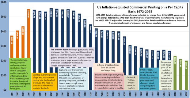
Yes, that sounds boring, but the data have been made interesting by including details about the last forty years or so of industry history and technological change. We added some statistical forecasts from our models that take the data out to 2025. When we started this chart almost ten years ago, those outlying years were near zero. They’re not any more (whew!). The data are inflation adjusted and based on the population data and forecasts of the US Census Bureau. It’s interesting how there are periods of relative stability, a change, followed by another period of stability. Technological change has been a much bigger factor affecting consumption than general economic conditions.