- 2026 marks the first time since the program’s inception that Pantone has chosen any shade of white as the Color of the Year.
- Cloud Dancer represents a rebirth of sorts; a clean slate that invites us to enter the new year with a calm, fresh perspective.
- Pantone’s Color of the Year has run the gamut since 2020, featuring shades of vibrant red and yellow, some blues and purples, and warmer shades of orange and brown.
By Eve Padula
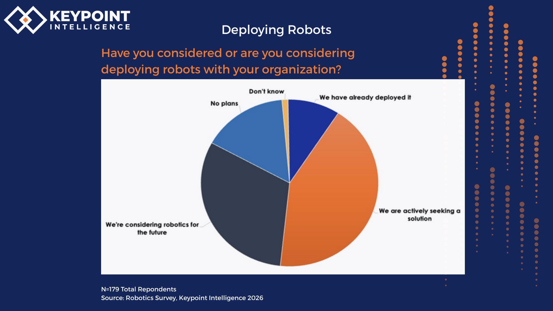
Introduction
The Pantone Color of the Year was first launched in 1999, and the program was designed as an educational initiative to reflect our global culture. The first official color, Cerulean, was selected in 2000. It’s important to note that these colors aren’t chosen randomly. On an annual basis, these colors are selected after careful trend analysis by experts to inspire design and conversation about how culture and color interact.
Pantone recently selected its 2026 color, which is called Cloud Dancer. As is the case every year, the selected colors are designed to spark thought about what they mean for the print industry as well as the overall world at any given time. Laurie Pressman, Vice President of the Pantone Color Institute, elaborates, “The Pantone Color of the Year has come to mean so much more than ‘what’s trending’ in the world of design. It’s truly a reflection of what’s needed in our world today.”
In addition to discussing Pantone’s 2026 Color of the Year, this article provides a brief history of the colors that Pantone has chosen in recent years. It’s amazing that something as simple as a color can offer a lot of insight about where we’ve been and where we’re going.
What is Cloud Dancer?
Despite its very fancy name, you might be surprised to learn that the 2026 Color of the Year is actually a shade of white! 2026 marks the first time since the program’s inception that Pantone has chosen any shade of white as the Color of the Year. An image used to highlight Cloud Dancer shows a woman dressed in billowy white clothing, with a background of a blue sky filled with equally billowy white clouds.
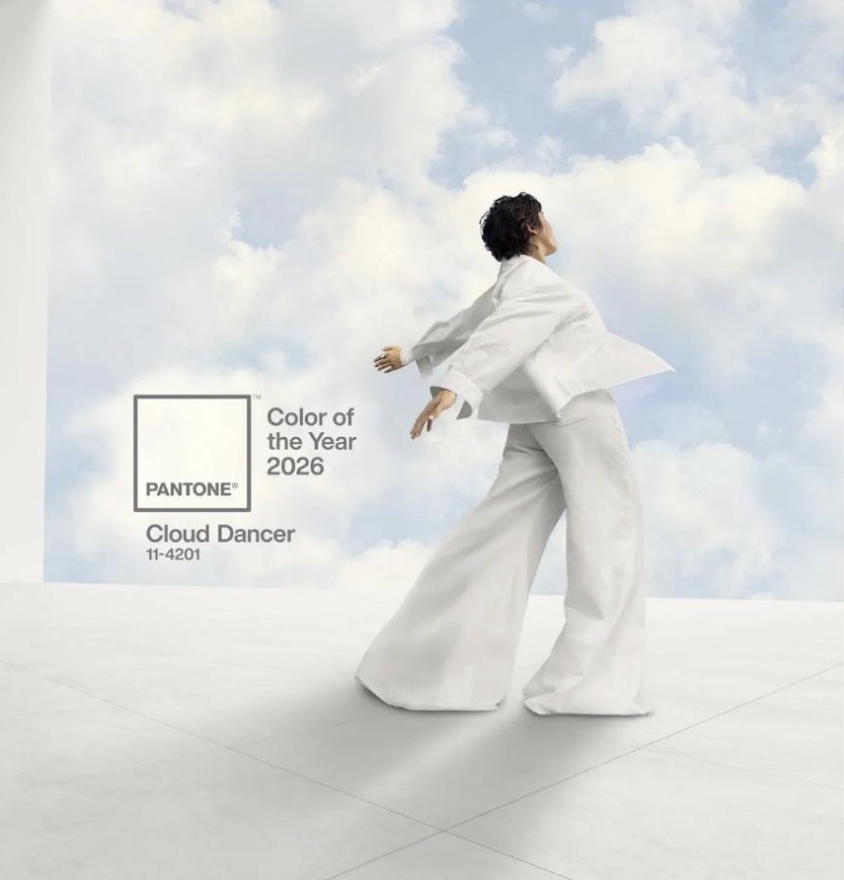
Cloud Dancer—Pantone’s 2026 Color of the Year. (Source: Pantone Color Institute)
Pantone describes Cloud Dancer as “a lofty, airy white that serves as a symbol of calming influence in a society rediscovering the value of quiet reflection.” As is the case with every Color of the Year, this year’s shade serves a prediction of the mood and culture for the upcoming year.
According to Pantone, its Color of the Year typically acts like a global forecast that sets the tone for what people will buy, wear, or gravitate towards in the near future. The fashion world is already seeing an aesthetic of quiet luxury that relies on shades similar to Cloud Dancer. There is an emphasis on logo-free (albeit expensive) natural clothing that communicates an understated sophistication.
Given the world’s uncertain political and economic climate, it’s not surprising that Pantone chose a color that is intended to encourage tranquility and alleviate stress. It represents a rebirth of sorts; a clean slate that invites us to enter the new year with a calm, fresh perspective. Pantone notes, “Cloud Dancer symbolizes a calming influence in a society rediscovering the value of quiet reflection. It invites true relaxation and focus, allowing the mind to wander and creativity to breathe. It opens up space for creativity, allowing our imagination to drift so that new insights and bold ideas can emerge and take shape.”
Throughout 2026, Cloud Dancer and the Pantone trademark will appear on a wide variety of products—smartphones, Post-It Notes, Joybird furniture, and even Play-doh. And yes, these products will be showcasing what boils down to just a fancy name for white.
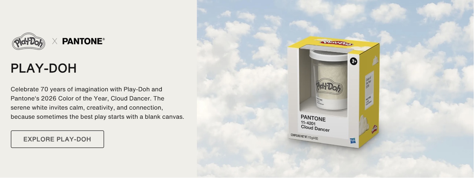
Play-Doh in Cloud Dancer. (Source: Pantone Color Institute)
Reactions to the latest Color of the Year on social media have been mixed, but Laurie Pressman asserts that the chosen color “reflects what people are looking for.” She elaborates, “Similar to a blank canvas, Cloud Dancer signifies our desire for a fresh start. Peeling away layers of outmoded thinking, we open the door to new approaches.”
A Look Back
Since the Pantone Color of the Year serves as a barometer of sorts that gives people an idea of what to expect in the coming year, it’s interesting to explore the recent history of Pantone’s colors to consider how they helped shape their represented years.
As shown in the Figure below, Pantone’s Color of the Year has run the gamut since 2020, featuring shades of vibrant red and yellow, some blues and purples, and even a conservative yet sophisticated brown.
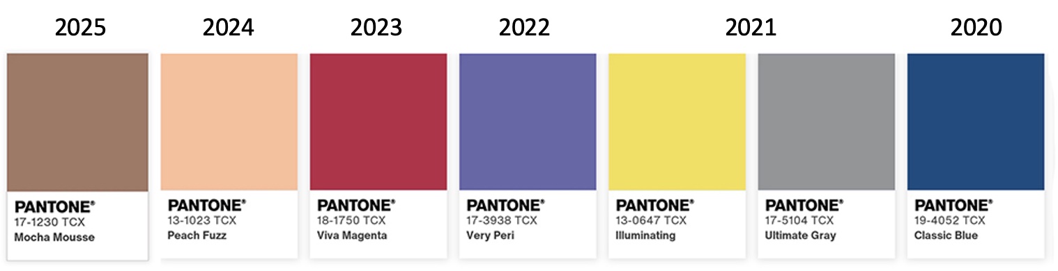
Pantone’s Colors of the Year, 2020–2025. (Source: Pantone Color Institute)
2020
2020’s Color of the Year was Classic Blue, a darker shade that suggested a somber sense of trust, authority, dependability, and strength. These things proved to be all the more important when the world was unexpectedly plunged into a global pandemic in early 2020. COVID-19 took the world by storm, creating a life-threatening emergency that left people craving a sense of predictability and peace. Classic Blue reminded people to stay calm and follow orders during an unprecedented time when no one knew quite what to expect.
2021
Perhaps not surprisingly, 2021 was a schizoid year where Pantone actually chose two very different shades to serve as the Colors of the Year—the first was a neutral gray, the second a bright yellow. Ultimate Gray reflected a year that remained shrouded under the dark clouds of a stubborn pandemic that refused to go quietly. Meanwhile, Illuminating helped remind us to stay optimistic and cheerful about a brighter future. Schools and businesses had re-opened, and vaccines were being developed and administered to the masses.
2022
In 2022, Very Peri was the Color of the Year. This marked the first time that Pantone created a new color for its own program. A periwinkle blue with violet-red undertones, Very Peri symbolized the fusion of the digital and physical worlds. According to Pantone, the new color encouraged a “new vision as we rewrite our lives” during what proved to be a transformative year of unprecedented change. The blue shade communicated familiarity and trust, whereas the violet-red undertones encouraged more carefree creativity and imagination.
2023
A vibrant reddish hue took center stage when Viva Magenta claimed the Color of the Year title in 2023. Pantone described it as “an animated red that revels in pure joy, encouraging experimentation and self-expression without restraint.” A natural color, Viva Magenta reflected recent movements around climate change, sustainability, and land protection. Many everyday activities were paused during the pandemic, and 2023 represented a time when many people were once again enjoying travel and sports in full force. Memories of the recent health crisis also made people more interested in protecting their bodies and focusing on natural forces.
2024
2024 was an uncertain year—Donald Trump was re-elected as President, there was upheaval in the Middle East, the conflict between Russia and the Ukraine continued, certain parts of the world were experiencing record heat due to global warming, and artificial intelligence (AI) developments continued to make waves. As a result, it was perhaps unsurprising that Pantone selected Peach Fuzzas the 2024 Color of the Year. It is described as “a gentle and nurturing peach shade that serves as a reminder to slow down and care for ourselves and one another.” According to Leatrice Elseman, Executive Director of the Pantone Color Institute, Peach Fuzz was a fitting color for 2024 because it reflected the basic human needs and desires that many may feel during challenging times. She elaborated, “We’ve been living in this time of turmoil in many aspects of our lives, and as a result, or need for nurturing, empathy, and compassion continues to grow stronger as we imagine a more peaceful future.” Peach Fuzz has a warm, welcoming, and cozy sensibility that was intended to bring people together while sending a message of compassion.
2025
Pantone’s 2025 Color of the Year was Mocha Mousse, which is described as “a warming, brown hue imbued with richness.” Pantone dubbed this shade a “thoughtful indulgence” that is intended to bring comfort and grounding energy. This decadent color brought a sense of elegance, inspired by indulgent flavors like chocolate and coffee. As was the case in 2024, 2025 was a year of uncertainty. It is therefore unsurprising that Pantone selected another warm tone as its color of the year. Mocha Mousse invited people to slow down and savor the good parts of their lives. It reflected a cultural shift toward simplicity and nature.
The Bottom Line
Our world has changed dramatically over the past six years, and the rate of change will only increase as time goes on. Pantone’s recently selected Colors of the Year reflect a period of upheaval, disruption, reinvention, and unprecedented technological advancements. Each shade captured something essential about our emotional, cultural, and technological climate. Cloud Dancer continues this trend with its minimalistic simplicity. It reflects a collective desire to pause, start fresh, and make room for new ideas. As we continue through 2026, this airy white color encourages a renewed sense of clarity, creativity, and inspiration.
Eve Padula is a Senior Consultant for Keypoint Intelligence's Production Services with a focus on Business Development Strategies, Customer Communications, and Wide Format. She is responsible for creating, analyzing, and formatting many types of content, including forecasts, blogs, industry analyses, and research/multi-client studies. She also handles editing, formatting, and client distribution for many types of deliverables.