By Sabine Lenz, PaperSpecs
Everyone in print wants the same thing: more meaningful work, more demand, and continued relevance in a changing market. Designers want it, too. They want to create more stunning, tactile, memorable pieces—work that stands out and delivers real impact.
What often gets misread as resistance or disinterest is something else entirely.
When you spend time listening to designers—really listening—you hear a different story. The interest is there. The appetite is there. What’s missing is confidence and clarity. Not because designers don’t want to use new technologies, but because they don’t yet understand what’s possible, how it behaves, or how to use it without risk.
And that gap between possibility and confidence is where adoption quietly breaks down.
The Assumption That Keeps Failing
There’s a quiet assumption baked into the print industry that designer education will happen somewhere along the way.
OEMs often assume printers will explain new capabilities. Printers assume designers will either already know—or figure it out when a project requires it. Designers, meanwhile, assume they’re supposed to understand these tools, even when they’ve never been properly introduced.
The result is a kind of industry-wide game of hot potato. Everyone agrees education is essential, but ownership keeps getting passed around.
In the meantime, incredible technology sits underused—not because it lacks value, but because the path to understanding it has never been clearly assigned.
When Possibility Outpaces Understanding
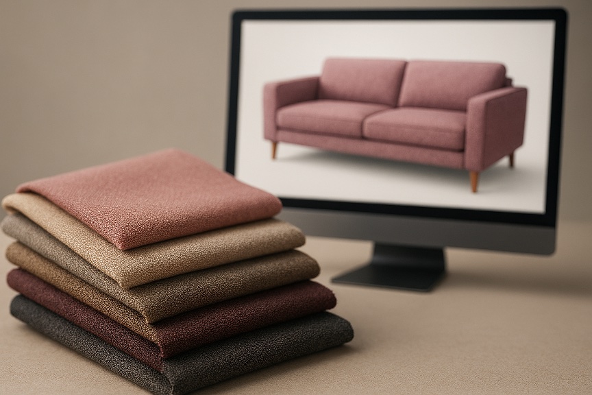
Embellishments are a perfect lens for understanding where this confidence gap shows up most clearly.
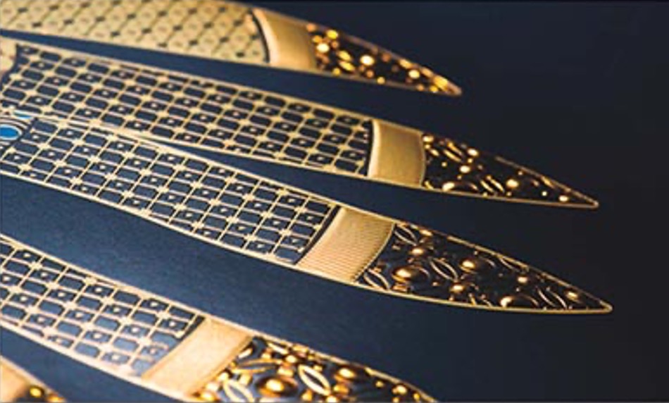
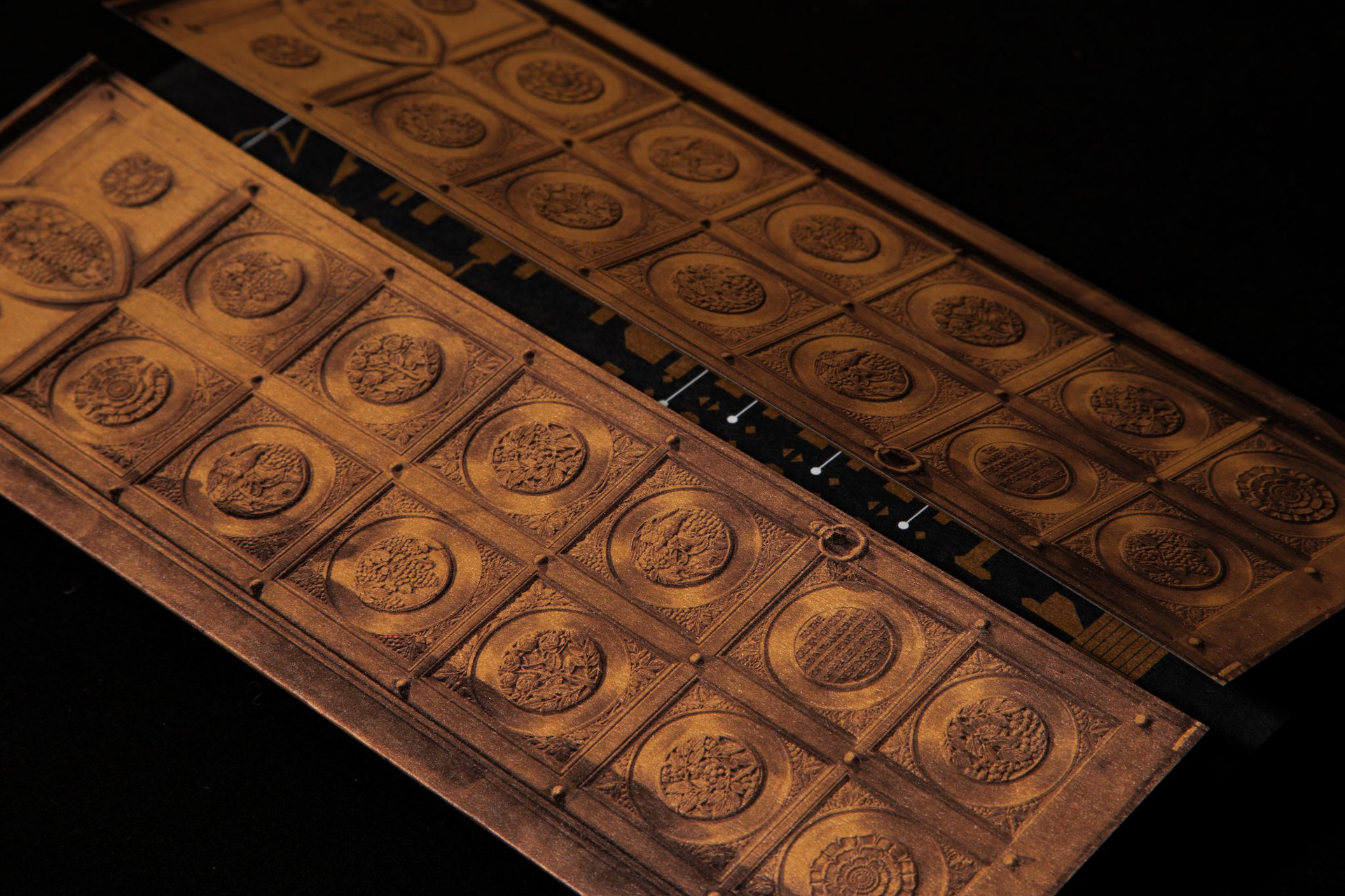
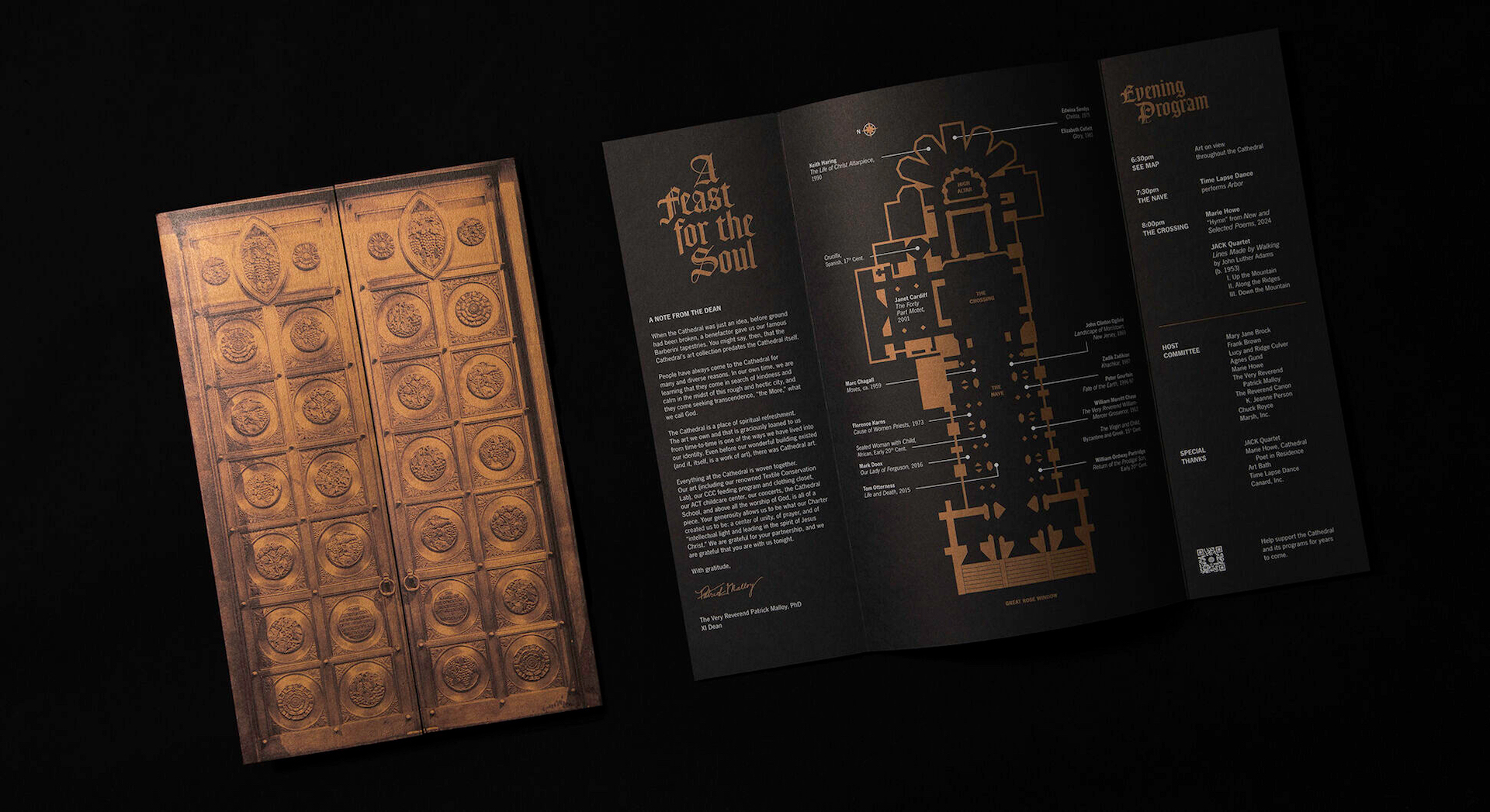
On paper, the tools have never been better. Digital foiling, specialty toners, and dimensional effects make it possible to create highly tactile, premium pieces—even in short runs and on tighter budgets. From a capability standpoint, many of the traditional barriers are gone.
But when you listen to the questions designers ask, it becomes clear that invention alone doesn’t equal adoption.
During my recent Print Design Trends webinar, the same question came up numerous times: whether digital raised UV could recreate the same reflective, holographic shine designers had seen on a clear holographic foil sample.
It’s a reasonable question—and the answer, of course, is no. Digital raised UV is about dimension and tactility; holographic foil is about reflection and optical sparkle. They create very different experiences.
What matters here isn’t the technical distinction—it’s what the question reveals. Designers don’t yet have a clear mental model for what each embellishment is designed to do. And without that clarity, confidence drops. When confidence drops, designers default to the safest option.
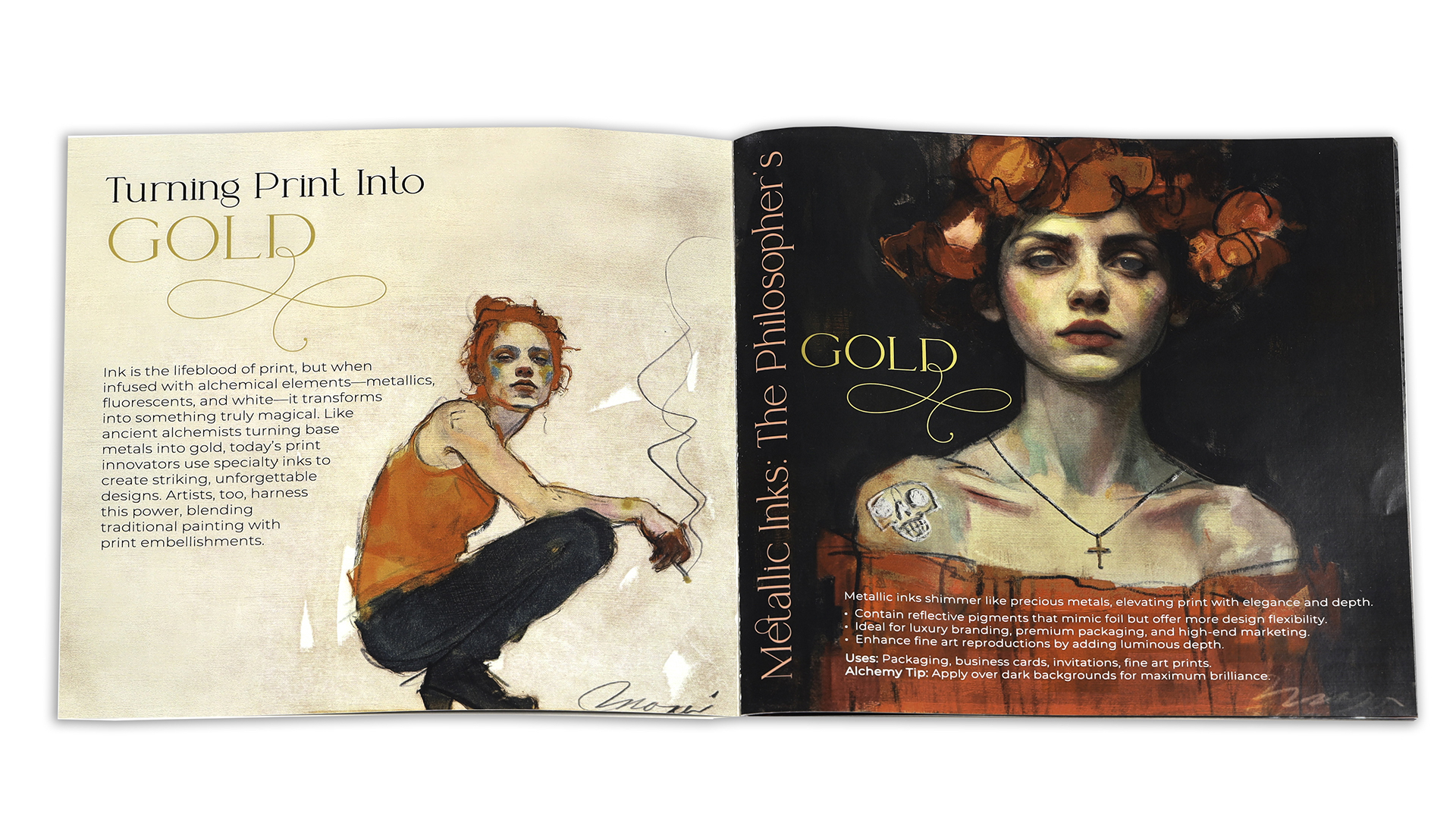
Digital Foiling and the Confidence Gap
Digital foiling shows this confidence gap particularly clearly.
On paper, digital foiling should be an easy yes. OEMs have developed increasingly sophisticated solutions. Printers have invested in the equipment. And designers, from a creative standpoint, are eager to use foil more intentionally.
And yet, digital foiling often stalls—not because designers aren’t interested, but because confusion enters the picture.
Many designers don’t realize that digital foiling isn’t a single, uniform process. There are different ways to achieve it, with different visual results and production implications. When those distinctions aren’t clear, “digital foiling” turns into a fuzzy, risky category instead of a confident design choice.
I see this play out regularly in real conversations. Designers will say they love the look of foil, but aren’t sure which digital foiling option makes sense for their project—or whether it will behave the way they expect. And when uncertainty creeps in, decisions slow down. As we all know, a confused mind doesn’t make decisions.
The irony is that access has never been better. The technology is there. The equipment is installed. But without consistent education that helps designers build a clear mental framework for how digital foiling fits into real-world projects, confusion wins—and adoption stalls.
Again, this isn’t about resistance. It’s about understanding what’s possible and wrapping your head around how these possibilities play out in the real world.
CMYK+: Capability Hiding in Plain Sight
CMYK+ is another area where the gap between capability and understanding becomes especially clear.
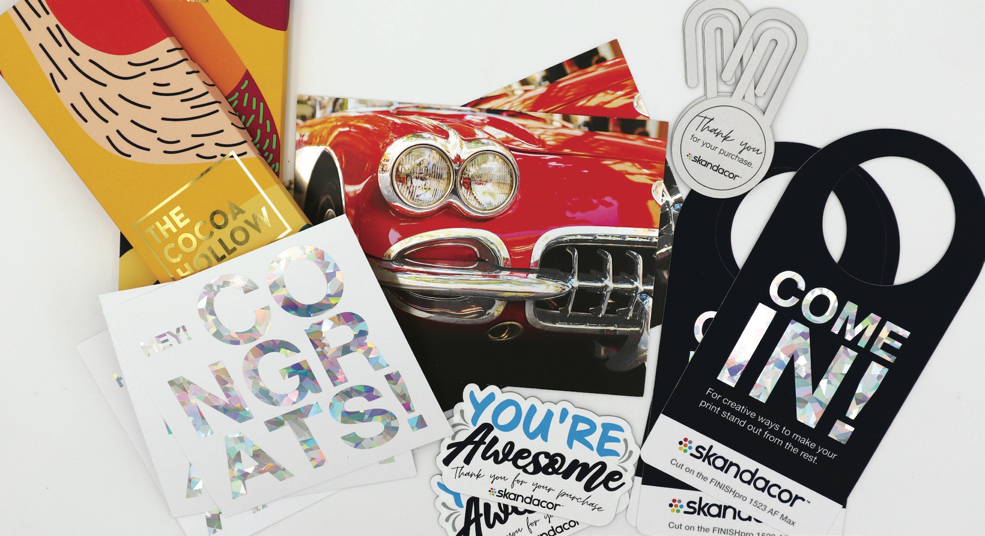
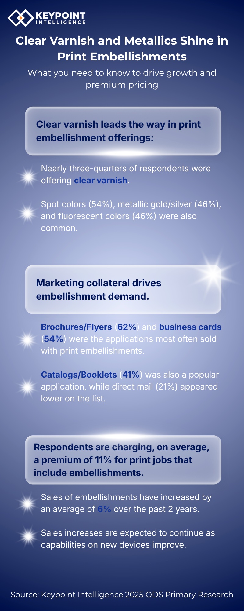
From a production standpoint, CMYK+ has been around long enough that it can feel almost routine. Adding specialty colors—like neons and metallics—extends the color gamut and opens up creative possibilities that standard CMYK simply can’t achieve, particularly in short runs.
From a design standpoint, however, CMYK+ is still often underused.
What I see again and again is that designers tend to approach neons and metallics the same way they’ve always approached specialty inks: as spot colors. We’re using a neon. We’re using a metallic. A yes-or-no decision, rather than part of a broader color system.
In many cases, designers aren’t even aware that specialty colors can be under- or overprinted with CMYK—or combined with each other—to dramatically change the result.
I see this play out regularly in conversations with designers. In a recent Deep Dive session with our PRO members, the general consensus was surprise when designers realized that gold, silver, and even neons could be under- or overprinted with CMYK to shift depth, tone, and emphasis. It wasn’t subtle. You could almost feel the collective “Wait…we can do that?”
That moment is telling. When designers don’t know what’s possible, they can’t design for it. And when they can’t design for it, CMYK+ remains something they admire rather than actively apply.
What’s missing isn’t access to CMYK+ technology. It’s understanding how these additional colors actually work within a design system. Until designers can wrap their heads around how CMYK+ supports the concept—not just the effect—it will continue to be underused.
When Excitement Meets Availability
Even when designers do understand what’s possible, there’s another hurdle that often shows up just as enthusiasm peaks: availability.
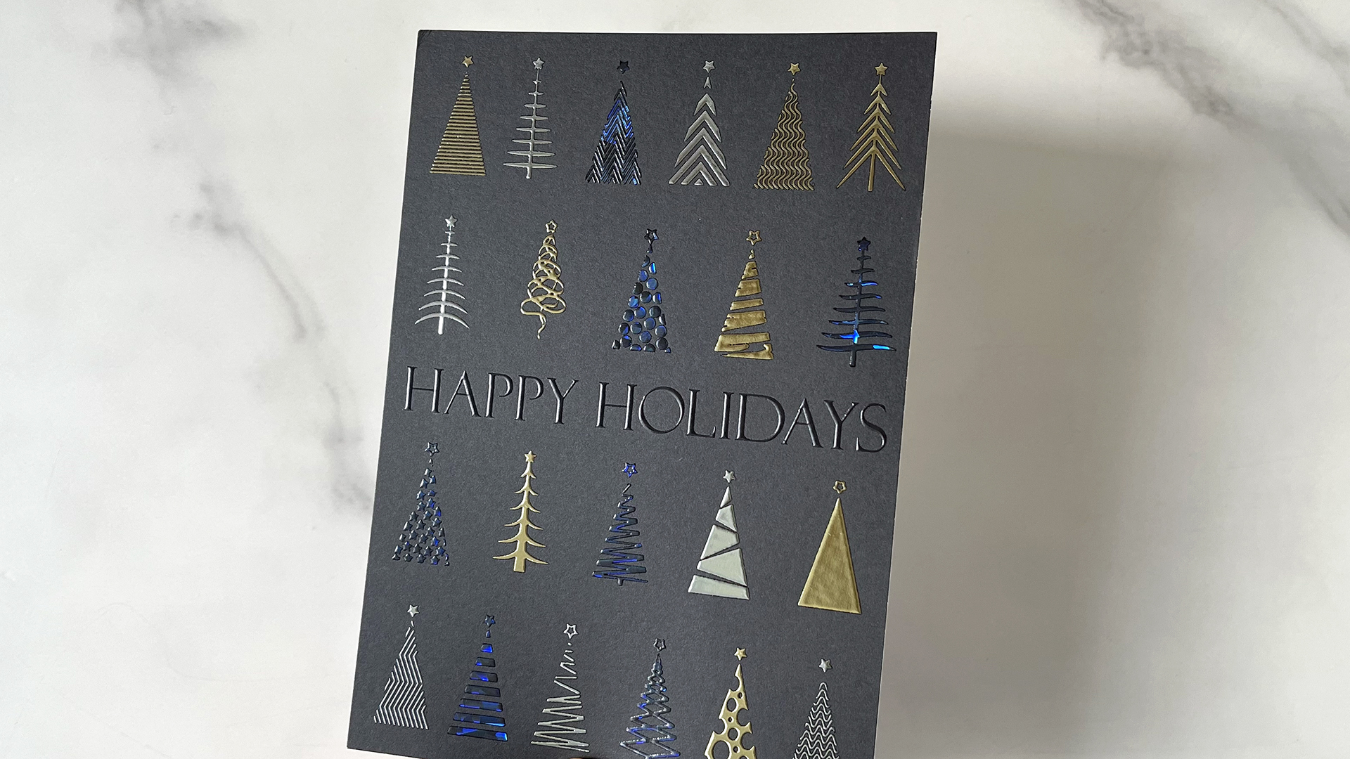
Take digital foiling. There are dozens—arguably hundreds—of foils suitable for digital applications, spanning different tones, finishes, and effects. And yet, most designers are presented with the same limited options over and over again: shiny gold, silver, maybe red.
Not because that’s all that exists—but because that’s all that’s stocked.
I see this pattern play out frequently. Designers get excited about a specific look, only to be told, “This is what we have,” as if it represents the full scope of what’s possible. The technology can support far more, but the offering quietly narrows to fit what’s familiar.
The same thing happens with CMYK+. In a recent conversation with one of our PRO members, a designer actively searched for a printer in the San Francisco area that could run neon pink toner—after learning what was possible and wanting to use it intentionally. It took days to find a single option, and it wasn’t a shop anyone expected.
That’s a problem.
When designers are finally confident enough to ask for something specific, the industry should be ready to meet that moment—not redirect it back to the safest, most convenient alternative.
This isn’t about carrying every option all the time. It’s about being willing to try. To source. To say “Let’s see what’s possible,” instead of “This is what we have.”
Because when excitement meets resistance—even unintentional resistance—momentum disappears fast.
Sustainability: When Language Gets in the Way
What’s interesting about sustainability conversations around embellishments—especially foil—is that the industry has actually made enormous progress.
OEMs and foil manufacturers have spent years improving materials, processes, and outcomes. Modern foils are thinner, more efficient, and, as independent studies have shown, can be successfully repulped in common recycling settings,with aluminum separating from the fiber stream during processing.
From a technical and material standpoint, the real work has been done.
And yet, there’s still a lingering stigma around foil.
I was reminded of this again at a recent industry breakfast. The conversation wasn’t really about how far sustainability has come—it was about whether the industry needed entirely new terminology to make foil sound more sustainable. The assumption seemed to be that the word foil itself had become a liability.
That instinct is understandable, but it misses the mark.
Designers already know foil. Printers know foil. The problem isn’t the material—it’s the perception. And changing language without reinforcing understanding only adds another layer of confusion.
What makes this especially challenging today is how misinformation gets reinforced.
A quick Google search can turn up outdated assumptions. AI tools confidently repeat those assumptions. And without a solid foundation to push back, uncertainty spreads. I’ve even spoken to printers who weren’t entirely sure whether foil was recyclable.
That’s not a failure of effort. It’s a failure of consistent education.
When designers—and printers—aren’t confident in how to talk about sustainability, embellishment becomes risky. And when something feels risky in a client-facing conversation, it’s often the first thing to be cut.
The irony is that sustainability isn’t the barrier here. Communication is.
Improving sustainability outcomes is only half the job. Making sure those improvements are clearly understood, repeated, and trusted is what actually changes behavior.
Where Understanding Unlocks What’s Next
When designers truly understand what’s possible—and how those possibilities actually play out in the real world—something shifts.
Embellishments stop feeling risky and start feeling intentional. CMYK+ stops being a novelty and becomes a design system. Sustainability stops being a source of anxiety and becomes part of the story designers can confidently tell their clients. The conversation changes from Can we do this? to Why wouldn’t we?
What’s striking is that the interest has been there all along. Designers want to create more compelling, tactile, meaningful work. The technology is already in place. The missing piece has never been capability—it’s been understanding.
That’s where leadership quietly matters most.
When education is treated as shared responsibility rather than a game of hot potato, designers gain the confidence to specify, experiment, and push ideas further. And when that confidence grows, adoption follows naturally.
The future of print doesn’t hinge on inventing new tools or new terminology. It hinges on helping designers wrap their heads around what’s already possible—and giving them the support they need to use it well.
That’s when print doesn’t just keep up.
That’s when it stands out.
Sabine Lenz is the founder of PaperSpecs.com. THE online hub for brand owners and designers who love and spec paper and print. More than 22,000 creatives receive her e-newsletter, watch her videos and attend her virtual [unboxed] events.
An award-winning graphic designer with more than 20 years of experience in the U.S., Germany and Australia, she writes frequently for numerous industry publications and is also a speaker on the subject of paper, print and related topics.
Lovingly referred to as the “Paper Queen” by many of her followers, she combines a passion for paper and print with a hands-on approach to sharing her knowledge.