To help determine what makes the perfect Election Leaflet, we held a survey of 878 of our customers. We wanted to find out what approaches they valued most when it came to headline content, tone of voice, presentation and design.
Among the results, we discovered that:
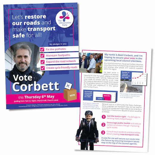
· 90% of people prefer an Election Leaflet written in the 1st person
· 82% prefer to see a photo of the candidate in the constituency rather than next to the party leader
· 80% of readers expect to learn about the candidate’s political and professional track record
· Passion and empathy are less important than direct, factual content
· Bullet points rule over paragraphs, according to two thirds of those surveyed
· 95% believe good design makes them more likely to read the content
We unpack the findings of the survey on the Solopress Blog, in a piece entitled:
How to design the perfect Election Leaflet that voters can’t ignore!