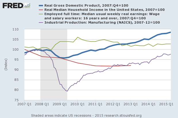
There are numerous data series that explain that the economy has never recovered from the recession. These are not obscure data series, but mainstream ones. Gross Domestic Product should be the standard for determining the status of an economy (thick blue line). Movements in GDP should be confirmed by other measures. This week's chart uses the start of the recession, December 2007, as the base, which is 100.
So 105 is 5% higher than that point in time and 95 is -5% lower than that point in time. We have shown in previous charts that full time workers has not reached the original recession level, and is just short of it; but when adjusted for population growth it is about 8 million workers short. This chart introduces other items. Median weekly earnings (green line)did okay during and after the recession until three years ago when it fell below GDP growth and stagnated. While it's better than the recession start, it has fallen since the recovery began.
Median real household income (red line) is shown to 2013 when it was about -7% from the recession start. It has only worsened since the recovery, an estimated third of that by the loss of interest payments on savings caused by the Fed's near-zero rate policies. A more current picture of median income's lag can be found at Sentier Research. The purple line is the Fed's own manufacturing index, and that still lags the recession level by about -3%, and still has a way to go to catch up to GDP.
There have been concerns that GDP is overstated because their inflation adjustment approach is biased to the low side. We'll let the economists have their barstool fights over that at some big city university club. Finally, we've cited Janet Yellen's labor market dashboard so reliably maintained over at Bloomberg where they just redesigned it. Of the nine items she and her fellow committee members are tracking, only three have recovered.

