Inkjet printing has created a faster paced schedule than traditional print methods often requiring faster turn times for creative work and file preparation.
Whether you are working on direct mail or transaction printing, designing for ease of navigation and to deliver a clear message is just as important as the color scheme or graphics used. Each color carries a message or an emotion and will provoke a response. Choosing the colors to support the intended tone of the mailing is important – particularly when some news (like an overdue bill or cancellation of service) can come as a shock and when there is a call to action that needs emphasis.
Getting the Colors to Work Together
When selecting colors for a project running in an aqueous inkjet environment, consider not just the hue of the scheme, but the saturation of the colors. Use of large areas of heavily saturated colors will create more strike through when using thin papers. This can result in visual show through of text and graphics on the back side. Though designers have to work with their customers brand colors, there is often wiggle room in selecting surrounding complementary colors. Balancing coverage and saturation using a scheme helps the colors work together with the ink and paper.
Finding a color scheme right for your project may require some trial and error. Adobe Illustrator has a great tool, called Color Themes, which I find is rarely used. Color Themes is a feature within Illustrator which helps with choosing the right colors when starting a new direct mail or transactional statement design.
Designers can start any design by choosing the number of colors required for the scheme. Starting with a choice for a base color, schemes can be created as monochromatic, triad, complementary, compound, by shade or with completely custom color choices.
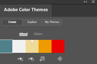
Based on the color wheel, Color Themes can help with building colors and their saturation values. Selecting colors with lower saturation values can reduce issues such as ink show through and paper curl and cockle.
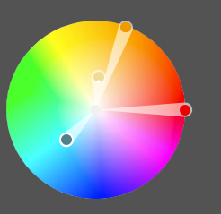
Colors are shown and can be edited by the color wheel

Saturation Slider bar can edit each color individually or as a group
To find this hidden gem, launch Adobe Illustrator and go to: Window>Color Themes
You can create your own scheme or choose from 100’s of popular combinations. Each scheme is customizable and ready to save as your own library. Every color is represented by sliders which show CMYK, RGB, LAB, HSB and HEX values ready for any print or digital application.
Final color values are supplied for any application
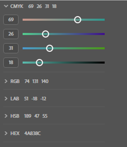
This cool tool makes helps you find color combinations that work well for print – but it also shows how the theme will be represented across your print, web, or colors displays. In my next post, I will dig into some cool tools for working with color schemes across delivery channels.
Remember color is a different recipe for each communication channel which should be shared for color consistency.