Previously I wrote about the complexity of inkjet color gamut and challenges with getting a monitor to simulate press outcomes. Today I want to talk about methods to expand the accuracy of monitor proofing using CRPC Profiles. I’ve also provided a downloadable .zip file containing all the CRPC print conditions.
Characterized Reference Printing Condition Profiles, or CRPC, are a 1-7 series of color ICC profiles based on paper type that defines the conversion between Adobe device CMYK values and the inkjet output device. Officially known as ISO/PAS 15339-2 Reference Print Conditions, these “conditions” create a common color space which Adobe Bridge and associated programs can target for viewing, preparing a color-managed workflow all the way to the press. These profiles are not newly released, so I am often surprised to find that people have not applied them to their workflows.
These print conditions expand the accuracy of a designer’s monitor proofing beyond standard uncoated and coated GRACol and SWOP color viewing conditions. The CRPC group of profiles issued includes profiles which offer a closer simulation of printing on paper stocks such as inkjet treated, highly calendared and inkjet coated stocks for high-speed inkjet and non-porous substrates for UV flatbed scanning systems.
- CRPCs, when assigned to Adobe ColorBridge and/or corresponding program settings, create a closer screen rendition to the paper and printer color space when viewing in proof mode.
- When used by the printer RIP, CRPCs serve as printing targets or “aims” for inkjet
- CRPCs also work as proofing targets for wide format proofing devices
- CRPCs are common color spaces which all elements in a color managed process can target
- Applying CRPC settings to Adobe programs in proof mode can simulate out of gamut colors within a document.
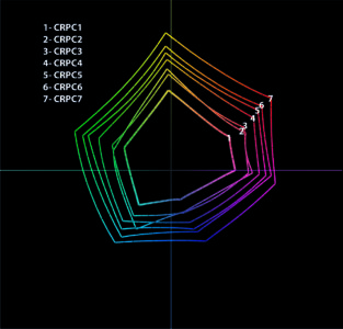 From large to small, CRPC profiles can align designers viewing conditions to the printed piece[/caption]
Imagine CRPC’s as varying sized dart boards of reproducible colors which the entire process from design, proofing and printing can all use as a common target. The paper type determines the size of the dart board chosen.
Considerations
Since CRPCs are based on media type, it is important to know what substrate your printer is using for the project. As the substrate is the first color in any print project, it determines the ability of the ink to accurately reproduce colors. This simulation is what a designer should be seeing on their screen to make better color choices. Using the same CRPC target as the print provider for a particular media will create a closer screen rendering for the designer.
Not all color workflows are the same, nor is how printers manage their color on their inkjet devices. The number of papers, press types and digital devices you work with will impact how you work.
[is_not_paid] The checklist and set of downloadable profiles is available for our members. Sign in or Become a Premium Member up to view. [/is_not_paid] [is_paid]Checklist
- If you are only using one type of paper, create a custom Adobe Bridge setting that will align all Adobe programs to the selected color space.
- If you are using various papers, load the CRPC profiles in the active profiles folder for Adobe programs:
- You can make different Bridge settings for each paper type you are using. It is best practice to change Adobe color settings based on paper selection before starting any design work
- Alternatively, use profiles as needed in proof mode to view color shifts and out of gamut colors based on paper selection for each project
- Verify that your printer is targeting one color space for all papers
- If this is the case, align your color settings with the printer, but note colors will not accurately render for different paper types.
- Ask if your printer is using the device color space
- If they are not using a CRPC reference and using the color space of the inkjet device, it is best to request the output profile of the machine for that substrate.
- Ask if your printer is targeting different condition’s based on paper type
- Confirm which CRPC profiles are used for selected papers
What To Do Next
Your print provider may target a different color space per ink chemistry and based on drying/curing needs for heavy or light coverage. Check in frequently with your print provider about what they are using. Use this checklist to drive the conversation with your printer. Ask about the print conditions they are using for each uncoated, treated/primed, highly calendared and coated media you may require and if there are any variations based on coverage.
Also, make sure that you understand the differences for each CRPC profile and when to use them:
- CRPC1- ColdSet- Newsprint- when viewing designs for newsprint grade papers.
- CRPC2- HeatSet News- when viewing designs for Improved Newsprint stock.
- CRPC3- Premium Uncoated- when viewing designs for uncoated stocks with no treatment or primer.
- CRPC4- Super Calendared- when viewing designs for highly calendared stocks. Uncoated inkjet treated stocks with a coated feel, inkjet treated or inline primed uncoated stocks.
- CRPC5- Pub Coated- when viewing designs for inkjet coated, in-line primed coated or offset coated stocks.
- CRPC6- Premium Coated- when viewing designs for inkjet coated, in-line primed or offset coated stocks with fast drying or expanded gamut inks.
- CRPC7-Extra Large- when viewing designs for UV flatbed devices or devices with high chroma or expanded gamut inks.
Download the .zip file containing all the CRPC print conditions here. Unzip the file and save it to your system profiles folder. You will then be able to create custom color space settings for Adobe programs or Adobe Bridge and test these viewing conditions to see color shifts or out of gamut colors
After completing these steps, you can start designing knowing that you are using the proper viewing conditions for the paper on your target device.
Let us know if you need any help with aligning your color management process. Remember, color management is a process that spans design through print, and each step must target the same color space or shift will happen. It’s all or none when managing color.
[/is_paid]