When comparing L*a*b* measured colors, differences are called Delta E, often written as dE or ΔE*. The calculations used are 76, 94 (an improved 76) and 2000 each with an increasing complexity of calculation. Delta E is measure of change in visual perception of two given colors. The larger the Delta E difference, the higher the visual color shift.
Out of the 3, Delta E 2000 is becoming more accepted in conventional and package printing. Delta E 2000 has an improved calculation which more closely models the human eye than 76 and 94. Depending on where the colors lightness value falls, dE2000 allows a wider L* variance.
When comparing L*a*b* measured colors, differences are called Delta E, often written as dE or ΔE*. The calculations used are 76, 94 (an improved 76) and 2000 each with an increasing complexity of calculation. Delta E is measure of change in visual perception of two given colors. The larger the Delta E difference, the higher the visual color shift.
Out of the 3, Delta E 2000 is becoming more accepted in conventional and package printing. Delta E 2000 has an improved calculation which more closely models the human eye than 76 and 94. Depending on where the colors lightness value falls, dE2000 allows a wider L* variance.
If you would like to get deeper into the dE and their calculations go to: http://www.colorwiki.com/wiki/Delta_E:_The_Color_Difference
The image below is from an X-Rite eXact Spectrophotometer. The image is showing the measurement of 2 printed swatches from the Uncoated Pantone Color Bridge to calculate dE2000 color differences between spot and process value swatches.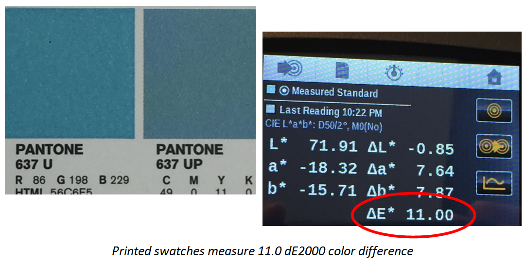 Each industry has different acceptable Delta E tolerances with commercial printing being < 4 and packaging being the tightest at 2.0. If Delta E difference is a number showing how 'far apart' two colors are, tolerance is the interpretation of the number. By setting a tolerance level, you can define what is acceptable and what should be rejected.
Currently, there is not an established Delta E tolerance for production inkjet printing. With inkjet using many different print heads, ink chemistries and colorants on varying media and treatments, the range of colors which can be reproduced accurately (within 2-4dE) varies.
Production and industrial inkjet are different processes and depending on the jetting, ink and media you may be using, you will find you may have different tolerances than conventional industries. The delta range for your process should be tested and tolerances set for your process, machine, ink, media and process can achieve. Spectrophotometers will help you determine your range of achievable print tolerances from proof to print in a scientific way, creating clarification and eliminating any color subjective or emotional distress for you and your customers.
Each industry has different acceptable Delta E tolerances with commercial printing being < 4 and packaging being the tightest at 2.0. If Delta E difference is a number showing how 'far apart' two colors are, tolerance is the interpretation of the number. By setting a tolerance level, you can define what is acceptable and what should be rejected.
Currently, there is not an established Delta E tolerance for production inkjet printing. With inkjet using many different print heads, ink chemistries and colorants on varying media and treatments, the range of colors which can be reproduced accurately (within 2-4dE) varies.
Production and industrial inkjet are different processes and depending on the jetting, ink and media you may be using, you will find you may have different tolerances than conventional industries. The delta range for your process should be tested and tolerances set for your process, machine, ink, media and process can achieve. Spectrophotometers will help you determine your range of achievable print tolerances from proof to print in a scientific way, creating clarification and eliminating any color subjective or emotional distress for you and your customers.