-
- Deuteranomaly: makes yellow and green appear more red and causes difficulty distinguishing violet from blue.
- Protanomaly: makes red, orange, and yellow appear greener and colors overall are seen as less bright.
- Protanopia: makes red appear as black and certain shades of orange, yellow, and green all appear as yellow.
- Deuteranopia: causes reds to be seen as brownish-yellow and greens to be seen as beige.
- Tritanomaly: causes blue to appear greener and makes it difficult to distinguish yellow and red from pink. Tritanopia: An extremely rare condition that causes blue to appear green and yellow to appear violet or light grey.
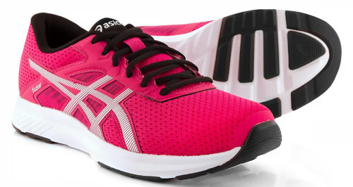 When I commented on his color choice, he said he thought they were gray. He was completely unaware of his color vision deficiency. When he said that pink would not be his color preference I wondered, if he can't see the color, then how can he have an opinion on it? And, if he has an opinion, how can he make a decision if he can't trust his eyes? What if Bob was color blind too? The answer is, he would be happily wearing pink sneakers that he thought were gray. That may not be mission critical when selecting your own shoes, but color vision is mission critical for your pressroom staff. Do any of them have vision deficiencies that they are completely unaware of?
There are many color tests on-line which evaluate for color deficiencies, and you may want to have your team use these to check their vision. Of course, the test is only effective if the lighting and monitor calibration are correct.
When I commented on his color choice, he said he thought they were gray. He was completely unaware of his color vision deficiency. When he said that pink would not be his color preference I wondered, if he can't see the color, then how can he have an opinion on it? And, if he has an opinion, how can he make a decision if he can't trust his eyes? What if Bob was color blind too? The answer is, he would be happily wearing pink sneakers that he thought were gray. That may not be mission critical when selecting your own shoes, but color vision is mission critical for your pressroom staff. Do any of them have vision deficiencies that they are completely unaware of?
There are many color tests on-line which evaluate for color deficiencies, and you may want to have your team use these to check their vision. Of course, the test is only effective if the lighting and monitor calibration are correct.
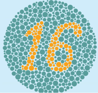
This on-line color vision test consists of 8 plates taken from the PIP 24 Plate Color Vision Test.
The Farnsworth Munsell Tests are far more sensitive and accurate at determining the type and extent of deficiency present, but are also more time consuming and have to be ordered. I have taken this test at various times throughout my career to track the difference that age makes in color perception. We all change to varying degrees over time whether we like it or not. Even with better than average color perception, I would never assess color subjectively for business purposes. I always work with color measurement data. Data is fact - everything else is an opinion.
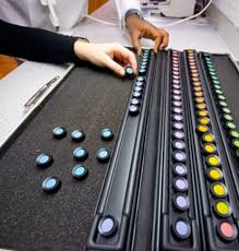 Visually tweaking or modifying color on press is never an efficient or repeatable way to run production. Making your staff's aware of their potential vision deficiencies will help catch color, as well as print quality issues, before they get to your customer. It's always best to create a color managed workflow that references the same target color space as your customer's file. If your device and paper selection allows you to match that color space, your variance should be limited. For output devices and paper combinations which may be smaller in reproducible gamut, target the color space which most closely fits your device.
Knowing the color capabilities of your inkjet device is very important, but understanding the color capabilities of your press crew is critical.
Visually tweaking or modifying color on press is never an efficient or repeatable way to run production. Making your staff's aware of their potential vision deficiencies will help catch color, as well as print quality issues, before they get to your customer. It's always best to create a color managed workflow that references the same target color space as your customer's file. If your device and paper selection allows you to match that color space, your variance should be limited. For output devices and paper combinations which may be smaller in reproducible gamut, target the color space which most closely fits your device.
Knowing the color capabilities of your inkjet device is very important, but understanding the color capabilities of your press crew is critical.