Router Rooter
Does the name “Gorton” mean anything to you? For some, it recalls the frozen seafood brand or the statue of the Gloucester (Mass.) fisherman, often confused with the Gorton’s Fisherman logo (Gorton’s is based in Gloucester).
But for typophiles—specifically Marcin Wichary—Gorton is a typeface and, as it turns out, a pretty ubiquitous one, at least in New York City. In this lengthy “fontologue” at his Ares Luna, Wichary details his discovery of this hitherto-unknown typeface. It started with computer keyboards.
Many keyboards, especially older ones, sported a particular distinctive font on their keycaps. It was unusually square in proportions, and a weird mélange of “mechanical” and “childish.”
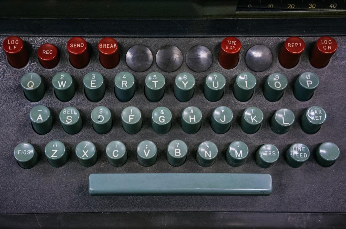
Looking at just a few keyboards, it was also obvious that it wasn’t just one rigid font. There were always variations, sometimes even on one keyboard. 0 came square, dotted, or slashed. The usually very narrow letter I sometimes sported serifs. The R and the 6 moved their middles higher or lower. There also seemed to be a narrower version of the font, deployed when a keycap needed a word and not just a letter. (Lowercase letters existed too, but not very often.)
Font-ID sites yielded no exact matches, while a typophile site suggested it was called “Gorton”—but it seemed to be unavailable for download anywhere. Wichary suspects this has to do with how old keyboard keys were made. Rather than being printed like they are now, they were manufactured from plastic.
In older ones – those from the early 1960s laboratory computers, or the 1980s microcomputers – the way every key was constructed was by first molding the letter from plastic of one color, and then grabbing a different plastic and molding the key around the letter. A Gorton letter was as physical as the key itself.
It also made it difficult for the character to abrade off the top of the key, which can happen if your keyboard has been around for a while.
Wichary then had an experience akin to one most of us have had at some point. You know how sometimes you’ll hear a new or rarely used word—like, say, “tiramisu”—and then all of a sudden you’ll start hearing or seeing it everywhere? Wichary had that Gorton moment.
One day, I saw what felt like Gorton on a ferry traversing the waters Bay Area. A few weeks later, I spotted it on a sign in a national park. Then on an intercom. On a street lighting access cover. In an elevator. At my dentist’s office. In an alley.
A common denominator was that all of these Gortonian examples were etched in metal or plastic. So, the conclusion: it was a font used by routers.
Some searches quickly led me to George Gorton Machine Co., a Wisconsin-based company which produced various engraving machines. The original model 1 led to model 1A and then 3U and then, half a decade later, P1-2. They were all pantograph engravers: They allowed you to install one or more letter templates and then trace their shape by hand. A matching rotating cutter would mimic your movements, and the specially configured arms would enlarge or reduce the output to the size you wanted.
And, yes, “The first font in the 1952’s company catalogue was called Gorton Normal and I felt I already knew it by heart.”
Wichary takes a deep dive into the aesthetics of such a “mechanical font,” its other uses, its transition to paper, and virtually everything you would ever want to know about fonts used in routing machines. Click through for much much more.
Utopian Type
Print magazine has released its 2025 Typography Report and apparently it’s Utopian.
Utopia traditionally refers to an idealized society
True, but “utopia” literally means, in Greek, “no-place”—Thomas More had selected it as the name of his fictitious island to emphasize its fictionality. Anyway, we continue.
But in typography, type utopia represents the frenzied intersection of form, function, and emotion—where letterforms communicate with clarity, impact, and innovation. However, this “utopia” isn’t about perfection but rather the evident tension between rebellion and idealism.
Utopia was a 1921 German publication whose design came out of the Bauhaus school.
Friedl Dicker’s collaboration with Johannes Itten on the type-focused publication Utopia reveals a rarely seen, gestural side of the Bauhaus. Her compositions are stunning improvisations, blending Blackletter and Roman type families: from Unger-Fractr, Fette Gotisch, Normande, Tiemann-Medieval, and Bernhard-Antiqua. Through her precise yet dynamic layouts, Dicker brings Itten’s essays to life, merging dense, chaotic hand-lettering with bold, expressive design.
How does this apply to typography 124 years later?
As typography marches towards its utopian future, the flexibility of digital design expands possibilities for creativity, drawing from the experimental spirit of the early 20th century—when Dadaists, Futurists, and Constructivists disrupted visual language. New type disruptions explore anarchic layouts, emotive forms, and evolving mediums.
The report profiles several contemporary designers working to drive type to its utopian future, such as:
Chantal Jahchan, an independent designer based in Brooklyn, blends experimentation with idealistic pursuits of beauty and meaning. Her work adapts to today’s fragmented, fast-paced media landscape. Known for her narrative illustrations, Jahchan integrates archival imagery, hand-drawn elements, and manipulated type to create illustrations for book covers, and publications like The New York Times, The Atlantic, The Economist, The BAFFLER, and The New Yorker.

How to Blow Up a Pipeline (Andreas Malm) features neat bento boxes of bucolic landscapes juxtaposed with barbed wire and fencing, organized in a grid around the type, set in Nick Sherman’sversion of Franklin Gothic, but tweaked with blobby, slightly imperfect ink traps that give it a vintage feel. “I was looking at old how-to manuals,” she says. “I got lucky with such a good title; don’t fumble that!” The cover was hardly a fumble; the design made the NYT: Best Book Covers of 2021 and the AIGA 50 Books 50 Covers 2021.
Disrupting the Euture
We’ve all made typos (goodness knows!) but very few them tend to be etched in stone. However, if you have ever been to the Lincoln Memorial and read the inscription carefully, you know that at least one was. The Memorial was designed and constructed from 1914 to 1922 by designer Henry Bacon, sculptor Daniel Chester French, and his assistant Evelyn Beatrice Longman. Inside the Memorial, on the north wall, is carved Lincoln’s second inaugural address inscription. In the sentence “With high hope for the future no prediction in regard to it is ventured,” someone goofed and etched “FUTURE” as “EUTURE.” Via Atlas Obscura:
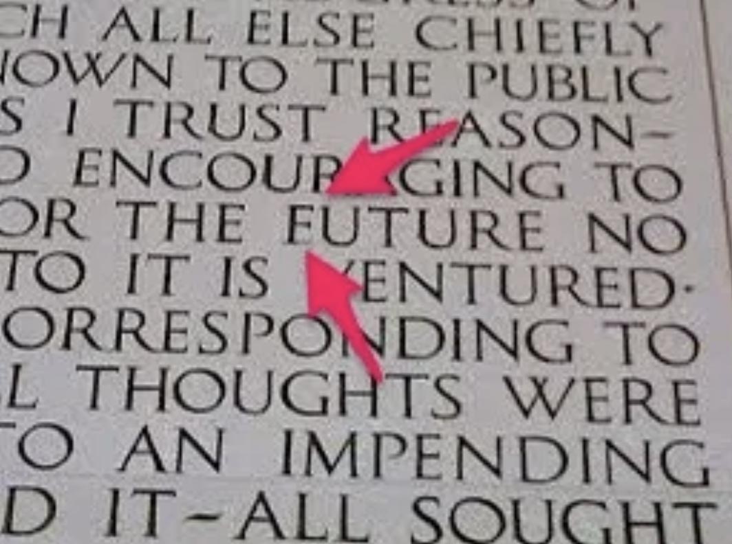
At least the text is not set in Gorton.
It’s hard to correct errors carved in rocks, but folks over the years have tried to fill the bottom bar of the “E”—we’re not sure how well Wite-Out works on marble. Discoloration makes it easier to spot the fix—although apparently very few visitors to the monument actually notice. Fortunately, marble carving doesn’t use Autocorrect or who knows how garbled the inscription would be.
Game of Fonts
Are you an avid typography buff? Do you play video games? If yes to both, then good news! Via Boing Boing, Charlotte Couderc’s Game Font Library is a reference that lets you find what typeface was used in a given video game. She says:
Game Font Library is a platform created to showcase and share the official interface fonts used in video games. As a Lead UI Artist for AAA games and a typography enthusiast, my goal is to collect and highlight the typefaces that define the visual identity of games, whether they come from user interfaces, logos, or graphic elements.This library features only official fonts provided by developers themselves—no recreations or approximations.
Boing Boing adds that “Game typography is an understudied and underappreciated field,” but finds that there has actually become some recent activities aiming to correct that.
Patrick H Lauke recreates retro game fonts for re-use. A beautifully-designed book, Arcade Game Typography, explores them in detail and is a stunning object in its own right. Damien Guard's fantastic collection of pixel fonts provides modern recreations inspired by retro aesthetics.
Map-to-Print
One fun type of interior wall décor is printed maps. Indeed, it’s probably safe to say that décor is the top use for printed maps these days, especially vintage or antique maps. One interesting service is called MapCanvas, which lets you print customized maps as posters.
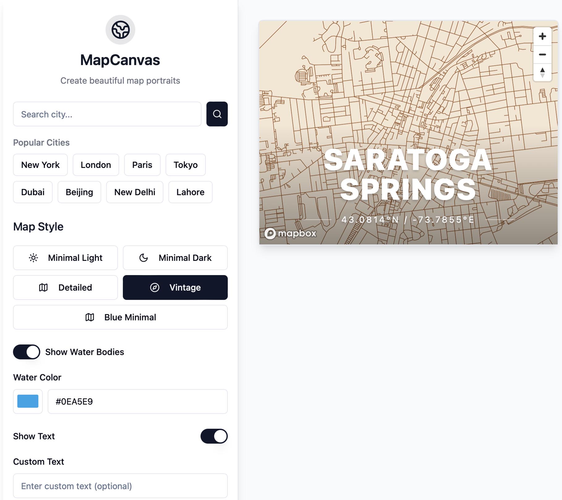
We transform cherished locations into stunning works of art, creating meaningful pieces that tell your unique story. Every location tells a story. At MapCanvas, we believe in capturing these narratives through beautifully crafted map designs that speak to your personal journey. Our designs combine precision cartography with artistic expression, creating pieces that are both meaningful and visually stunning. Each map is thoughtfully rendered to highlight the places that matter most to you.
If there is a limitation it’s that the maps are just text-less streets and bodies of water. The “Custom Text” only changes the big headline name of the city. Could be fun.
New Yorker State of Mind
The New Yorker magazine has long been known for its often iconic cover designs, featuring work from top illustrators. Françoise Mouly has been The New Yorker’s cover art editor for 32 years and, to commemorate the 100th anniversary of the magazine’s founding, she has co-curated an exhibition of New Yorker covers, “Covering The New Yorker,” on view at L’Alliance New York Gallery on E. 60th St. until March 30. The exhibit was co-curated by Rodolphe Lachat, L’Alliance New York’s President Tatyana Franck, and programming manager Clementine Guinchat. Print magazine talked to Mouly.
The idea emerged through conversations with Rodolph Lachat, editor of my book Blown Covers at Abrams. I had visited L’Alliance New York recently for their Sempé exhibit and was struck by Tatyana’s extraordinary energy in animating the space. I had also attended their animation festival featuring Lorenzo Mattotti, a frequent New Yorker cover artist. With the magazine’s centennial approaching, L’Alliance proved the perfect venue—they were eager to explore The New Yorker‘s history and to highlight my career as the Franco-American art editor over the past 32 years.
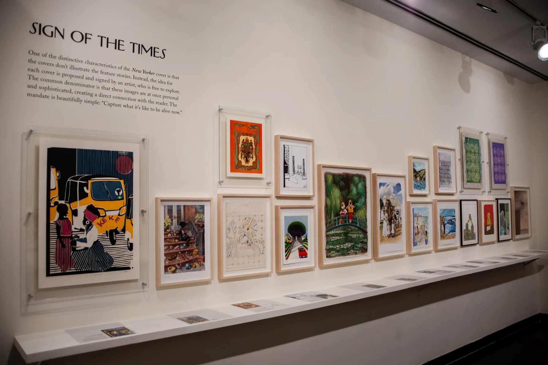
I am proud of having given so many different artists in that room their first break—almost everyone in the show—and opening up those august gates. But what I’m truly proud of is the range of their approaches. My mission as art editor has been to assemble a diverse roster of artists, each working at the height of their powers, rather than establishing a predictable “New Yorker style.” I think that has been my greatest accomplishment.
If you’re in New York, check it out.
Graphene Makes Its Mark(er)
Was it a good week for graphene news? It’s always a good week for graphene news! Ordinary marker ink can be turned into graphene. From (who else?) Graphene-Info:
Researchers from Graz University of Technology, University of Florence, Istituto Italiano di Tecnologia, and Scuola Superiore Sant’Anna have developed a process that lets certain common dyes—such as those found in everyday marker pens—to be converted into laser-induced graphene (LIG).
The team’s discovery originated from an accidental observation: certain colors in commercially available markers could be laser-carbonized, while others were merely ablated. Further spectroscopic analysis identified Eosin Y as a particularly effective precursor. While other dyes, such as Eosin B, showed some potential for laser-induced pyrolysis, the study found that not all xanthene-based dyes behaved the same way. The research determined that a combination of optical absorption and thermal stability plays a crucial role in whether a dye can successfully form conductive graphene-like structures.
There are benefits to this process and basic approach:
While further refinements are needed to enhance material uniformity and conductivity, this study provides a new perspective on how everyday materials can be repurposed for advanced electronic applications. By leveraging the properties of commercial dyes, this technique could lower the barrier to entry for developing functional carbon-based electronics, making graphene technologies more accessible across multiple fields.
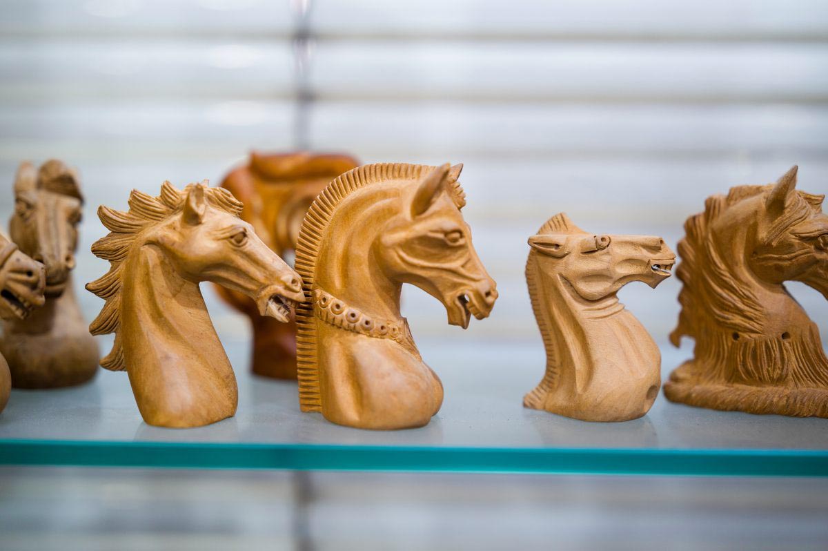
Knight Moves
As many of you know, the game of chess originated in India some 1,500 years ago, where it evolved from an earlier game known as chaturanga. And indeed there remains a class of artisan in India that specializes in intricately carved chess sets. Says Atlas Obscura:
These are no basic sets. The pieces make up elaborate professional and collector’s chess sets that sell for up to $4,000 U.S. dollars on the international market. That price is well deserved. Each set is a collective labor of love, with every component handcrafted by a man who specializes in one type of chess piece. (Traditionally, women are not chess carvers.) There are pawn makers, queen craftsmen, and the most coveted—the knight carvers.
Is it true that the carvers who specialize in bishops can only move diagonally? We wonder, but they’re quite strict about their niches.
“The knight carvers are only knight carvers,” says Rishi Sharma, CEO of the Chess Empire, India’s oldest and largest chess manufacturing company, which was founded in 1962. “The person who is making the queen, we don’t give him the pawn. Otherwise, he’s going to ruin it.”
Hmm…so “the men on the chessboard get up and tell you where to go.” Grace Slick had a point.
Of all the pieces, the most difficult to carve is the knight—and thus the most revered carver is the knight carver.
While pawns and other pieces can be shaped under lathes, the knights—resembling horse heads usually with wild flowing manes—are carved completely by hand. A chess carver won’t graduate from pawn to knight or any easier piece to harder ones, but instead will learn his craft from the start of his career, usually from their father or a mentor from one of the well-established chess companies. Surinder Pal, a knight carver at the Chess Empire, learned from his father at 18 years old. Now, he has been working on the craft for over 35 years. With his advanced and highly specialized skill, he can make up to 30 simple knights a day, or spend up to three days on a single ornate knight.
How much demand is there for chess sets these days anyway?
demand has fluctuated in recent years. The COVID-19 pandemic left many people secluded in their homes, leading to a boost in demand for many indoor games, says Sharma. In October 2020, that enthusiasm for chess was compounded by the release of The Queen’s Gambit, a series about a fictional American chess prodigy. “The Queen’s Gambit had a very big role in spreading awareness of chess,” Sharma says.
They are eagerly awaiting a second season, should there be one. But, alas:
With economic impacts and trade restrictions from ongoing wars around the world, the demand for high-quality chess sets has taken a hit, Sharma says. As producers in China and other countries circulate more plastic and inexpensive sets, the ornate wooden craft has become more of a luxury. But for some, the price is well worth it. “You won’t get the feeling of that craftsmanship in those plastic chess sets,” Sharma says.
But given that we’re the type of chess player that makes a horsey noise when moving the knight, that may be just as well.
Holding a Candle (or Two)
Have you always wanted to be Liberace but didn’t have the budget? Well, via Core77, British industrial designer Sebastian Bergne designed the Candloop, a simple way to turn a wine bottle into a candelabra.

Although originally designed in 1999, it’s been revived by German housewares brand Details Produkte. A steal at €20/$20 (wine bottle and candles not included).
Big Wheel
We can think of many candidates for the most terrifying phrase in the English language, but surely “electric unicycle” would be on the list. And, yes, it is apparently a thing, and not just for circus clowns anymore. Via the Autopian, electric unicycle (EUC) clubs have been around since 2022 and participate in various races.
Enter Seth Johnson and Amped Electric Games. He and his tribe of electric unicycle (EUC) disciples have been tearing up the EUC life since 2022, hosting and live streaming races all around the country, nay, the planet, in the hope of bringing some zen to the world.

There are plenty of different types [of EUCs] to choose from on Johnson’s website, with motors ranging from 750 watts to 4,500 watts. Some are meant for high-speed on a flat surface while others are focused on more torque to go up and down hills. You can opt for smooth tires or knobby off-road tires and battery sizes can range from a dinky 375 wH with 10 miles of range to 4,400 wH that can last for over 100 miles. Depending on your size and speed, of course. You’ll spend about $500 for an entry-level model to nearly $4,500 for a wheel with the biggest battery and motor.
Yeah, we’re probably not going to be doing that. Race courses can be fairly flat, but extreme courses involve very steep drops. Check out a recent race:
Igloops
OK, slight design flaw. Via Food & Wine, Igloo is recalling its 90-quart Flip & Tow Rolling Coolers because of “amputation concerns.”

“The tow handle of the recalled 90-quart Flip & Tow Rolling Cooler can pinch consumers’ fingertips against the cooler, posing fingertip amputation and crushing hazards,” Igloo shared in a recent social media post.
Apparently, the Consumer Product Safety Commission says the cooler’s handle has been linked to at least “12 fingertip injuries, including amputations, bone fractures, and lacerations.” Well, at least when you chop your fingers off you can put them on ice pretty quickly.
Still In a Pickle
Pickle Mania continues! Now Cheetos is getting in on the act. From (who else?) Food & Wine:
In February, Cheetos released its first-ever pickle flavor after it said fans had long pleaded for this exact seasoning. In fact, it says it’s the most requested Cheetos flavor ever. And it’s calling its “dangerously dill-icious” twist, Cheetos Flamin’ Hot Dill Pickle.
Regular readers of Around the Web (both of you) no doubt recall that WhatTheyThink has been tracking “pickle mania” for at least a couple months now, as pickles have blown up (figuratively, perhaps even literally) on social media.
#Pickle has amassed nearly four billion views on TikTok, while Pinterest named “pickles” as a top trend for 2025. It also said that Gen Z was of particular interest after the generation “turned Cheetos onto this match made in spicy-tangy heaven via social media.”
Pickles. Go figure.
This Week in Printing, Publishing, and Media History
February 17
1673: French actor and playwright Molière dies (b. 1622).
1781: French physician and inventor of the stethoscope René Laennec born.
1890: American publisher and politician and inventor of the first commercially successful typewriter Christopher Latham Sholes dies (b. 1819).
1904: Madama Butterfly receives its première at La Scala in Milan.
1933: Newsweek magazine is first published.
1996: The Rematch: In Philadelphia, world champion Garry Kasparov beats the Deep Blue supercomputer in a chess match.
February 18
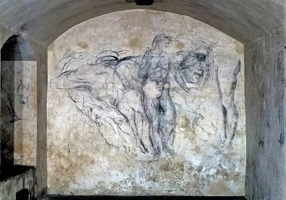
1564: Italian sculptor and painter Michelangelo dies (b. 1475).
1745: Italian physicist and inventor of the battery Alessandro Volta born.
1885: Adventures of Huckleberry Finn by Mark Twain is published in the United States.
1896: French author and poet André Breton born.
1911: The first official flight with airmail takes place from Allahabad, United Provinces, British India (now India), when Henri Pequet, a 23-year-old pilot, delivers 6,500 letters to Naini, about 10 kilometres (6.2 mi) away.
1930: Elm Farm Ollie becomes the first cow to fly in a fixed-wing aircraft and also the first cow to be milked in an aircraft. (That’s why you never want to be in Southwest’s C boarding group.)
1931: American author, Pulitzer Prize winner, and Nobel laureate Toni Morrison born.
February 19
1473: Polish mathematician and astronomer Nicolaus Copernicus born.
1847: The first group of rescuers reaches the Donner Party. They politely decline a dinner invitation.
1878: Thomas Edison patents the phonograph.
1949: Ezra Pound is awarded the first Bollingen Prize in poetry by the Bollingen Foundation and Yale University.
1951: French novelist, essayist, and dramatist, Nobel Prize laureate André Gide dies (b. 1869).
1952: American novelist, essayist, and short story writer Amy Tan born. Much joy luck.
1953: Georgia approves the first literature censorship board in the United States.
1956: American singer-songwriter and guitarist Peter Holsapple born.
1963: The publication of Betty Friedan’s The Feminine Mystique reawakens the feminist movement in the United States as women's organizations and consciousness raising groups spread.
2016: Italian novelist, literary critic, and philosopher Umberto Eco dies (b. 1932).
2016: American author Harper Lee dies (b. 1926).
February 20
1792: The Postal Service Act, establishing the United States Post Office Department, is signed by United States President George Washington.
1816: Rossini’s opera The Barber of Seville premieres at the Teatro Argentina in Rome.
1872: The Metropolitan Museum of Art opens in New York City.
1877: Tchaikovsky’s ballet Swan Lake receives its premiere at the Bolshoi Theatre in Moscow.
1902: American photographer and environmentalist Ansel Adams born.
1926: American author and screenwriter Richard Matheson born. He was legend.
1933: The U.S. Congress approves the Blaine Act to repeal federal Prohibition in the United States, sending the Twenty-first Amendment to the United States Constitution to state ratifying conventions for approval. And there was much rejoicing throughout the land.
1943: The Saturday Evening Post publishes the first of Norman Rockwell’s Four Freedoms in support of United States President Franklin Roosevelt's 1941 State of the Union address theme of Four Freedoms.
1946: American singer-songwriter and guitarist J. Geils born. No anchovies, please.
1962 : While aboard Friendship 7, John Glenn becomes the first American to orbit the earth, making three orbits in four hours, 55 minutes.
February 21
1804: The first self-propelling steam locomotive makes its outing at the Pen-y-Darren Ironworks in Wales.
1821: American publisher and founder of Charles Scribner’s Sons Charles Scribner I born.
1828: Initial issue of the Cherokee Phoenix is the first periodical to use the Cherokee syllabary invented by Sequoyah.
1842: John Greenough is granted the first U.S. patent for the sewing machine.
1848: Karl Marx and Friedrich Engels publish The Communist Manifesto.
1874: The Oakland Daily Tribune publishes its first edition.
1878: The first telephone directory is issued in New Haven, Conn.
1903: French-American essayist and memoirist Anaïs Nin born.
1925: The New Yorker publishes its first issue.
1947: In New York City, Edwin Land demonstrates the first “instant camera,” the Polaroid Land Camera, to a meeting of the Optical Society of America.
1958: The CND symbol, aka peace symbol, commissioned by the Direct Action Committee in protest against the Atomic Weapons Research Establishment, is designed and completed by Gerald Holtom.

1962: American novelist, short story writer, and essayist David Foster Wallace born.
1967: American author and screenwriter Charles Beaumont dies (b. 1929).
February 22
1632: Galileo’s Dialogue Concerning the Two Chief World Systems is published.
1857: German physicist, philosopher, and academic Heinrich Hertz born.
1878: In Utica, N.Y., Frank Woolworth opens the first of many of five-and-dime Woolworth stores.
1924: U.S. President Calvin Coolidge becomes the first President to deliver a radio address from the White House. We bet it was riveting.
1925: American illustrator and poet Edward Gorey.
1983: The notorious Broadway flop Moose Murders opens and closes on the same night at the Eugene O’Neill Theatre.
February 23
1455: Traditional date for the publication of the Gutenberg Bible, the first Western book printed with movable type.
1633: English diarist and politician Samuel Pepys born.
1821: English poet John Keats dies (b. 1795).
1898: Émile Zola is imprisoned in France after writing J’Accuse…!, a letter accusing the French government of antisemitism and wrongfully imprisoning Captain Alfred Dreyfus.
1904: American journalist and historian William L. Shirer born.
1927; U.S. President Calvin Coolidge signs a bill by Congress establishing the Federal Radio Commission (later replaced by the Federal Communications Commission) which was to regulate the use of radio frequencies in the United States.