Whenever I am in Chicago, I always make it a point to head over to the Art Institute. One of the museum’s most famous works is Georges Seurat’s A Sunday on La Grande Jatte–1884, the archetypal example of pointillism, a style of painting that creates an image using tiny dots of color. The canvas is 81¾ by 121¼ inches, what we might call “grand format.” In fact, it is a perfect analog of the problem we often have with digital printing, especially wide-format printing. If you look at the painting up close, you can easily see all the dots, and that Seurat must have a lot of time on his hands. But as you move further away, the dots become less visible until, by the time you’re across the room, the painting looks for all intents and purposes like a continuous-tone image. I don’t know that anyone has calculated the resolution of Seurat’s painting, but as you can tell, the perceived quality of an image is subject to a number of variables.
This is an issue referred to as “apparent resolution,” which can be quite different than a print’s actual resolution. An image designed to be viewed up close, like a photograph in a magazine, catalog, or direct mail piece, will have a different apparent resolution—and thus resolution requirement—than one designed to be viewed from a long ways away. Taking apparent resolution into account was the raison d’êtreof a new specification for sign and display graphics just released by the Ghent Workgroup.
Founded in 2002, the Ghent Workgroup (GWG) is an international organization of graphic arts users, associations, and developers tasked with creating best practices for printing, publishing, and packaging workflows. The recommendations and specifications the organization develops are designed to make it easy for graphic arts professionals to create, process, and exchange consistent and high-quality print files for a wide variety of applications. The group first tackled publishing, then moved into commercial print, and then packaging and digital printing. Late last year, GWG introduced a new specification for sign and display graphics.
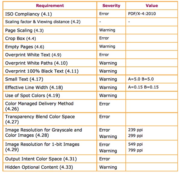
The specification is based on two key variables: the average viewing distance (that is, how far away is the viewer going to be from the graphic) and, if needed, the scaling factor (how many times the job needs to be enlarged before being printed). There are also other “legacy” factors built into the specification that are common to other kinds of print applications, like color. “A lot of the work that we are doing really feeds off earlier work that we’ve done,” says David Zwang, Chair of the Ghent Workgroup’s Executive Committee, “so it’s not like we’re starting from scratch.”
At the same time, shops need some kind of common ground as they take on an increasing variety of print applications, from commercial print, to packaging, to wide format.
When we say it’s a “specification,” what exactly does that mean? Essentially, the GWG Sign and Display Preflight Profile is, as the name indicates, a set of PDF profiles, or rules a PDF file has to abide by in order to be in compliance with the specification. It is closely tied to the preflighting process. When you preflight a PDF file in a program such as Enfocus PitStop or callas pdftoolbox, it will flag you if the file violates any of the rules that are spelled out in the profile. If you’re playing along at home, it’s based on the PDF/X-4 ISO Standard, which is in turn based on PDF 1.6. When preflighting a file, the GWG Preflight Profiles use ISO PDF Standards as a base, and then add additional checks based on the specific industry segment the profiles were designed for—in this case, sign and display. The specific checks for sign and display include a minimum image resolution that is based on viewing distance.

A year and a half ago or so, the GWG felt the time was right for a sign and display spec. “The growth of sign and display was significant enough that we needed to take that on,” says Zwang.
When thinking about output parameters, the GWG began with an enumeration of the issues specific to sign and display. “Color, obviously,” says Zwang, “all the things around metadata, layering, different kinds of versioning requirements, language requirements, and so on.” All of these issues are already part of previous GWG specifications so could easily be imported into a sign and display spec. “Resolution is always a big issue,” says Zwang. “Resolution, type size, minimum font sizes, etc.” As any printer knows, image resolution is an issue in any size printing, but wide-format printing adds a unique wrinkle—apparent resolution. “It starts to get really interesting because if it’s a point-of-purchase display and it’s right on the counter in front of you, the resolution has to be high enough, and the type has to be big enough, for you to read it.” “Big enough for you to read it” means one thing when it’s a counter display. “But,” adds Zwang, “what if it’s a billboard on a highway? A minimum of six-point type ain’t gonna cut it.” So the specification includes an algorithm that changes the preflight and design requirements based on intended viewing distance.
GWG began working on the specification about a year and a half ago, and has been doing extensive testing. “Once we’ve developed it, we need to throw it out into the wild and do some testing with it and see if it’s going to work,” says Zwang. “We tested it and everybody said, ‘Yeah, this is great.’ We tweaked it here and there, but it was a winner and we released it.”
The testers included printing associations who are members of the Ghent Workgroup, and especially hardware and software manufacturers—basically, says Zwang, “all of companies who have a stake in it, who all have a dog in the fight. We wanted to make sure that it was going to work for them because ultimately it’s their equipment or their software that’s going to be used and their customers are the ones who are going to use it.”
You can download the GWG Sign and Display Preflight Profile for free here.
The GWG is likely going to take on textile printing next, says Zwang.


