A Ferndale, Mich. – based print, direct mail and fulfillment company, Allied Printing Company invites others to "Rethink Ink".
Celebrating more than 60 years of business, Allied has long helped clients push the envelope on traditional print, direct mail, eCommerce, data management, warehousing and fulfillment services. Now the full-service firm is rethinking its own future with a vision that’s boldly reflected in the company’s strategic growth plan and comprehensive marketing campaign.
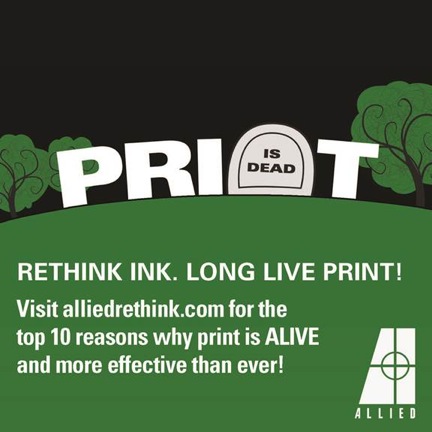
Rethink Ink. It’s simple, yet impactful. It dispels misconceptions that permeate the market to remind business professionals that print remains a vibrant component of any company’s promotional effort. Print is one of the most sustainable and effective marketing applications today and Allied’s new campaign spotlights the highly sophisticated solutions that can come from rethinking the role of print in marketing campaigns.
Key elements of Allied’s Rethink Ink strategy include:
- Clever graphics and promotional text – The eye- and ear-catching appeal of Allied’s direct mail and advertising initiatives sets the firm apart from its industry counterparts to help underscore the unique products and services Allied provides to each and every client.
- Bold brochure and website – Also part of the effort to distinguish itself within an ever-changing business climate, Allied has launched a new brochure and website, including a blog, reflecting the company’s heritage and dedication to Detroit. To accomplish this, Allied is projecting a Detroit-centric attitude and showcasing the images of eight metro Detroit photographers in its new marketing collateral. The brochure’s photographs capture the change sweeping Detroit.
- Advertising – A series of targeted direct mail pieces (examples attached), as well as print advertisements and videos are also part of the comprehensive campaign to help Allied clients rethink the possibilities and shatter the misconception that print is passé.
- New logo –Even Allied’s new logo communicates the company’s technical advancement and focus on the future. The stylized “A” is contemporary, while the printer’s registration mark displayed in the letter’s center serves as a nod to the company’s longevity and commitment to quality and craftsmanship.