Hi. This is Frank Romano for WhatTheyThink.com I want to talk to you today about one book, The Bentons. What, you never heard of The Bentons? Well again, most of us today don’t have that base in history that we used to have. At one time as we grew up in the industry, got educated in the industry, there was a lot of history, a lot of publications about it. But as time went on we became much more pragmatic. We really tended to look at technology and productivity and running our plant, and we really lost track of all the things that happened in the past.
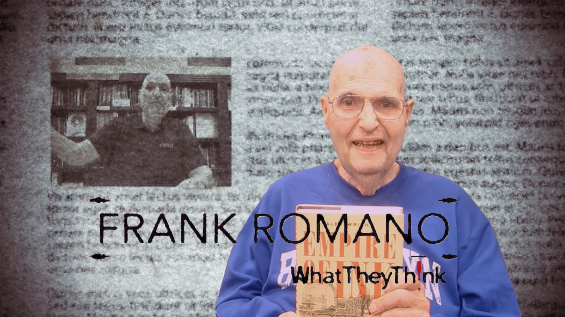
Patty Cost wrote this book almost 30 years ago as her Master’s thesis at RIT and it was just published by the RIT Cary Press. It didn’t take her that long to finish it but in the way she had a family—three great kids, many of them off to college—and now has the time, or had the time, to go back and make this one of the greatest books ever. Because the two Bentons, Linn Boyd Benton and Morris Fuller Benton, probably had a greater impact on the printing industry than any other two individuals.
First of all the father, Linn Boyd Benton. In the late 1890s he invents a machine called the pantograph. Now it doesn’t look like very much, but when you take a pattern of the shape of a letter down here and you trace it up here it cuts a punch. It cuts the little punch that you then punch into brass or some other softer material in order to create the mould so you can make a lot of type. And so the Linotype Company was one of the first to take it up. The ATF organization took it up. And around the world the people who made type used the pantograph. I’ve seen a few of them. I saw one at the Type Museum in London. There are one or two of them in the United States that you can have access to. They’re not easily accessible. I don’t think there are any that are functional as far as I know, although some—I think there was one company that claims that there’s one that’s functional.
But this opens up the market for type because Mercantile had this very serious problem with the Linotype. He had to have each character individually cut by a punch cutter, which is probably what Gutenberg did. It didn’t change very much over several hundred years. But when the word of the pantograph got out, Philip Tell Dodge, the President and former patent attorney for Linotype, went to Wisconsin to talk to Benton about this machine; brought one back and experimented with it, and it just changed everything. It allowed Linotype to create a very rich typeface library. It allowed ATF to create a very rich typeface library.
And that’s where the son comes in, Morris Fuller Benton. He was not an inventor as such, he was a type designer. And if you go to his Wiki page on the list of typefaces that he did, it’s a gigantic list which, by the way, Patty has documented in the back of the book. And by the way, phenomenal information, documentation and pictures of them, their work and their lives. You almost get to know them on a personal level. Morris Fuller Benton officiated at American Type Films. ATF was formed in 1890 or so when the 23 largest type foundries merged together to form this new conglomerate. And the reason is most of the type foundries were going out of business because the linotype machine was literally a foundry in and of itself. And so Morris Fuller Benton then started on this program.
And many of the typefaces that we use today, the Centuries, were created by him. Now some of them he designed, some he designed with others, and some were designed with others and he sort of managed what they did. The Cheltenham series which Bertram Goodhue did. Alternate Gothic, by the way, all of them; Franklin Gothic. Typoscript, Cushing, Wedding Text which by the way is still used at a very high level. Engravers Shaded, Engravers Old English, Clearface, Newton, News Gothic which many people use today. He created the first real Bodoni series. By the way, he believed in series so he had all of the different weights and all the different versions of the fonts. Hobo is still used today in the various series. Copperplate Gothic which is still used on business cards in some cases. Cloister—by the way, Souvenir, the typeface I’ve criticized for years and years, he only did one version of it and then later on ITC took it to another level. The Goudy series. The Garamond series, not the original Garamond but the one that most people recognize. He did the version of Baskerville.
I’m skipping over some of these by the way because you wouldn’t even know their names, although today they have been modified to a large extent. He did Broadway, the font that evokes the feeling of art deco. Boomer, Bank Gothic, Rockwell, Thermotype came in three widths. And oh, I guess that would be it of the fonts that you would generally have a knowledge of. In any case, those two gentlemen had more to do with creating the typographic base of the printing industry than any other individuals, although there have been great designers over the years. One, you had the father who created the mechanical way for doing it, and the son who created the artistic way of doing it. It’s all documented in The Bentons. RIT Cary Graphic Arts Press, you can find it there. You can find it on Amazon. You can find it at Oak Knoll Books. It’s a wonderful book and I recommend it highly.
And that’s my opinion.