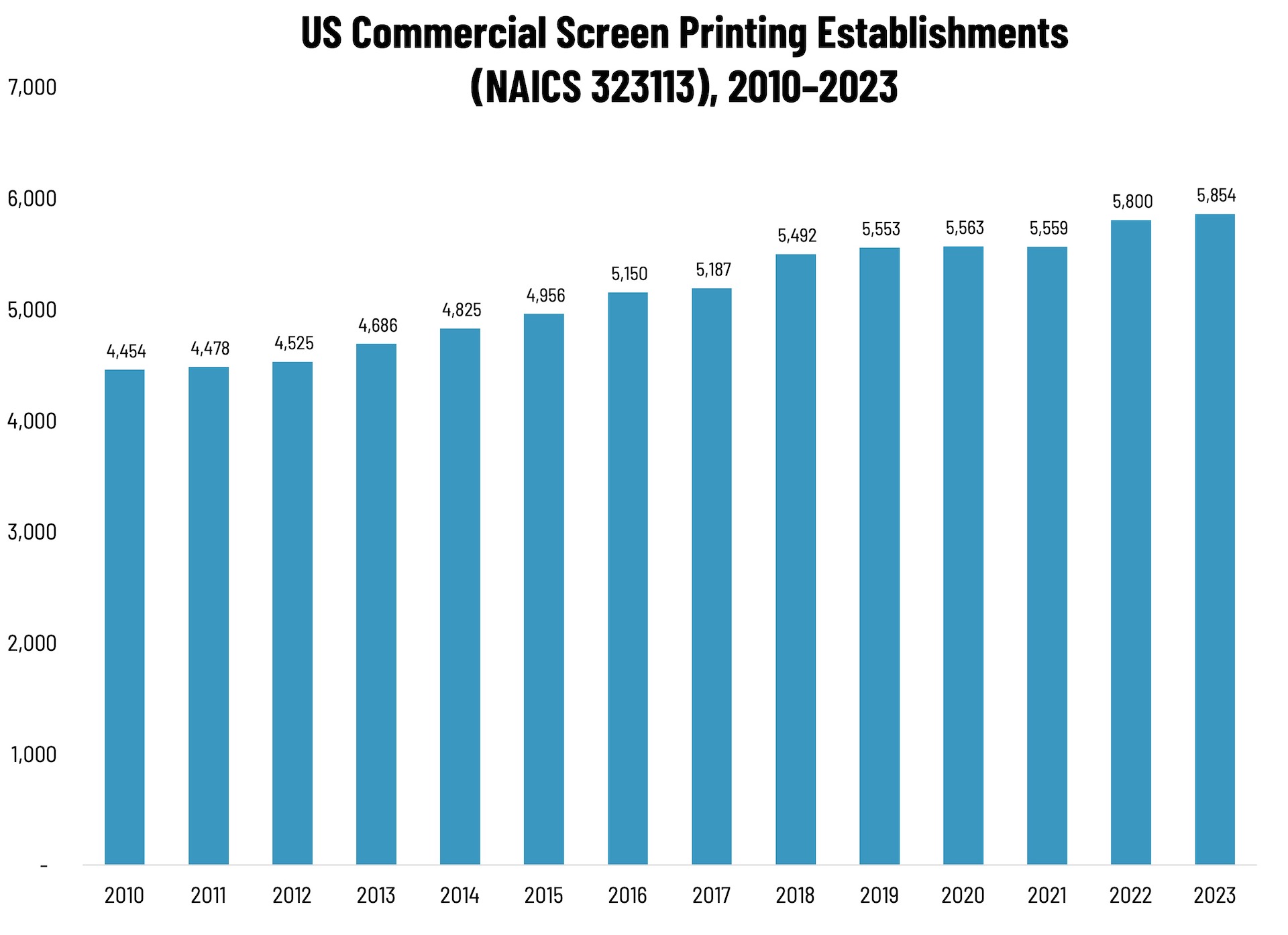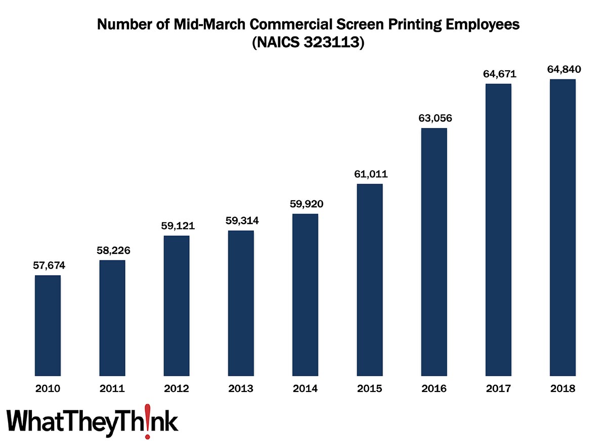
In 2010, there were 57,674 employees working in US commercial screen printing establishments (NAICS 323113) and by 2018 that number had actually increased +12.4% to 64,840.
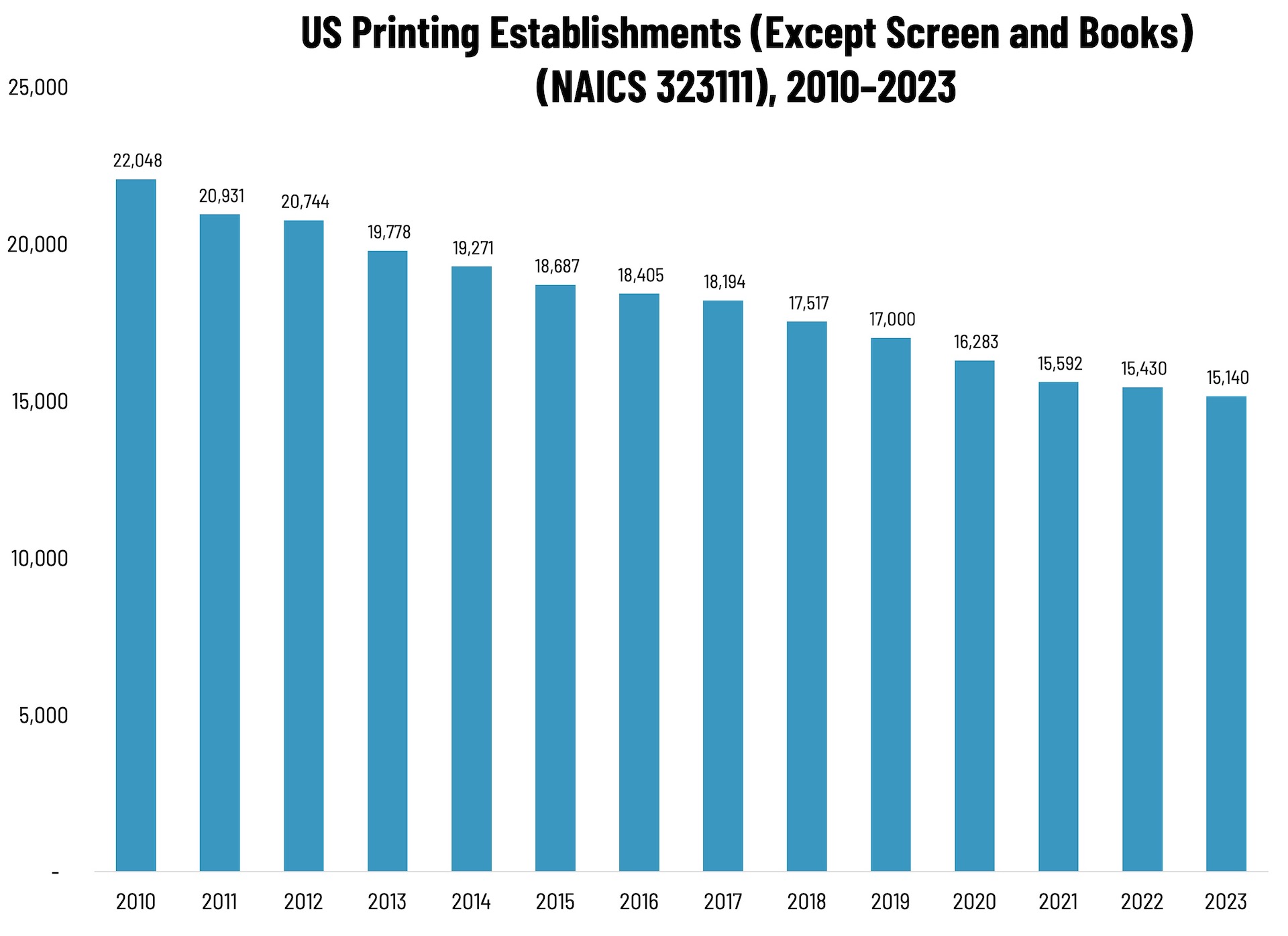
When we last looked at screen printing establishments, we noted that establishments had seen consistent growth from year to year, almost the exact opposite of general commercial printing, where establishments have been consistently declining. Likewise with employees. We attribute this to the rise of specialty printing. Screen is commonly used to print on textiles (T-shirts being the emblematic example), and these kinds of items really started to take off in the past decade. Couple this with the rise of short-run and digital technologies that can complement screen, and as demand for specialty items has increased, establishments and thus their employee counts have grown to take advantage of this hot print application area.
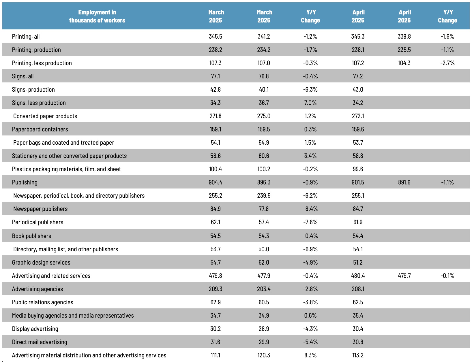
These counts are based on data from the Census Bureau’s County Business Patterns. Every other week, we update these data series with the latest figures. These counts are broken down by printing business classification (based on NAICS, the North American Industrial Classification System). Next up, we will be looking at employment in:
- 323117 (Books Printing)
- 32312 (Support Activities for Printing—aka prepress and postpress services)
These data, and the overarching year-to-year trends, like other demographic data, can be used not only for business planning and forecasting, but also sales and marketing resource allocation.
This Macro Moment
Folks who have been round these parts for a while may recall that after the Great Recession, Dr. Joe used to track what he called “recovery indicators,” six economic data points that, when they all started moving in lockstep in a positive direction, indicated that the recession would be “officially” over. Those indicators were the NASDAQ, ISM non-manufacturing new orders and imports, ISM manufacturing new orders and imports, and proprietors’ income.*
Likewise, Calculated Risk, our favorite economics blog, has been tracking the COVID-19 recovery via “Seven High Frequency Indicators for the Economy.” Given that the pandemic has not affected all areas of the economy equally, tracking the rebound in certain sectors—most of which are the printing industry’s top verticals—can give us a sense of how we’re doing. The sectors predominantly comprise travel and entertainment, and they are:
- Air travel, via the Transportation Security Administration’s travel numbers. (The seven day average is down 58.8% from last year.)
- Restaurant dining via a “7 day average of the year-over-year change in diners as tabulated by OpenTable for the US and several selected cities.” “Dining picked up during the holidays. Note that dining is generally lower in the northern states - Illinois, Pennsylvania, and New York. Dining in Texas declined sharply due to the weather.”
- Movies via domestic box office figures from BoxOffice Mojo. “Movie ticket sales were at $8 million last week (compared to usually around $200 million per week at this time of year).”
- Hotel occupancy rate week over week from STR/HotelNewsNow. (Year-over-year hotel occupancy is down 29.0%.)
- Gasoline supplied via U.S. Energy Information Administration (EIA). (Gasoline supplied was about 95.5% of the same week—February 12—in 2019.)
- Transit “From Apple: “This data is generated by counting the number of requests made to Apple Maps for directions in select countries/regions, sub-regions, and cities.” “Public transit in the 7 day average for the US is at 50% of the January 2020 level. It is at 44% in Chicago, and 32% in Houston (weather related decline).”
- New York City subway usage from the MTA’s public turnstile data.
While they are not perfect (Bill McBride, who writes the CR blog, adds specific caveats for each data source) and are not updated on the same schedule and thus don’t correspond to the same weeks, these data points indicate the extent to which people are increasingly (or decreasingly) out and about. McBride updates these each week, and if we’re ambitious, we may in the future compile the changes in a table à la Dr. Joe’s recovery indicators. For now, though, it’s worth clicking through—there are charts galore and links to the original data sources.
As vaccinations continue, it will be interesting to see what impact they have on these various data points and if we are indeed seeing a rebound in some of the sectors most acutely affected by the pandemic.
* They never did indicate that the recession was over, even by 2016, so we’re not sure** if it was the economy and the recession never did end, or if the choice of indicators was a bit flawed.
** We’re pretty sure…