In the past I have recommended a site maintained by the St. Louis Federal Reserve Bank that provides easy access to economic data. This is a highly recommended site. The site has been expanded and the software has improved greatly. Chartmaking is easier than ever. The site has been updated for easier access on smartphones and tablets. Nearly every week the site reports the addition of new data series and new sources of data.
Here's a chart that was not possible in FRED last time I wrote this. We had to hunt down the data from the Bureau of Labor Statistics and make our calculations in Excel. Now those data are part of FRED's expanding data base. The chart shows the Producer Price Index for commercial offset printing and digital printing compared to the Consumer Price Index. I was able to adjust the data so they could share the same base year. FRED also allows you to download the data in your chart into a spreadsheet file, and also export your images, and create a link that you can share with others.
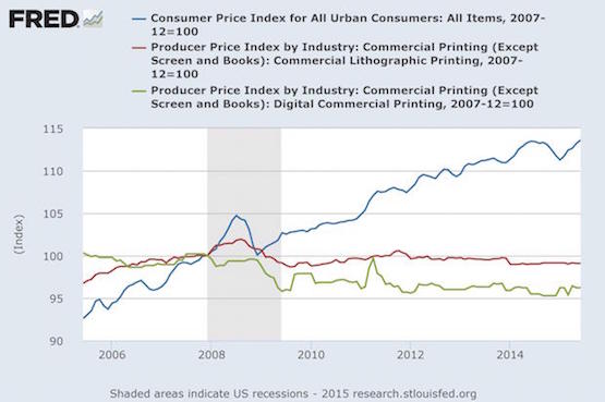
What's it mean? First, the prices of commercial printing have not kept up with inflation. In other words, print is cheaper every day. Second, by comparing print prices with the Consumer Price Index, we see the “margin gap” that print businesses have to make up because of that disparity in other ways. This often means cutting costs, increasing productivity, and/or changing their product offerings. Factors of production, such as wages and benefits, energy for running plants, production materials, and others, typically follow the CPI in the long run. As noted in a presentation we made in 2011 (slides available in SlideShare), and a column from 2008, the inflation adjustment method you use has to be appropriate to the task and can yield different insights. I have a preference for the CPI but also use the others in my private work. Using FRED can be addictive if you're a stats geek. So if someone asks what you're doing in your office, just tell them you're “playing with FRED.”


Discussion
Join the discussion Sign In or Become a Member, doing so is simple and free