New brand Identity Underscores Heidelberg’s Strategic Reorientation
Press release from the issuing company
Heidelberger Druckmaschinen AG (Heidelberg) is associated with the printing industry like no other company in the sector. For generations, the company has shaped the industry to make a success of printed communication in all its different forms. To maintain its position as the most reliable partner in the printing industry, Heidelberg has undergone extensive strategic development and systematically adapted its portfolio to today’s and tomorrow’s customer needs and requirements. The company is underlining this reorientation with the launch of a new brand identity.
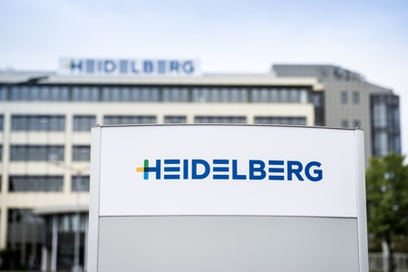
This development at Heidelberg will help customers remain successful in a changing market environment – to ensure lasting profitability, customers need a comprehensive and tailored package of services geared toward effective and reliable production processes, the right equipment for cost-effective investment, and exceptionally easy access to all tried and tested consumables.
The new brand identity reinforces the customer benefits that Heidelberg is offering through its all-inclusive portfolio of digital and offset printing, workflows, consumables, and services. The focus is no longer simply on equipment, but on the integrated overall process and all the requisite components.
New brand identity reinforces integrated end-to-end processes
The Heidelberg portfolio is based on three pillars – Services, Equipment, and Consumables. Each of these three areas of customer contact is being given its own color-coded identity – yellow for services, blue for equipment, and green for consumables. These colors are also used in the initial letter of the redesigned company logo. The new colors maintain a connection with the traditional Heidelberg blue, a symbol of the company’s competence, its unique global network, and all its staff. The first letter of Heidelberg will also be used as a brand icon alongside the new logo.
Another level of design – thematic icons
As another new design element, Heidelberg will be using thematic icons to highlight the specific benefits for customers. As a result, communication will no longer focus on technical features and functions. Instead, Heidelberg will put customer benefits center stage in all its communication to make it easier for customers to find what they need in complex scenarios. It’s all about making things simpler, quicker, and less complicated.
Image 6: An example for thematic icons. In future, Heidelberg will be using this icon to represent the following customer benefit: Ensuring maximum availability for a print shop’s production equipment is crucial to its success in business. By delivering quick access to services, expert knowledge, original parts, and consumables at all times, Heidelberg helps its customers achieve significant improvements in planning their own production and portfolio.
How? With more than 3,000 specialists in 170 countries, Heidelberg boasts the largest service network in the entire industry. An intelligent knowledge management system is in place so that the right know-how is always available wherever it is needed. What’s more, with four logistics centers around the world, the logistics system is equipped to dispatch almost all service parts within 24 hours.
In line with this new principle, these icons will be used to provide new levels of structure in the company’s communication and thus help customers orient themselves.
Brand identity unveiled at opening for new demo center
Visitors got a sneak preview of the new Heidelberg brand identity during the inauguration of the Print Media Center Commercial (PMC Commercial) at the Wiesloch-Walldorf site at the beginning of June. Over 500 customers came from all over the world to mark the opening of the PMC Commercial, which covers an area totaling over 4,700 square meters. The visitors were treated to practical demonstrations of integrated print production with a constant focus on customer benefits. The centerpiece of the PMC Commercial is an innovative presentation platform that uses interactive media to illustrate the aspects of workflow, consumables, and services and highlight their role in the overall process from the customer’s perspective when it comes to delivering high-quality, stable production.
Together with the Print Media Center Packaging, Wiesloch-Walldorf can now lay claim to the world’s largest demonstration center for commercial and packaging printing in the industry.
Run-up to drupa 2016 begins
Launching the new Heidelberg brand identity at the inauguration of the PMC Commercial also marked the start of its global roll-out. By the time the drupa trade show is held from May 31 to June 10, 2016, in Düsseldorf, the new branding will have been introduced and implemented worldwide. Particular emphasis will be placed on any international adaptations required for the realignment, as market and customer focus are key here. In the past, innovative technologies may have been enough to ensure future success, but now this depends much more on solutions designed to meet specific customer requirements.

WhatTheyThink is the official show daily media partner of drupa 2024. More info about drupa programs
© 2024 WhatTheyThink. All Rights Reserved.



Discussion
By Charles Gehman on Jul 01, 2015
What a complete waste of time! Strongly advise stopping payment on the check written to the consultants who came up with this utter nonsense,
Of course, I mean this in the nicest way possible.
Great products sell, not icons and color schemes that require explanation.
By Patrick Henry on Jul 02, 2015
In fact, Heidelberg has been implementing and communicating its revised business strategy for the last three years, and apparently with some success. The company says it now derives half of its revenues from software, consumables, and services. So, the rebranding is fully consistent with objectives set and achieved.
As for the logo, it has undergone a modest and tasteful change that delivers an updated message without obscuring the identity of the source. I like it, and I say the creative consultants who came up with it have properly earned their money.
By Charles Gehman on Jul 03, 2015
So Patrick, success meaning sales are "up"? I would ask you, as the wonderful communicator you are: who is the target audience for this message? It must not be me, because I have no idea what it is saying. What is the benefit for the customer?
It implies that the benefit is a better understanding of what the company is doing, but to me it just sounds like the same old, same old with new colors and icons. Maybe something is lost in the translation.
Today, buying this company's products is a risky gamble. They view the print market as being in a "constant state of flux" (quote from their website under the Digital Press section). A state of flux is defined by uncertainty, which is where they are, not the market. The print market is in constant change.
I also understand that their presence at the upcoming Drupa is tiny. It is ironic because for so many years, they deployed a massive presence unnecessarily because their loyal customers would buy nothing else.
It's sad to see this venerable institution in this state. Where is the leadership?
Discussion
Join the discussion Sign In or Become a Member, doing so is simple and free