hubergroup Strengthens Its Profile with a New Brand Image
Press release from the issuing company
- Website with a fresh look: personal, intuitive, customer-oriented
- New company logo symbolizes a strong appearance as a global player
hubergroup is a traditional family business. With over 255 years of company history, it is rich in experience and know-how. In order to position itself even better for the future, the printing ink manufacturer has taken a number of measures such as a relaunch of its website and further development of the logo. These are now visible and tangible for the customer.
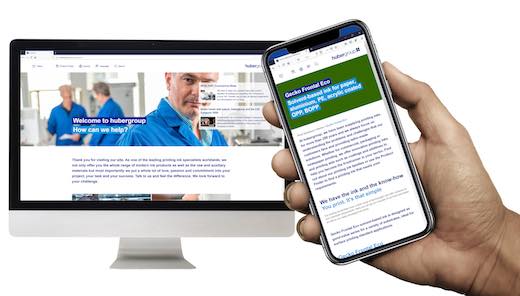
New website with a personal touch
hubergroup has a new online presence. The site is based on a revised corporate design, which is significantly streamlined in its look and thus gives the website a fresher and more modern look.
The dominant colour is reflex blue. As hubergroup is the last big manufacturer of the pigment alkaline blue, the printing ink specialist has given it more weight in the course of the redesigns.
Customers will benefit from the new website, as the newly designed product finder will help them find solutions even more quickly and clearly.
One of the facts that customers appreciate about hubergroup is the intensive, personal contact they have with the company. As a result, the website now features individual contact persons for each country, so that customers worldwide can contact the appropriate competent local advisors directly with their specific requirements.
With the new website, the printing ink manufacturer presents itself in a much more approachable way. The visual language has become more personal and emotional, with hubergroup relying exclusively on its own employee portraits in the design, thus emphasizing authenticity.
To reflect the global nature of a world market leader, the content is available in a large number of national languages of the hubergroup locations and has been optimised for mobile use in line with today's standards.
Global orientation - also in the logo
The corporate logo is the central element of a brand. It is unique, unmistakable and represents the heart of a company. As hubergroup, with over 30 locations worldwide, continues to grow in an integrated manner across its global footprint, this is also reflected in the new logo. hubergroup is a company that offers its customers around the world consistently high product quality and service standards. The group functions as a unit, which is now also visually represented in the new logo.
For more information, visit our website www.hubergroup.com and our corporate blog blog.hubergroup.com or follow us on Twitter and LinkedIn.


![]()

WhatTheyThink is the official show daily media partner of drupa 2024. More info about drupa programs
© 2024 WhatTheyThink. All Rights Reserved.
Discussion
Join the discussion Sign In or Become a Member, doing so is simple and free