The “boiled frog” syndrome is not true, but that won’t stop us from using it in this column since its purported wisdom applies. The story goes, usually told by consultants, is that a frog put into warm water will not react to a gradual heating of the water to its boiling point, and die from boiling to death.
It is natural to consider conditions around you as “the way things are supposed to be” when they persist for a long period of time. This is natural. The perception of what is normal is affected by additional information that is considered new, especially when that is historical perspective. It’s almost impossible to get that perspective into the mix.
This has been particularly clear in the nature of “soft economic data” versus “hard economic data.” Soft data comes from surveys about feelings or perceptions. Hard data comes from monitored behavior and the results of the choices and actions people take; it is historical by definition. These data can’t be forward-looking by itself but needs an understanding of trends through some kind of analysis and an understanding of what might change those trends in the future.
Survey data fills in the gap that historical data cannot provide at a particular point in time. The “future” is not historical yet, which is why there is such interest in confidence surveys and assessments of current conditions.
A good example is what’s happened to confidence surveys since the election. The chart is from the Gallup poll:
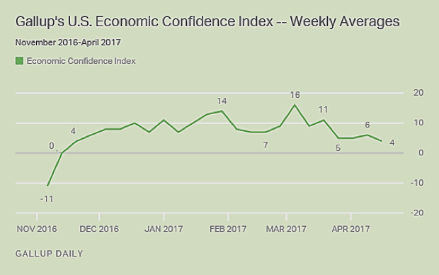
Note how the lead-up to inauguration time led to confidence rising because there would be changes in regulations, health care programs, and tax law changes. In recent weeks, notice how it has decreased to levels just after the election. During this period, economic data have been sub-par, and Q1’s GDP may be worse yet, as the Atlanta Fed’s GDPNow is estimating Q1-2017 GDP at a tiny +0.5% (I suspect it will be closer to +1%). You could make the case that economic conditions are equal or slightly worse now than they were when the Gallup confidence measure was at -11 prior to the election.
There was a saying in the old TrendWatch business of yours truly: decision-makers can understand the past, they can take a good guess about the future, but they really have a problem understanding the present. Surveys like this are supposed to help that situation, but they often just divert attention away from realities with a “nice to know” when managers are looking for the “must know” actionable perspective.
Surveys about confidence may be among the most worthless data in today’s economics. We’re pay attention to them in the hope they can reveal some upcoming or unique turning point. The short-term traders of equities and bonds and contracts seek short-term price movements. They’ve come to know that survey data are often catalysts in price volatility of the instruments they trade. Those traders don’t really care about the surveys being right, they just care about how they affect prices until the next data point comes along.
This does not mean that decision-makers should not use these kinds of “soft” data. They should be aware of them and be skeptical about them. Our industry has had its share of the soft data that report preferences for one communications medium or another. Preference is not action, and it’s definitely not dollars. If all the preference surveys were solidly true, there would be no need for salespeople.
The likeability of print in surveys had nothing to do with its volume, page counts, page size, frequency, and run lengths. People went about their lives with smartphones, search engines, social media, and more. Like Mom said, watch what people do and don’t always listen to what they say.
I’m now becoming concerned about another factor: the mix of age cohorts in the confidence survey data is showing a disconnection between the experiences of the different age groups that make up the survey participants.
At a recent event I attended, a speaker about human resources and organizational advancement reminded me that by 2020 more than half of the workforce will be millennials. I’ve had a similar reminder in this column that if you were born in 1982, you have never held a full time position during an economic boom. The experiences of each generation shapes the way they view the world, and the context of what they believe is normal.
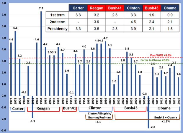
Look at real GDP since 2000 through the eyes of someone born in 1982. By the time they graduated from high school, growth was sub-par, and made worse by the “great recession” and the Fed actions that many came to describe as “the new normal.” They have little perspective about the conditions that preceded their workforce entry, and that those conditions were very different. It’s fascinating because the high growth years of 1994 to 2000 of +4.1% (which I call Clinton/Gingrich/Gramm/Rudman in the Presidential GDP chart) does not seem so long ago. It might as well be in the Stone Age for someone now in their early or mid-thirties whose adult work life began during the Bush43/Obama years of +1.8%. There’s no sense that since the end of WW2 that economic growth has averaged +3.3%; none of the newer entrants in the labor force knows what that feels like.
It’s that difference in experience that affects the nature of survey data and creates a discrepancy between confidence measures and what plays out in the actual data on a historical basis.
When researchers query about their assessment of today’s conditions or expectations, new generation workers have a different definition of “good” or “bad” than others do. As these workers represent a larger share of the consumer marketplace, their perceptions of good and bad is becoming a greater portion of the survey response.
The chart shows this pattern of how consumer sentiment no longer reflects or is close to economic conditions in recent years as this group’s numbers in the workforce have increased. The disparity begins in earnest sometime in late 2014. All of the data series in the chart, consumer sentiment (the thick red line), real GDP, inflation-adjusted manufacturing shipments, and labor-force-adjusted full time employment, were indexed to the beginning of the recession in December 2007.
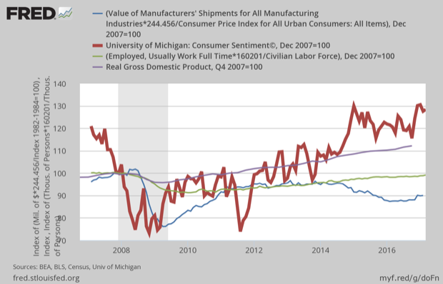
In the past, sentiment indicators were viewed as affirming actual data and sometimes being a leading indicator or a change. The chart appears to show that this confidence measure previewed the recession and the recovery about a year in advance.
Remember: all of these data series were set to December 2007 as being their common point because that is when the recession began. Since then, the confidence measure is up almost +30%. Real GDP (purple line) is up almost 12%. Important economic measures of labor force adjusted full time employment is still below the recession start (the green line; short about 1.5 million full time jobs) and inflation adjusted manufacturer shipments is -10% lower (blue line).
The reason for the disparity may very well be the exit of long-time workers for many reasons, especially retirement (and mortality) and the entrance of new and younger workers. The perception of economic conditions and what they perceive as “normal,” and when some economist and investment gurus refer to as “new normal.” Europe has accepted slow economic conditions for decades, considering them “normal.”
This has many implications for management, but here are some practical ones to be certain that you are communicating correctly and sharing the same frames of reference.
First, insist on some kind of quantitative and objective measure of what’s good and what’s bad, especially with new workers and younger managers. Not everything that can be measured should be, so be careful about insisting that this be done. Make sure that numbers and assessments have proper context and meaning that everyone understand what good and bad really mean.
Second, whining about the past and telling stories about it goes nowhere. Let data tell the story as much as possible, especially in management reports. Saying “things were different then” does little unless there are facts behind it. Are you measuring the right things? Do your reports have past, present, and future perspectives to them that ensure current data are presented in the right context?
Third, get out of the office. Experience in the field with customers, suppliers, vendors, influencers, and others are very important. It’s easy to be trapped in the four walls of “this is the way we do things.” Ask questions. “Why” is still the most important management question. “I don’t know” is a good answer only if it leads to finding out “why” or setting priorities for learning.
Fourth, be aware of feelings but always seek “unshakable facts” as Harold Geneen used to call them. Part of knowing whether facts are unshakable or not is knowing how those facts were gathered. In the case of the confidence and similar surveys, that seems to be more important than ever when the life experiences of respondents can be so different.
Fifth, when conducting field research and survey work, always learn as much about your respondents as possible. Make sure reported data are weighted to reflect the demographic or other appropriate profile of the marketplace. These different generational perceptions can be mined as market segmentation opportunities.
Sixth, a key reason the industry missed out on the opportunities of the digital media era was the lack of age diversity in the ranks of ownership and leadership. The age gap between sales personnel and communications decision-makers is wide might be our industry’s biggest problem today. If two age groups can view “normal” so differently, imagine how different the perceptions of goals, objectives, quality, cost, and other important aspects of purchase decisions might be.


Discussion
By Wayne Lynn on Apr 24, 2017
It's no wonder that older sales reps don't, on average, hit good numbers any more. If, as an older owner or executive, you continue to whine about lack of performance, maybe you should look in the mirror and ask, "Do I understand what's going on?"
Great perspective adjustment for us Joe!
Discussion
Join the discussion Sign In or Become a Member, doing so is simple and free