Here is another great use of a QR Code, but a few things could have done better. What would you have done differently?
This is a request for feedback from a local school system. The cards are sitting at the windows of each school’s main office. It’s a great idea because the district wants to know what it’s doing well and what it’s not. Making it easy for people to provide feedback anonymously and honestly is always a great idea. Having a QR Code on a business card is an inexpensive way to do that.
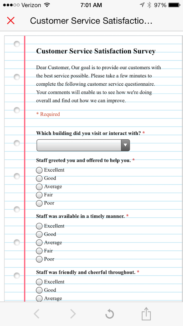
The QR Code led to an online survey that was easy to take and only took a minute or two. Hit submit and you’re done. Everything worked. But some things could have been done better.
Here’s an image of the card and the landing page, along with some of my thoughts. Anything I missed?
- Give instructions for using the code. After all these years, there are still people who have not used QR Codes or who do not know what they are. In fact, I just had lunch with a good friend of mine who, along with her husband, owns a successful cleaning business. I scanned a QR Code on the bottle of hot sauce at the lunch table and she wanted to know what I was doing. “Oh!” she exclaimed. “I always wondered what those things were!”
Using a QR Code for this implementation is a great idea, but instead of simply asking people to “complete the survey using the QR Code,” the school district might have used a short set of instructions: “Scan this code on your phone using a QR Code reader to take the survey. Need help? Just ask!”
- Use a URL shortener. Not only would this have made the code less cluttered (although I had no trouble scanning it), but it would have enabled the district to track its use. Yes, they will know someone has scanned the code when they receive back a survey, but when using a free QR Code generator and a non-shortened URL, they can’t track attempts or bounces. To learn the most they can about user behavior and get the most out of their efforts, it would have been helpful to have both. A URL shortener like Tiny URL or Bitly would have helped them do that.
- Use a mobile-optimized landing page or make the font larger. This was an easy survey to take, but on a phone, the type was really tiny and hard to read. With QR Codes, mobile-optimizing the landing page is always best, but there are cases in which it’s not possible. In this case, the school district could have adjusted the type size on the page to be readable on a phone.
- Provide an option to take the survey without using the code. Provide a link that allows people to take the card home and take the survey on their desktops or laptops of they want to. Not everyone is going to use the QR Code. In this case, there may be high percentages of parents who aren’t familiar with them. If you’re in Silicon Valley, maybe the option isn’t as important, but everywhere else, it’s probably a good idea. If the page is not mobile optimized and the font is enlarged to be readable on a phone, one option is to create a separate page for laptop and mobile responses (www.schooldistrict/survey/mobile and www.schooldistrict/survey/nonmobile). This provides two benefits—an optional way to take the survey and a way to track user preference. What percentage of people scan the code and what percentage log in directly? That’s helpful for the district to know.
Did I miss anything?


Discussion
By John Leininger on Jan 24, 2017
Here are a few things I would add:
1. Test the trigger in the actual situation (how it is going to be delivered—an electronic image or print (you might find issues with the type of stock— gloss/dull/coated/uncoated/laminated)
2. Understand where the trigger will be used (lighting, Internet access, viewing distance)
3. Specifically tell people to what they are going to link to.
4. Consider using a repurposable QR Code.
By Dan Korn on Jan 25, 2017
What QR code? I don't see it in the article.
By Heidi Tolliver-Nigro on Jan 26, 2017
Dan, I didn't include a picture of the card with the QR Code on it. It was nothing spectacular. Just a business card sized piece with the school's address and the like on it. In the post, I used the screen shot of where the QR Code led. That's where all the interesting stuff happens!
Discussion
Join the discussion Sign In or Become a Member, doing so is simple and free