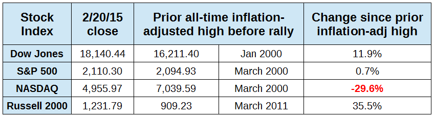
Are stock indexes at all time highs? Finally, the S&P 500 has broken through its inflation-adjusted all-time high of March 2000, closing on Friday, February 20 at 2110.3. The Dow broke through a while ago, and is now 11% above its January 2000 high. The Russell 2000 has been above its all-time high, and since March 2011, almost four years ago, is up +35%. (click table to enlarge)

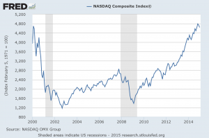
The NASDAQ is a different matter. On Friday it closed at 4955.97, and remains -3.4% below its intraday high of March 10, 2000 when it hit 5132.52. Today, the NASDAQ would have to hit 7039.59 to be at its equivalent inflation-adjusted value. It has to climb +42% higher than it is today to match that level. Below is a chart of the NASDAQ with end-of-month closings since 2000, in current dollars. (click chart to enlarge)
It is important to realize that any index is just a point in time. Had one invested every month in the NASDAQ starting in January 2000 buying one share at a time, they would be up +82% because those shares would have been purchased at low prices after it crashed and would have increased in value. In 15 years that's about a 5.5% return, and after inflation a net gain of about 2.8%.
If someone invested $100 a month in the same index without regard to the price (an investment method called “dollar cost averaging”), in 15 years they would have contributed $18,000 and slightly more than doubled their money in current dollars. That would have been a 6.8% return per year, and about 4.2% after inflation. So it is important to realize that the value of an index at a particular time does not indicate the value of investing. Better returns could have been gained by choosing the winning index at the time (the Russell 2000) but the example of the NASDAQ shows that even picking a dreadful loser of an index and patiently investing can still produce a positive result.
Finally, there should be some concern about why stocks are rising. The chart below was in one of our newsletters recently, and it's worth repeating here. (click chart to enlarge)
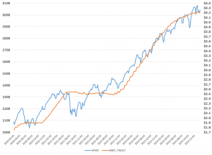
It shows the purchases of bonds and mortgage securities by the Federal Reserve and how stocks as measured by the S&P 500 have gone up along with it. For sure, companies have been profitable as they have changed their costs and have exercised some post-recession discipline regarding their spending. Much of the stock market rise has been the result of stock buybacks, by some estimates to be the cause of about 40% of the increase in value. Whether or not passive stockholders of index funds should care is a separate matter. Some of those stock buybacks have been made by borrowing money at very low rates, something the Fed is responsible for, though it was not their intended purpose. The chart should be a red flag for investors to be careful once there is a change in Fed policy. But a negative result may only create new buying opportunities, as the NASDAQ exercise noted above, illustrates.
# # #
 The NASDAQ is a different matter. On Friday it closed at 4955.97, and remains -3.4% below its intraday high of March 10, 2000 when it hit 5132.52. Today, the NASDAQ would have to hit 7039.59 to be at its equivalent inflation-adjusted value. It has to climb +42% higher than it is today to match that level. Below is a chart of the NASDAQ with end-of-month closings since 2000, in current dollars. (click chart to enlarge)
 It is important to realize that any index is just a point in time. Had one invested every month in the NASDAQ starting in January 2000 buying one share at a time, they would be up +82% because those shares would have been purchased at low prices after it crashed and would have increased in value. In 15 years that's about a 5.5% return, and after inflation a net gain of about 2.8%.
If someone invested $100 a month in the same index without regard to the price (an investment method called “dollar cost averaging”), in 15 years they would have contributed $18,000 and slightly more than doubled their money in current dollars. That would have been a 6.8% return per year, and about 4.2% after inflation. So it is important to realize that the value of an index at a particular time does not indicate the value of investing. Better returns could have been gained by choosing the winning index at the time (the Russell 2000) but the example of the NASDAQ shows that even picking a dreadful loser of an index and patiently investing can still produce a positive result.
Finally, there should be some concern about why stocks are rising. The chart below was in one of our newsletters recently, and it's worth repeating here. (click chart to enlarge)
It is important to realize that any index is just a point in time. Had one invested every month in the NASDAQ starting in January 2000 buying one share at a time, they would be up +82% because those shares would have been purchased at low prices after it crashed and would have increased in value. In 15 years that's about a 5.5% return, and after inflation a net gain of about 2.8%.
If someone invested $100 a month in the same index without regard to the price (an investment method called “dollar cost averaging”), in 15 years they would have contributed $18,000 and slightly more than doubled their money in current dollars. That would have been a 6.8% return per year, and about 4.2% after inflation. So it is important to realize that the value of an index at a particular time does not indicate the value of investing. Better returns could have been gained by choosing the winning index at the time (the Russell 2000) but the example of the NASDAQ shows that even picking a dreadful loser of an index and patiently investing can still produce a positive result.
Finally, there should be some concern about why stocks are rising. The chart below was in one of our newsletters recently, and it's worth repeating here. (click chart to enlarge)
 It shows the purchases of bonds and mortgage securities by the Federal Reserve and how stocks as measured by the S&P 500 have gone up along with it. For sure, companies have been profitable as they have changed their costs and have exercised some post-recession discipline regarding their spending. Much of the stock market rise has been the result of stock buybacks, by some estimates to be the cause of about 40% of the increase in value. Whether or not passive stockholders of index funds should care is a separate matter. Some of those stock buybacks have been made by borrowing money at very low rates, something the Fed is responsible for, though it was not their intended purpose. The chart should be a red flag for investors to be careful once there is a change in Fed policy. But a negative result may only create new buying opportunities, as the NASDAQ exercise noted above, illustrates.
# # #
It shows the purchases of bonds and mortgage securities by the Federal Reserve and how stocks as measured by the S&P 500 have gone up along with it. For sure, companies have been profitable as they have changed their costs and have exercised some post-recession discipline regarding their spending. Much of the stock market rise has been the result of stock buybacks, by some estimates to be the cause of about 40% of the increase in value. Whether or not passive stockholders of index funds should care is a separate matter. Some of those stock buybacks have been made by borrowing money at very low rates, something the Fed is responsible for, though it was not their intended purpose. The chart should be a red flag for investors to be careful once there is a change in Fed policy. But a negative result may only create new buying opportunities, as the NASDAQ exercise noted above, illustrates.
# # #