One of my favorite articles over the past decade has been “You are What You Spend” which appeared in the New York Times in 2008.
One of my favorite articles over the past decade has been “
You are What You Spend” which appeared in the
New York Times in 2008. Using Bureau of Labor Statistics data, it explained that income data do not explain the full extent of economic activity, but data about spending yields a richer perspective of the effects of income, transfer payments, and savings on consumer spending. The BLS recently released new data in their annual Consumer Expenditures Survey. As the Times article explains,
Looking at a far more direct measure of American families’ economic status — household consumption — indicates that the gap between rich and poor is far less than most assume, and that the abstract, income-based way in which we measure the so-called poverty rate no longer applies to our society.
I've taken those data and adjusted them for inflation (using the December Consumer Price Index values for each year).
The data explain why the economy remains sluggish: household incomes remain below levels prior to the recession. They also explain why so many consumers still believe the economy is still in recession or
permanently harmed by the downturn. The data also make one wonder why GDP data is rising when incomes are not; some economists have questioned GDP's rise these past years when other data series have not risen. There is no doubt that the credit crisis impaired the savings and incomes of consumers. For some of those households, it will still take years to recover the financial losses and the employment interruptions they suffered. It is still the case that households can shift from one quintile to another quickly. This is often the case of small business owners who sell their businesses: one year may find them in the top 1% and the next year, as they enjoy the fruits of their labors, and perhaps a non-compete agreement, may fall to the lower quintiles. Generally, workers in organizations can stay in the same quintiles for years if they stay in the same kinds of positions or professions. I mention this because much of the quintile positions are based on career choices, education choices and not always circumstance.
They are also functions of time of life. College students who work part time will be in the lowest quintile and move to the top or second quintile after a short period of experience. Retiring workers will drop to the bottom quintile as they may no longer have employment income. In both these situations, they are in the low quintiles by choice. The college student is there as a trade-off for future income, and the retiree usually by financial plan. Each of the quintiles is a more diverse population than is assumed; it is always assumed in the news that the lower quintile is packed with people who need help, and many do, but the data do not describe the hard and financial assets held by the households in the quintiles, nor the wide ranges of ages and reasons for their being there.
This is one of the problems with data: “all” does little to explain because “all” has no context, and neither do the quintiles. Like employment data, the interesting stuff is in the details of age ranges, educational levels, social groups, geography, and other characteristics. Unfortunately, these income and spending data do not have these available, at least that I can find.
One thing we do know from other data are that in the range of one-third of the decline in incomes is the result of lower interest rates on savings. An under-reported story in these years of Fed quantitative easing is the devastation to retirees who saved modestly and worked hard to accumulate $100,000 or so, expecting to earn 6% on certificates of deposit. Their $500 per month interest earnings are one third of that or less. That's lost ground that's hard to make up since these savers are risk-resistant (they should be) and in a moment of financial difficulty would dig into principal, meaning that even when interest rates rise, their interest earnings will be impaired.
Now to the data. They show that none of the income classes (in quintiles, in other words, households were divided into five groups) had significant income increases.
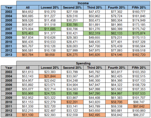
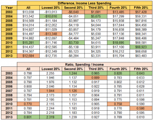
The first set of tables show the inflation-adjusted data for all households, and the quintiles. The tables are income and spending. Highest levels are in green, lowest levels are in pink (may vary depending on the computer you are using; click chart to enlarge).
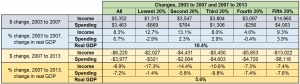
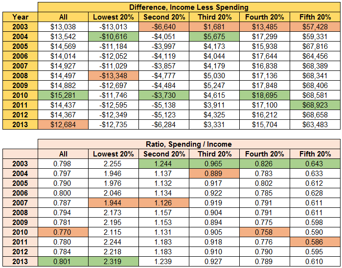
How can spending be higher than incomes? That's the point: spending is a better indicator of how these households are doing. A retired couple who saved for later years would get Social Security payments, income from savings and pensions, and would likely be drawing down principal from their accounts. Other transfer payments, such as food stamps, social assistance, disability and insurance payments may go to other households in that quintile. Government transfer payments work: they're supposed to allow low income households to buy goods and services they could not otherwise afford, and they do.
What happens in the higher income quintiles? Their incomes are higher than their spending. The difference goes to taxes and savings.
The next table shows the difference in spending and income for each year. Note that the bottom two quintiles are always negative. The table that follows shows how spending relates to income. In 2013 the lowest quintile spent 2.3x more than its income. (click chart to enlarge)
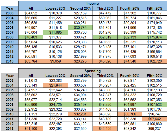
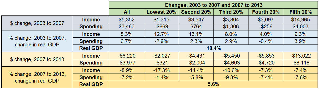
The table below shows the changes before and after the recession (or after the housing bubble burst, choose your name for the period as you wish). The chart compares the two periods to the change in real GDP. In neither period did changes in income or spending get close to GDP growth. In the 2007 to 2013 period all of the changes to income and spending were negative. (click chart to enlarge)
The lack of income growth has occurred more than a decade. Workers have not been receiving the fruits of their increases in productivity. In some periods, the shortfall was explained by increased benefits costs or regulatory compliance. That is, if the households had people working, their costs to their employers were increasing for benefits (usually medical insurance costs) and regulatory compliance, such as increased Social Security and Medicare payments when increases in the income thresholds for the employer contributions applied. Those payments do not show up as income, but they are costs to the employer for total payroll.
There was also a time when the Producer Price Index was running higher than the Consumer Price Index. That meant that worker productivity was paying for the increased costs of materials that could not be passed to the marketplace at the consumer level. Nonetheless, you still have a situation where workers have not been getting paid for increases in their output. That is not good.
The economy can't grow in a robust manner until incomes rise in a general way. Until then, these income and spending data cast doubt on the long term GDP data. If the economy was really growing, incomes would have confirmed the rise in GDP. Yet, there are many other data series (such as employment data) that have not moved in a way that affirms post-recession GDP data.
* * *
The
Wall Street Journal had a review of the economic and political implications of flat wages as this summary was being prepared.
* * *
Remember, households in the low quintiles still pay taxes. According to the Census Bureau, 40% of those included in their measure of poverty levels own their own homes. While they may not pay income tax, they do pay property taxes, sales taxes on what they buy, and other government fees. In May 2012 I wrote a long piece about the effect of taxes called “
The 'Half of All Workers Don't Pay Taxes' Mantra is Starting to Get Taxing.” It was written during the last presidential campaign, when that phrase was being used often. It may be an interesting read in light of these latest BLS data.
* * *
The “tax inversion” topic is being well-politicized this political season. What I find so funny about it is that every new large-size company sets themselves up in this manner. Facebook is a good example. These new companies were founded in a time when the same tax rates that make inversions appealing to older companies make complicated structures like the “
Double Irish arrangement” worthwhile for new companies. These structures are created when the companies are growing, and privately held, well before their first public offering of stock. It's old companies attempting to replicate those kinds of tax savings new companies have that make the old companies take the brunt of the bad public relations that inversions create. I have yet to see any news stories about high profile companies (other than a 2012 article about
Apple's aggressive cash management) reported with the same venom as the inversion stories are.
 How can spending be higher than incomes? That's the point: spending is a better indicator of how these households are doing. A retired couple who saved for later years would get Social Security payments, income from savings and pensions, and would likely be drawing down principal from their accounts. Other transfer payments, such as food stamps, social assistance, disability and insurance payments may go to other households in that quintile. Government transfer payments work: they're supposed to allow low income households to buy goods and services they could not otherwise afford, and they do.
What happens in the higher income quintiles? Their incomes are higher than their spending. The difference goes to taxes and savings.
The next table shows the difference in spending and income for each year. Note that the bottom two quintiles are always negative. The table that follows shows how spending relates to income. In 2013 the lowest quintile spent 2.3x more than its income. (click chart to enlarge)
How can spending be higher than incomes? That's the point: spending is a better indicator of how these households are doing. A retired couple who saved for later years would get Social Security payments, income from savings and pensions, and would likely be drawing down principal from their accounts. Other transfer payments, such as food stamps, social assistance, disability and insurance payments may go to other households in that quintile. Government transfer payments work: they're supposed to allow low income households to buy goods and services they could not otherwise afford, and they do.
What happens in the higher income quintiles? Their incomes are higher than their spending. The difference goes to taxes and savings.
The next table shows the difference in spending and income for each year. Note that the bottom two quintiles are always negative. The table that follows shows how spending relates to income. In 2013 the lowest quintile spent 2.3x more than its income. (click chart to enlarge)
 The table below shows the changes before and after the recession (or after the housing bubble burst, choose your name for the period as you wish). The chart compares the two periods to the change in real GDP. In neither period did changes in income or spending get close to GDP growth. In the 2007 to 2013 period all of the changes to income and spending were negative. (click chart to enlarge)
 The lack of income growth has occurred more than a decade. Workers have not been receiving the fruits of their increases in productivity. In some periods, the shortfall was explained by increased benefits costs or regulatory compliance. That is, if the households had people working, their costs to their employers were increasing for benefits (usually medical insurance costs) and regulatory compliance, such as increased Social Security and Medicare payments when increases in the income thresholds for the employer contributions applied. Those payments do not show up as income, but they are costs to the employer for total payroll.
There was also a time when the Producer Price Index was running higher than the Consumer Price Index. That meant that worker productivity was paying for the increased costs of materials that could not be passed to the marketplace at the consumer level. Nonetheless, you still have a situation where workers have not been getting paid for increases in their output. That is not good.
The economy can't grow in a robust manner until incomes rise in a general way. Until then, these income and spending data cast doubt on the long term GDP data. If the economy was really growing, incomes would have confirmed the rise in GDP. Yet, there are many other data series (such as employment data) that have not moved in a way that affirms post-recession GDP data.
* * *
The Wall Street Journal had a review of the economic and political implications of flat wages as this summary was being prepared.
* * *
Remember, households in the low quintiles still pay taxes. According to the Census Bureau, 40% of those included in their measure of poverty levels own their own homes. While they may not pay income tax, they do pay property taxes, sales taxes on what they buy, and other government fees. In May 2012 I wrote a long piece about the effect of taxes called “The 'Half of All Workers Don't Pay Taxes' Mantra is Starting to Get Taxing.” It was written during the last presidential campaign, when that phrase was being used often. It may be an interesting read in light of these latest BLS data.
* * *
The “tax inversion” topic is being well-politicized this political season. What I find so funny about it is that every new large-size company sets themselves up in this manner. Facebook is a good example. These new companies were founded in a time when the same tax rates that make inversions appealing to older companies make complicated structures like the “Double Irish arrangement” worthwhile for new companies. These structures are created when the companies are growing, and privately held, well before their first public offering of stock. It's old companies attempting to replicate those kinds of tax savings new companies have that make the old companies take the brunt of the bad public relations that inversions create. I have yet to see any news stories about high profile companies (other than a 2012 article about Apple's aggressive cash management) reported with the same venom as the inversion stories are.
The lack of income growth has occurred more than a decade. Workers have not been receiving the fruits of their increases in productivity. In some periods, the shortfall was explained by increased benefits costs or regulatory compliance. That is, if the households had people working, their costs to their employers were increasing for benefits (usually medical insurance costs) and regulatory compliance, such as increased Social Security and Medicare payments when increases in the income thresholds for the employer contributions applied. Those payments do not show up as income, but they are costs to the employer for total payroll.
There was also a time when the Producer Price Index was running higher than the Consumer Price Index. That meant that worker productivity was paying for the increased costs of materials that could not be passed to the marketplace at the consumer level. Nonetheless, you still have a situation where workers have not been getting paid for increases in their output. That is not good.
The economy can't grow in a robust manner until incomes rise in a general way. Until then, these income and spending data cast doubt on the long term GDP data. If the economy was really growing, incomes would have confirmed the rise in GDP. Yet, there are many other data series (such as employment data) that have not moved in a way that affirms post-recession GDP data.
* * *
The Wall Street Journal had a review of the economic and political implications of flat wages as this summary was being prepared.
* * *
Remember, households in the low quintiles still pay taxes. According to the Census Bureau, 40% of those included in their measure of poverty levels own their own homes. While they may not pay income tax, they do pay property taxes, sales taxes on what they buy, and other government fees. In May 2012 I wrote a long piece about the effect of taxes called “The 'Half of All Workers Don't Pay Taxes' Mantra is Starting to Get Taxing.” It was written during the last presidential campaign, when that phrase was being used often. It may be an interesting read in light of these latest BLS data.
* * *
The “tax inversion” topic is being well-politicized this political season. What I find so funny about it is that every new large-size company sets themselves up in this manner. Facebook is a good example. These new companies were founded in a time when the same tax rates that make inversions appealing to older companies make complicated structures like the “Double Irish arrangement” worthwhile for new companies. These structures are created when the companies are growing, and privately held, well before their first public offering of stock. It's old companies attempting to replicate those kinds of tax savings new companies have that make the old companies take the brunt of the bad public relations that inversions create. I have yet to see any news stories about high profile companies (other than a 2012 article about Apple's aggressive cash management) reported with the same venom as the inversion stories are.