This month’s research summary is an introduction to the monograph Minding the Gap: Evaluating the Image Quality of Digital Print Technologies Relative to Traditional Offset Lithography (PICRM-2008-08), by Susan Farnand, Staff Scientist at the Carlson Center for Imaging Science at RIT.
By Susan Farnand
The goal of this research was to examine the current gap in image quality between high-end digital printers and offset lithography and to develop an idea of how important or relevant this image quality difference is to the end user through the use of psychophysical experiments. An investigation into image quality parameters that are particularly relevant in comparing print systems technologies was also conducted.
Introduction
Little more than a decade ago, the introduction of the Xeikon and Indigo printers ushered in a new era of print possibilities. These machines offered reasonable image quality at high enough speeds that short-run, on-demand print runs became a possibility. While typical offset presses required upwards of half an hour for make-ready, economically precluding runs of less than a few thousand, this new equipment required minimal set-up time, making runs of even one print feasible. With the addition of variable data printing (VDP)—in which each document in a print run can contain different information allowing personalization of documents—life in the printing world became considerably more interesting.
In the past decade, the equipment has evolved, offering increased reliability and the capability of printing on a wider range of substrates. But—what about image quality?
Certainly, the wider range of substrates has helped. Other technological advances have boosted the quality of the images being generated on digital printing equipment to the point where some might argue that it is now in the realm of offset. Henry Freedman of Technologe Watch™ (2004, 2006a, 2006b) has demonstrated that higher-end digital printers such as the Kodak NexPress 2100 and the Xerox Docucolor 8000 can be set up to produce image quality comparable to that of offset lithography. While Freedman has shown that it is possible to achieve image quality comparable to offset on high-end digital printing equipment, it is telling that there exists a great deal of information on “designing for digital.” Googling “designing for digital print” results in about 209,000,000 hits, including whole books on the topic as well as websites and articles.
Background
Much work in evaluating digital print quality has been undertaken by researchers in technical, marketing, and academic milieus. A number of these efforts have focused on printing digital photographs; this is an application where image quality is of particular concern. In one of these studies, Swanson (2000) found four “significant issues” in assessing image quality: “color reproduction, uniformity, resolution, and artifacts.”
The same issues are among those listed by the INCITS W1.1 Image Quality for Printer Systems ad hoc committee working to establish a standard for perceptually measuring image quality (INCITS, 2004). (The INCITS W1.1 committee was established by W1, the Office Equipment subcommittee of INCITS. This is also the ANSI Technical Advisory Group for ISO/IEC Joint Technical Committee 1, which is responsible for the standardization in the arena of Information Technology.) This committee has identified gloss, color rendition, uniformity, text and line quality, and sharpness and effective resolution as the essential characteristics for measuring image quality on prints.
In their study on digital print quality, Chung and Rees (2006) generated lists of attributes of interest in evaluating image quality for both digital and offset print. Most of the print attributes identified as being of key concern in evaluating digital images, including color rendition, resolution, text quality, and artifacts, also appear on the offset list. However, Chung and Rees point out that, “while many of the attribute names are shared, the difference in the two technologies results in different visual appearances.” It is this difference in the visual appearance that is of interest in this study. While efforts have been made to evaluate the measured differences in such items pertaining to print appearance as solid area density, dot gain, colorimetric values, and color gamut volume (Xu & Kellogg, 2007), it is the focus of this research to evaluate actual perceived differences in the quality of prints produced on high-end digital printing equipment relative to those printed via offset lithography.
Experimental Method
To answer questions around image quality differences, it is essential to first establish an image set that will be effective for evaluating image quality. This can often be the most difficult part of a productive image quality evaluation. The set must comprise images that will provide a measurable signal of the difference that exists between technologies. The set should also be representative of various types of images that may be encountered. To address this, images representing the four categories included in Frey, Christensen, and DiSantis’ (2006) monograph were used: direct mail, marketing and promotional materials, business communications, and photo books. Six test images were created, and can be seen under the “Images Used in Research” heading later in this summary.
In the marketing and promotional materials category, a brochure, entitled “Train,” created as part of the Technology Practicum printing course offered each spring at the Rochester Institute of Technology, was used. In the direct mail category, a mailer obtained from the Village Sports center was used. For photo books, two photo pages were created, one entitled “Sarah” and one entitled “China.” The latter image includes vacation-type photos and Chinese text as well as copyright text. For business communications, a text and graphics document was created and IS&T’s NIP23 Print Gallery image was used.
With the image set in hand, prints were made on high-end digital equipment, including an HP Indigo 5000, a NexPress 2100, and an iGen3. Prints were also made on the Heidelberg Speedmaster 74 sheetfed press in the Printing Applications Lab at RIT. An image of the text print on uncoated paper on a desktop color printer was also included.
Two substrates were used on each device, one coated (Titan Plus Dull digital 100lb. cover) and one uncoated (HP Indigo printing paper 80 lb premium cover) cover stock. The text image on the coated stock was not used in the experiment. Two prints, one from early in the run (typically the fifth print) and one from later in the run (typically the ninety-fifth print), were used for each printer on each paper for each image. With two prints on two papers of five images on four printers plus two prints of one image on one paper on five printers (though only one print from the desktop printer), the complete test set consisted of 89 prints.
With the print database generated, psychophysical experimentation was conducted that examined effective image quality differences; essentially, the impact of any apparent differences on perceived quality or value. The experiment was initiated by showing the participant prints of the Print Gallery image made on the desktop printer and the Heidelberg Speedmaster sheet-fed press. These prints represented a clearly visible range in image quality. Various aspects of image quality that the participants could use in making their print quality decisions were described. The participants were specifically instructed not to consider hue shifts in their decisions on print quality. The rationale for this comes from three factors: Freedman has shown that printing equipment can be set up to match in color; the images used had little high chroma content (and therefore gamut mapping was not an issue); and color management did not function adequately during the execution of the print runs.
After speaking with each participant briefly regarding image quality, the participants were shown the prints in sets, where each set consisted of the prints made on either coated or uncoated paper for each image. For example, one set would be the prints of the Village Sports brochure made on coated paper on each of the four printers. At the start of the evaluation of each set, the participant was told of the purpose of the document.
For the photo book pages, the participants were told that the prints represented photo book pages of pictures that they may have taken on vacation and that were for their personal use to share with family and friends. For the Village Sports brochure, each was told that he or she was the owner of Village Sports, and that this was a mailer that had been commissioned to send to prospective customers. For the Train brochure, each was told that they were the owner of Georgetown Loop Railroad, and that the prints represented sales brochures used to generate business. For the text document and the Print Gallery page, the participants were told that these were business communications documents that would be used within an office environment (perhaps to be sent to a supervisor or another company), and that, although the main purpose of the document was to convey information, the documents still needed to be presentable.
To address the question of impact, the observers were questioned regarding what they would be willing to pay for a given print. For each set, one of the prints made on the Heidelberg Speedmaster 74 sheet-fed press was selected to be the reference print. When the participants were shown the first reference print, they were told that they paid a dollar for this page. The participants were given the following instructions: for each of the comparison prints, if the quality was sufficiently higher than the reference to justify paying more for the document, they were to specify how much more they would be willing to pay. If the quality was sufficiently worse than the reference (so that they would not want to pay as much for the document as they had for the reference), they were asked to tell how much less they felt it was worth. If they thought the quality was essentially comparable (even if the prints looked quite different), they were to state that it had the same value as the reference. With this explanation, the first comparison print of the first set was presented, and each participant proceeded through the document sets in random order.
The experiment was conducted under D50 lighting conditions within the Vision Lab of the Color Science building at RIT. Thirty-eight people of varied backgrounds participated, including twenty-five students from an undergraduate psychology course. The students’ majors ranged from Computer Science and Liberal Arts to Photography and Biotechnology. The remainder of the participants consisted of Imaging Science and Color Science undergraduates, graduate students, and faculty. Eleven females participated along with twenty-seven males. At least three participants had color vision anomalies; this was self-reported, so others may have been present. The age range of the participants was approximately 20 to 50 years of age. None of the participants were involved in any way with the printing industry.
Images Used in Research
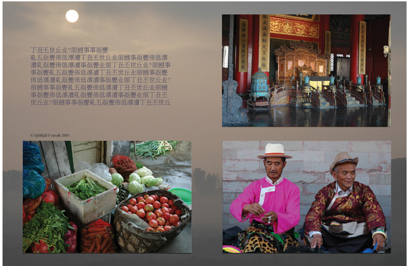
China Photo Page
click to view image full size
NIP23 Image
click to view image full size

Sarah Photo Page
click to view image full size

Text Business Page
click to view image full size
Train Brochure
click to view image full size

Village Sports Mailer
click on image to view it full size


References
Chung, R., & Rees, M. (2006). A survey of digital and offset print quality issues (PICRM-2006-04). Rochester, NY: Printing Industry Center at RIT.
Freedman, H. B. (2004). Production color xerography matches offset printing quality – Xerox’s groundbreaking high density multibeam digital color printing systems. Technologe Watch. Vol. 9, Fall 2004.
Freedman, H. B. (2006a). Kodak NexPress digital color printing – Offset quality and enhanced screening technology create new market opportunities. Technologe Watch. Vol. 11, Fall 2006.
Freedman, H. B. (2006b). Matching electrophotographic color printing to offset lithography – Color measurement targets perform magic. In Test Targets 6.0 (pp. 33-36). Rochester, NY: RIT School of Print Media.
Frey, F., Christensen, H., & Disantis, N. (2006). Permanence of toner on paper—Based on the lifecycle of documents (PICRM-2006-05). Rochester, NY: Printing Industry Center at RIT.
International Committee for Information Technology Standards. (2004). What is INCITS? Retrieved from http://www.incits.org
Swanson, T. W. (2000). Digital image quality: What is it and how is it measured? IS&T’s Eleventh International Symposium on Photofinishing Technologies: Vol. 11 (pp. 11-13). Springfield, VA: The Society for Imaging Science & Technology.
Xu, R., & Kellogg, H. P. (2007). Print quality of dry-toner color electrophotography for production printing and comparison to offset printing. IS&T’s NIP23: International Conference on Digital Printing Technologies and Digital Fabrication 2007: Vol. 23 (pp. 378-381).
Next month, we will continue with Part B of this research, which will discuss the research findings.
2007-2008 Research Monographs:
To read about this research in detail, download the monograph from: http://print.rit.edu/pubs/picrm200803.pdf
This article from the Printing Industry Center at RIT was originally published in the Centers affiliate-only eReview newsletter. Article Series Index.