In a previous article, I focused on the growth of the United States Postal Service’s Informed Delivery, a free service that provides mail recipients with an email, in-app, or on-dashboard preview of the mail arriving in their mailboxes each day. Not only is Informed Delivery growing in subscribers, but it is expanding in services. Of particular interest to me is the expansion of its interactive campaigns, which allow marketers the option to replace the grayscale scans automatically provided with Informed Delivery with full-color “representative” images of each mail piece instead. (This article assumes a knowledge of the basics of the Informed Delivery service. For more on Informed Delivery, click here.)
As a general rule, color is better than grayscale. But is this an option that mailers should rush to embrace?
The USPS has long allowed marketers to add a small color ride-along (advertising) image and campaign hyperlink below the grayscale image to create multi-channel campaigns. Subscribers can click on the hyperlink or ride-along image to respond to the offer before the physical piece arrives. These campaigns not only allow Informed Delivery subscribers to respond to campaigns immediately, but also provide the mailer with metrics, giving them a sense of how well the campaign is working.
The USPS has now expanded interactive campaigns to allow marketers to replace the grayscale image with a full-color “representative” image of the actual piece instead. Representative images do not have the address area, providing more space for messaging and design, and allowing mailers to do split testing of offers.
While the replacement of grayscale images with full-color images might seem like a slam dunk (color images always get better response rates than grayscale ones, right?), this isn’t necessarily the case.
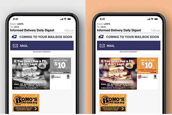
In a case study provided by the USPS, one marketer—Bono’s Pit Bar-B-Q, a Florida-based restaurant chain—produced an Informed Delivery interactive campaign that included an offer of $10 off. Thanks to the split testing option, Bono’s chose to test the regular grayscale scan against the full-color representative image. Both had the same $10-off offer and accompanying color ride-along image and hyperlink.
While we might expect the color image to out-perform the grayscale image by a significant amount, the opposite was true. The grayscale scan outperformed the representative color image by 35%.
Bono’s attributed this surprising result to the color image detracting from the colorful banner/response URL underneath the image. Instead of the ride-along image and hyperlink standing out against the grayscale image, Bono’s surmised, allowing them to grab attention and encourage response, they just blended in with the full-color image and could be overlooked. This certainly is a possibility. However, the other possibility is that the representative image looked too much like an advertisement, which actually depressed response. In fact, after comparing the response rates of thousands of Informed Delivery campaigns, the USPS has found that full-color representative images consistently under-perform their grayscale counterparts. Specifically, campaigns using grayscale images have click-to-open rates that are 13% higher on average than those using full-color ones.
These results are counter-intuitive, but they give us insight into an interesting dynamic. Mail recipients sign up for the service because want to see what mail is arriving in their mailboxes each day. They aren’t expecting to see advertisements, which is exactly what the representative images are. It may be that subscribers don’t like it. The fact that Bono’s experience mirrored that of many other marketers in the USPS’s analysis suggests that this is more than a color image detraction issue. There may be something deeper.
What do you think? I’d love to hear the experiences of other mailers who have created test campaigns and have experience with the grayscale and representative color images. Which performed better for you?


Discussion
By Mike Porter on Oct 13, 2021
I think representative images would work best for mail that doesn't get a greyscale image, like flats.
Instead of the message that says "A mailpiece for which we do not currently have an image is included in today’s mail", consumers could see a representative image and a ridealong that encourages interaction.
By Dwight Polglaze on Oct 13, 2021
Definitely, in my opinion, the drastic and surprising difference in response rates is due to consumers being put off by the advertising. That's exactly what happened to me and two friends who use the service. We were disturbed that, once again, "Is there no escape from advertising?!" Until seeing this article, I assumed those images weren't actual mail that was coming to my house at all, but that the USPS simply starting selling ad space in the program.
By Jim Lyons on Oct 13, 2021
For me, nothing replaces a printed piece in the mail.
By Heidi Tolliver-Walker on Oct 13, 2021
It will be interesting to see whether the USPS continues offering the representative image if the response rates drop. The whole point of expanding its services is to increase the value and relevance of mail. If a service (or part of a service) is actually depressing response rates, that's counter to its goals, so I wonder if the USPS will find that it is in its best interest to offer grayscale images (plus the hyperlinks and ridealong image, of course) only.
By Maeghan Nicholson on Oct 25, 2021
I believe in the USPS' latest report on Informed Delivery they said the reverse is now true and color representative images are outperforming the black and white scans.
By Heidi Tolliver-Walker on Oct 25, 2021
Wow! Thanks. I'd love to see it! When writing this post, I was using the most recent report from USPS. If there is a new one out, would you mind posting a link?
Discussion
Join the discussion Sign In or Become a Member, doing so is simple and free